You-Mami
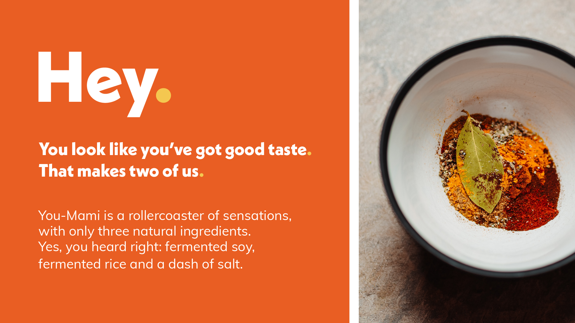
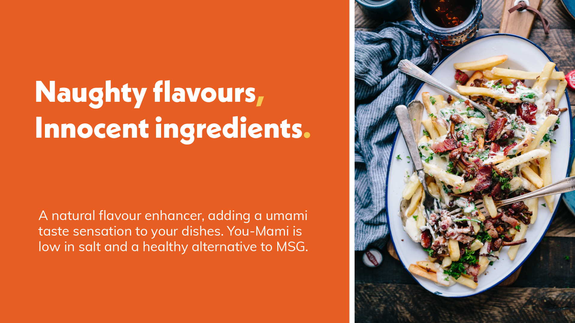
You-Mami helps you add naughty flavours to your food, without the hellish repercussions. New to the market, You-Mami is a soy based miso powder packed full of flavour. Consisting of just three ingredients, it’s a healthy and natural alternative to salt.
The team behind You-Mami were bored of bog standard condiments. They wanted to offer a new player to dining tables across the world. One that not only could provide a taste sensation but would also offer a healthier alternative to cooking with an abundance of salt. Using the concept of 'umami', or the fifth taste, the team created a three ingredient miso powder that can be used to add a depth of flavour to various types of food. Umami means 'the essence of deliciousness' in Japanese and You-Mami delivers this in spades (or should that be spoons?).
Services
Brand Strategy, Visual + Verbal Identity Design, Copywriting + Messaging, Web Design + Development, Campaign Creation + Design Print + Digital Design, Packaging Design, Photography.
The Challenge
- Create a brand that would motivate consumers to add You-Mami to their condiment cupboard.
- Make You-Mami stand out on overcrowded supermarket shelves and differentiate it from other miso based products.
- Help to educate consumers as to how they can use You-Mami.
Barefaced Solution
- What motivates people when buying food? According to our research, consumers want to be able to buy something that’s healthy whilst hitting a home run in the taste department. You-Mami does just that. So we developed bold slogans focused on making You-Mami’s health and taste credentials obvious, coupled with a brand pattern and colour system aimed at delivering some serious taste cues.
- This isn’t just a product to add to your noodles (although we’re not knocking it!), You-Mami can be added to stews, pies, popcorn – it’s incredibly versatile. So we avoided Asian clichés and traditional designs in favour of a bolder approach. Instead, we created an identity that demands attention, avoids preconceptions and easily differentiates itself when placed next to its fellow shelf dwellers.
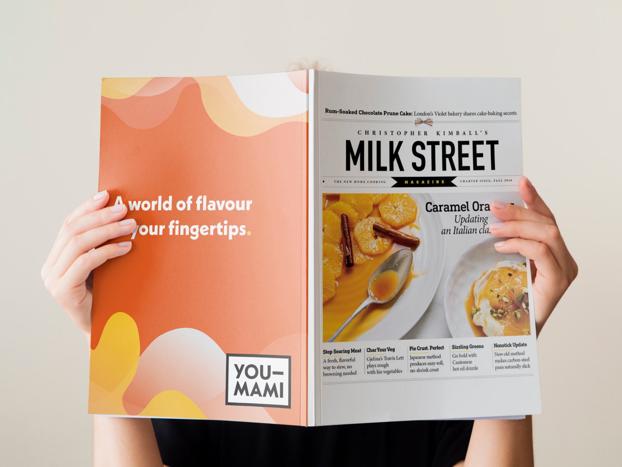
- The bold slogans clearly state what the product is and its benefits. But we knew we could push this further to really show how to use You-Mami to its maximum benefit. So we snuck in recipe ideas on the packaging. From You-Mami popcorn to Monkfish & Mussel Bourride, we had a recipe or piece of culinary inspiration to encourage anyone to pick up a packet and try You-Mami.

Angel on the shelf, devil in the dish
We started out with the nerdy bit – conducting shelf studies to see where You-Mami would sit alongside competing brands. Those shelves were packed with a lot of traditional Asian designs. Once we had a good idea of the competition we researched the market and audience. This led to us finding out that 72% of UK shoppers are purposefully buying food with less salt, sugar and fat and over 60% would pay a premium for natural, ethical and/or reduced sugar/salt foods.
We knew then that we needed a bold approach. Which is lucky really as that’s what we do best. We knew it was important to avoid traditional or cliched Asian designs. We also knew that it was important to emphasise the product’s health credentials to make it an easy pick for consumers.
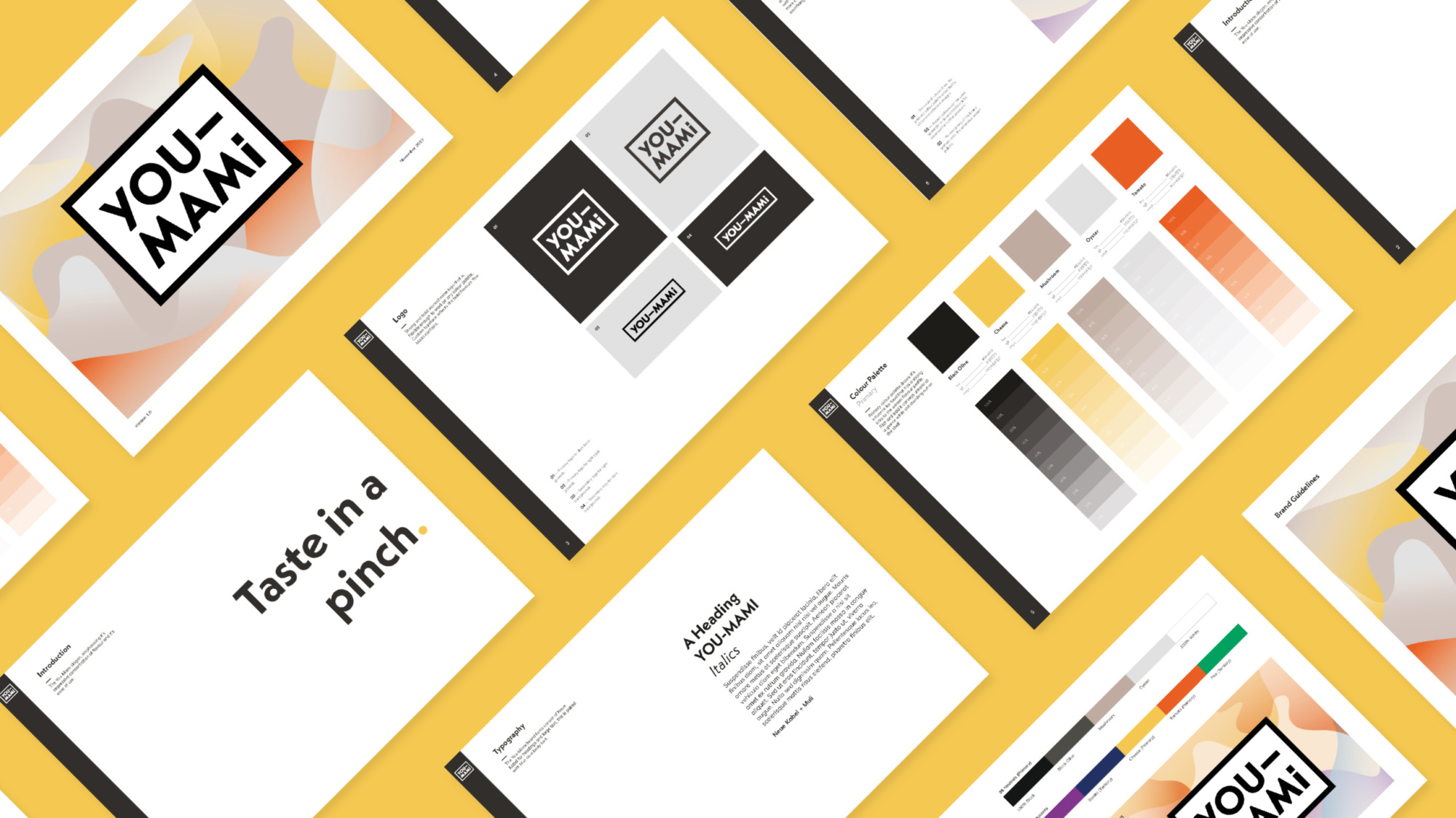
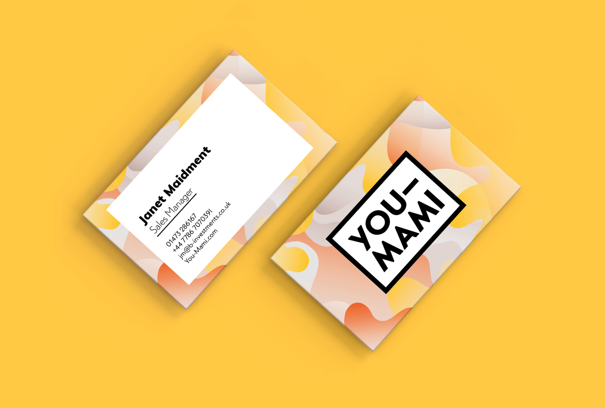
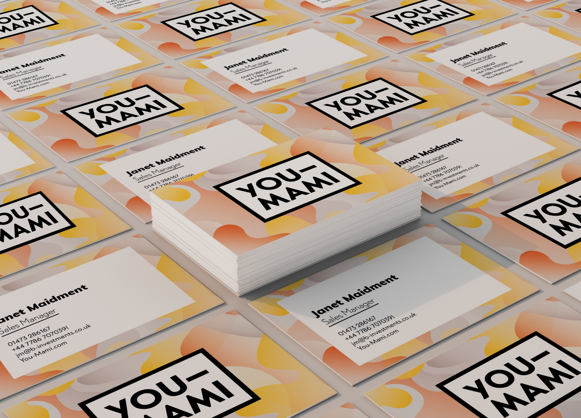
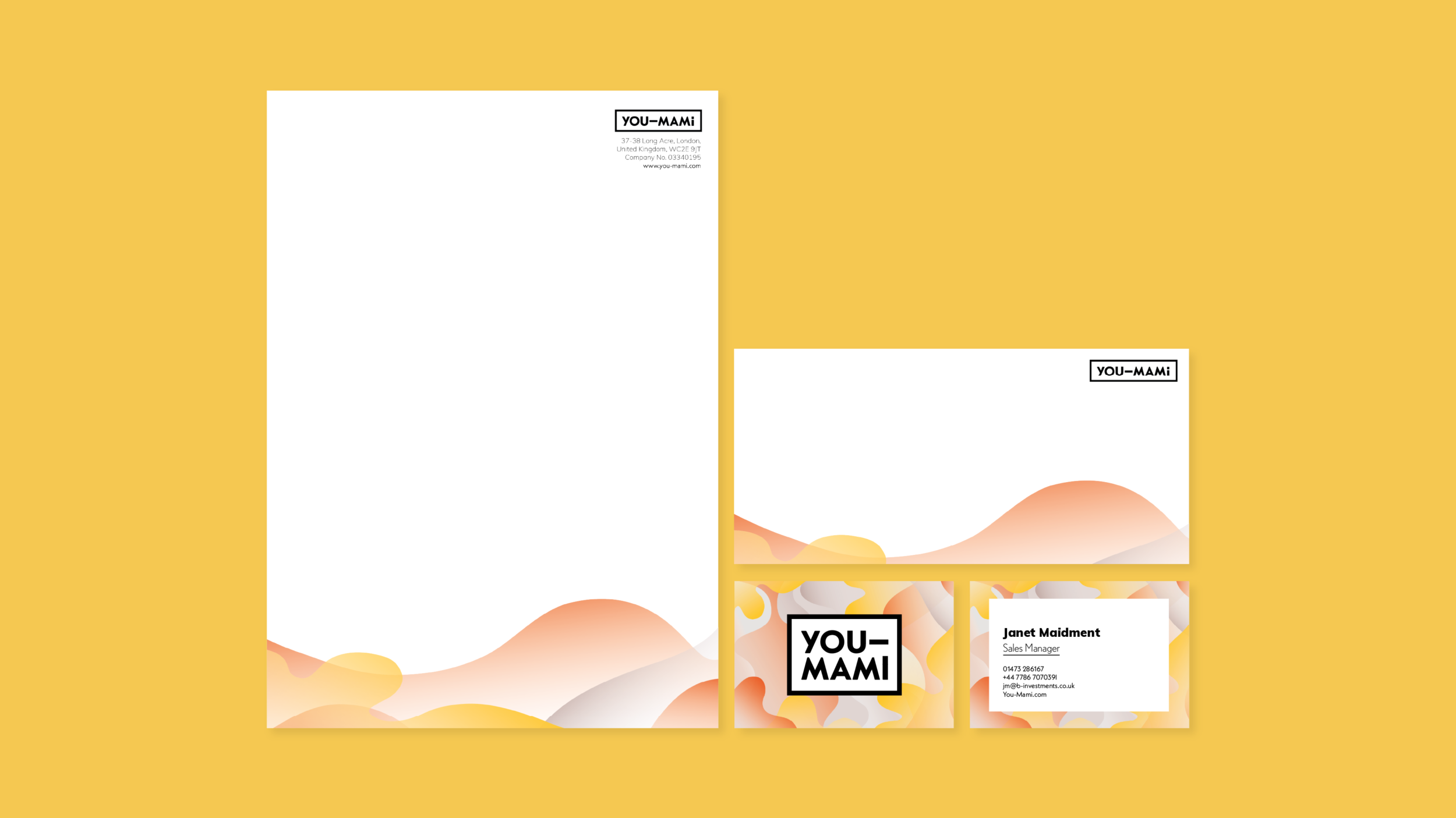
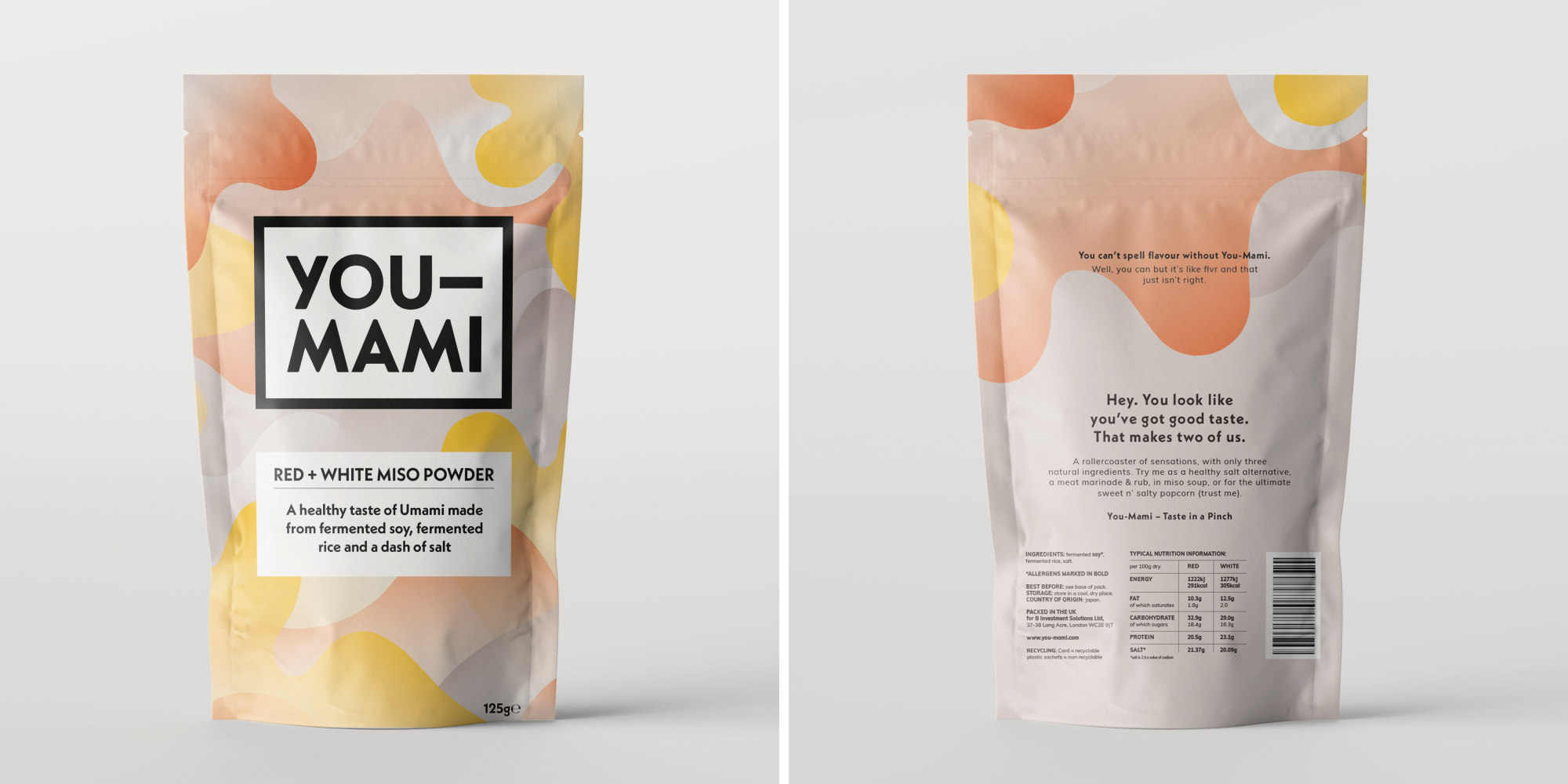
The You-Mami logo drew inspiration directly from the product. A simple logo with a bold impact mirrors the simplicity of You-Mami’s ingredients and the punch of flavour it delivers. Furthermore, the stark contrast of the logo demands attention among the typically colourful and often intricate logos of competing brands. A brand pattern was developed to convey just how much flavour You-Mami packs. The colours were drawn from food that represent the 5 major taste groups – bitter, sour, salty, sweet and umami. These colours were stirred together and left to marinate. The end result was a brand pattern that forms the backbone of the You-Mami visual identity, a vivid and eye catching design that tickles the taste buds.
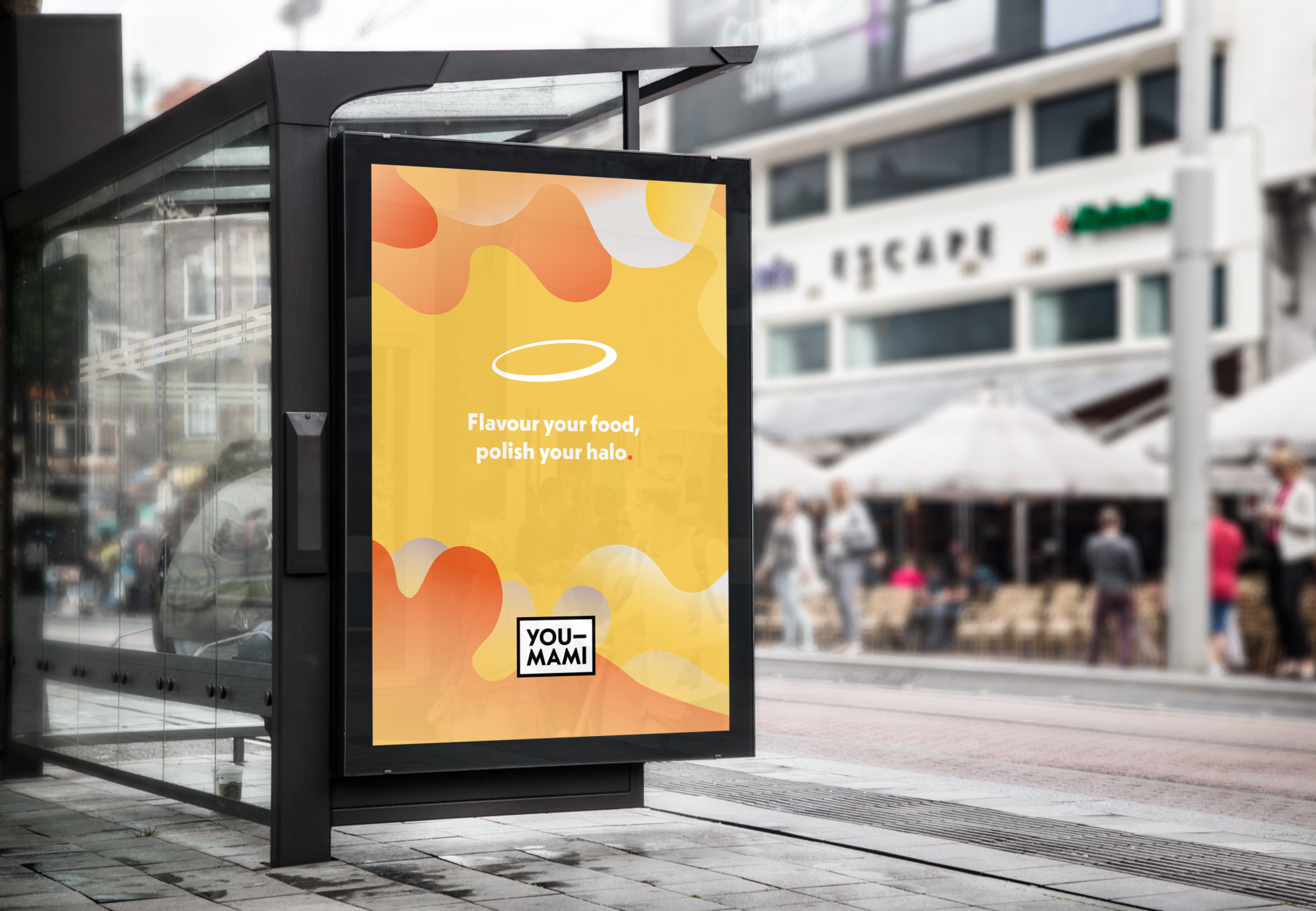
A series of cheeky brand slogans were created that emphasise the healthy credentials of the product. The tone of voice is another step away from convention. It’s energetic and fun – helping to attract purchasers from a wider market segment. Our approach to the packaging was as no-nonsense as the product itself. We displayed the three ingredients proudly on the front to emphasise that no nasties were used in the making of this condiment. Add in a dollop of witty copy and a dash of colour, before combining with a pinch of boldness for a perfect packaging recipe.