M-Wek
M-Wek's mission is to show the world the sheer power of properly considered recruitment. Operating primarily in the finance and FinTech sectors, M-Wek treat everyone with respect and never act like a recruitment robot.
Overview
There’s a big imbalance in the world of finance and FinTech. The data speaks for itself: only 17% of senior FinTech roles are held by women and 8.5% of senior leaders in tech are from a minority background. Traditional recruitment methods are failing too: 95% of employers feel ‘let down’ by them and 50% said that they usually provided them with below-par candidates. Attracting, nurturing and successfully placing the very best candidates is essential, but the M-Wek brand wasn’t communicating strongly with tech talent. Moreover, their messaging didn’t communicate their efforts to address the gender and diversity imbalance within these sectors, which is core to their identity. We took M-Wek into a new space, making them fearless and future-facing, resulting in a brand worthy of their mission and reflective of the people they serve.
Services
Brand Strategy, Brand Positioning + Planning, Brand Audits + Guardianship, Visual + Verbal Identity Design, Web Design + Development, UX + UI Design, Copywriting + Messaging, Print + Digital Design, Animation.
THE CHALLENGE
- M-Wek had experienced impressive growth in just a few years. But their potential was restricted by outdated aesthetics, minimal consistency and a lack of clarity around their offering and values.
- M-Wek wanted to attract more FinTech clients/candidates without alienating their Financial clients. Yet their visual and digital presence didn’t align with the expectations of a FinTech demographic. Simply put, M-Wek weren’t speaking their language.
- The old M-Wek website didn’t tell the M-Wek story, accurately portray the brand’s personality or act as a convincer.
- M-Wek wanted a brand identity that aligned with their status-quo busting objectives. One that levelled the playing field for job applicants of all genders, races and backgrounds.
BAREFACED SOLUTION
- We built a cohesive brand system for M-Wek, promoting them as dependable and trustworthy. Their new identity portrays their warm personality and spirit of inclusivity; whilst at the same time communicating their offer in a more obvious and compelling way.
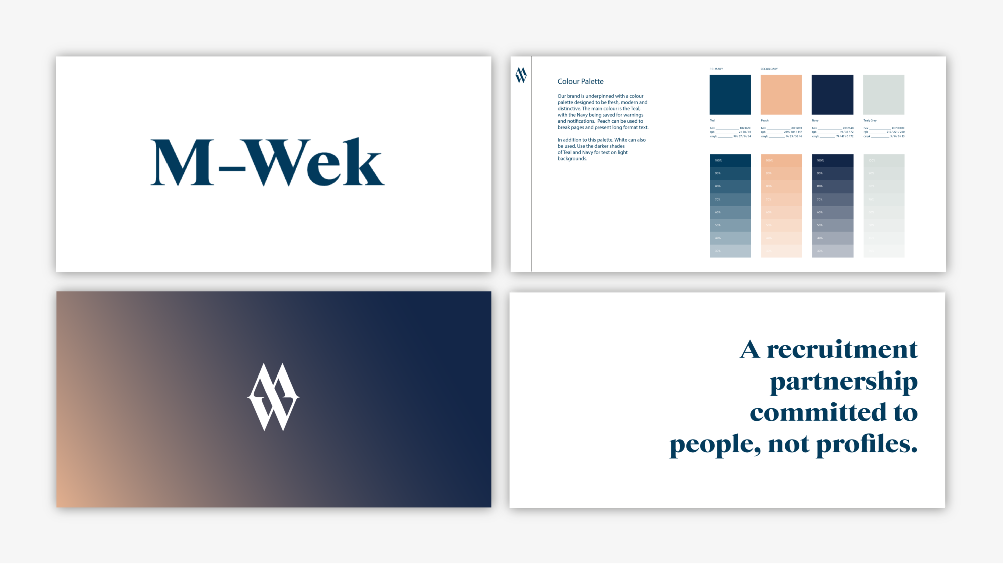
- We created a brand identity that simultaneously incorporates the established aesthetic of the historic finance industry, whilst drawing inspiration from tech giant re-brands and trends. This allows M-Wek to appeal to their very specific cross-section of clients and candidates. The result is esteemed, approachable but modern.
- Before starting work on their identity, we oversaw an intensive immersion session to ensure our team truly understood who M-Wek are. Our aim is to work from the inside out to create something truly authentic for each of our clients. Working closely with the founder and his team, we helped the M-Wek team better establish their core values and beliefs. This led to us developing a brand tone-of-voice, set of brand guidelines and a concrete set of USPs. M-Wek are now able to more confidently and coherently communicate with their audience, garnering increased respect and affinity for their brand.
- A changemaker business needs a differentiating brand identity. We built something truly unique. They stand out among their competitors, which has cemented their position as industry disruptors. Special attention was paid not only to the aesthetics of the brand and website, but also to their tone-of-voice and messaging.
“Barefaced took the time not just to understand our brief, but to understand us. As such, the final result was basically, perfect. The feedback we have had on our website has been outstanding. They even made me change my logo which I would NEVER have thought of doing. It really worked.”
– Mark Weclawek, Founder
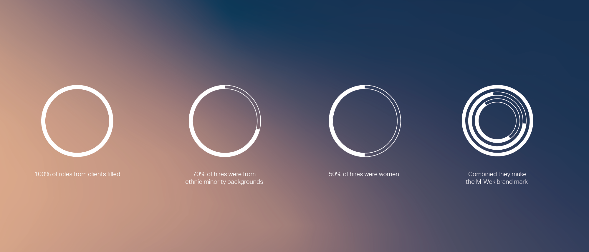
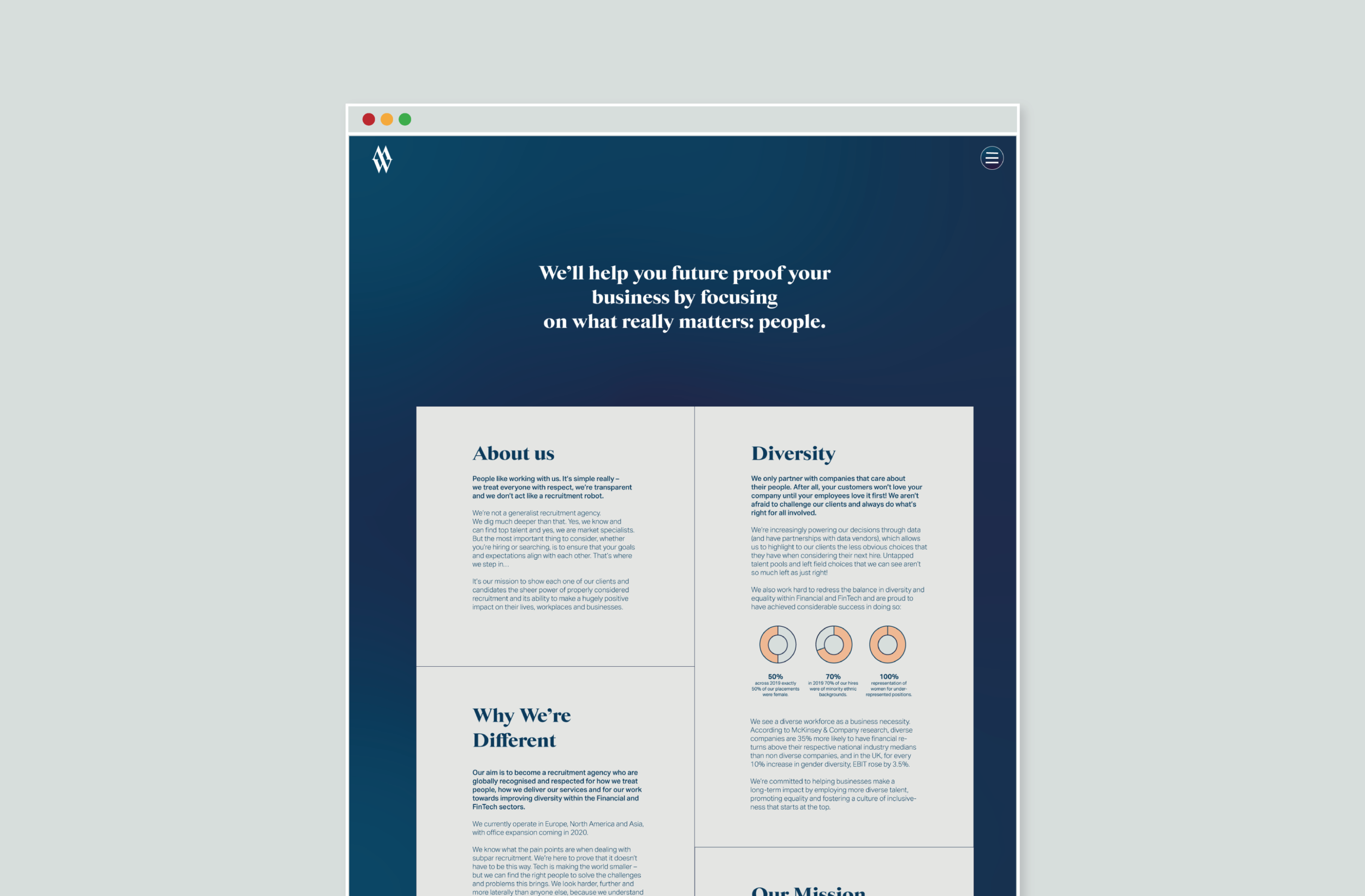
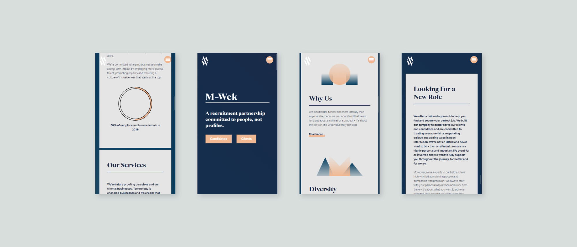
50% of our placements were female in 2019
Properly Considered Recruitment
To ground the project we created a research report featuring audience profiles, key market challenges and a competitor matrix. From here we were able to build brand collateral, tone of voice and key messages, a UX focused website and brand guidelines. With these tools M-Wek were able to reach and attract a demanding tech audience, galvanise their existing audience and grow their appeal with executive boards, founders and start-up organisations.
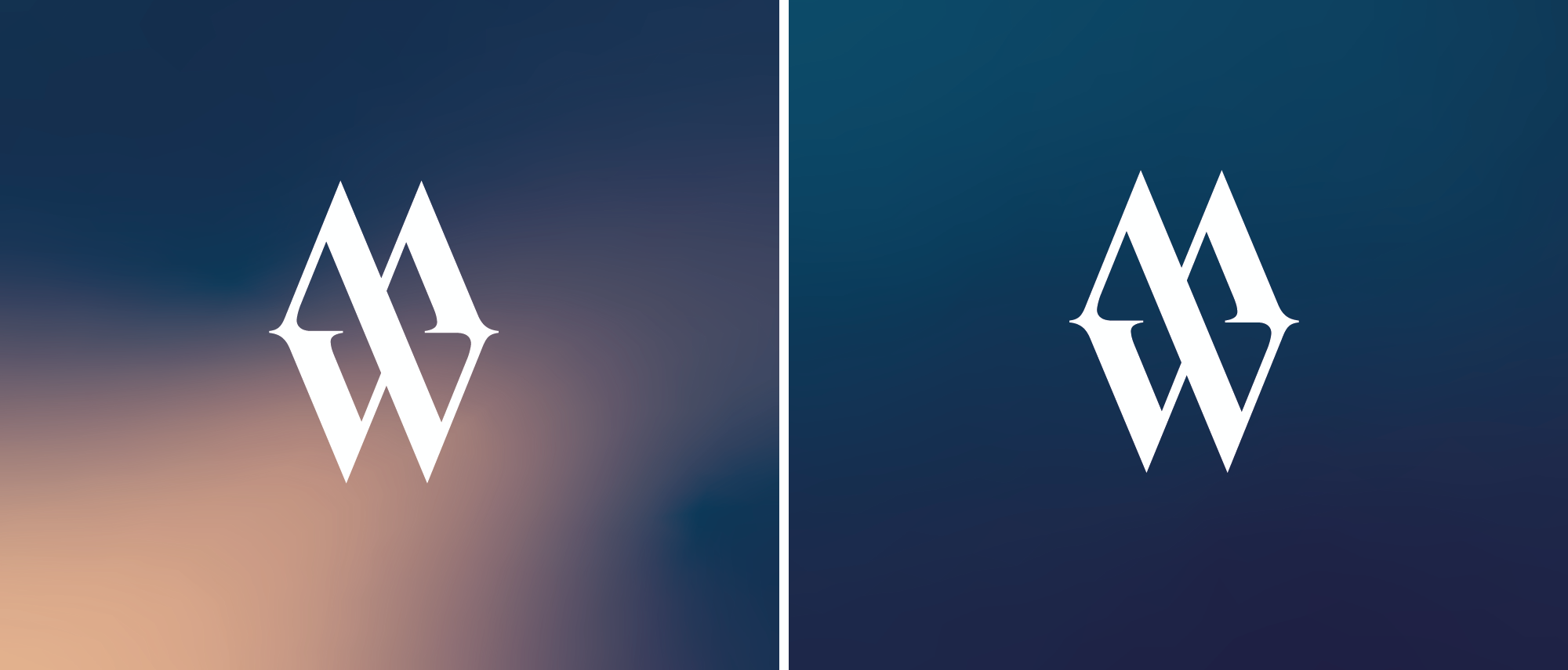
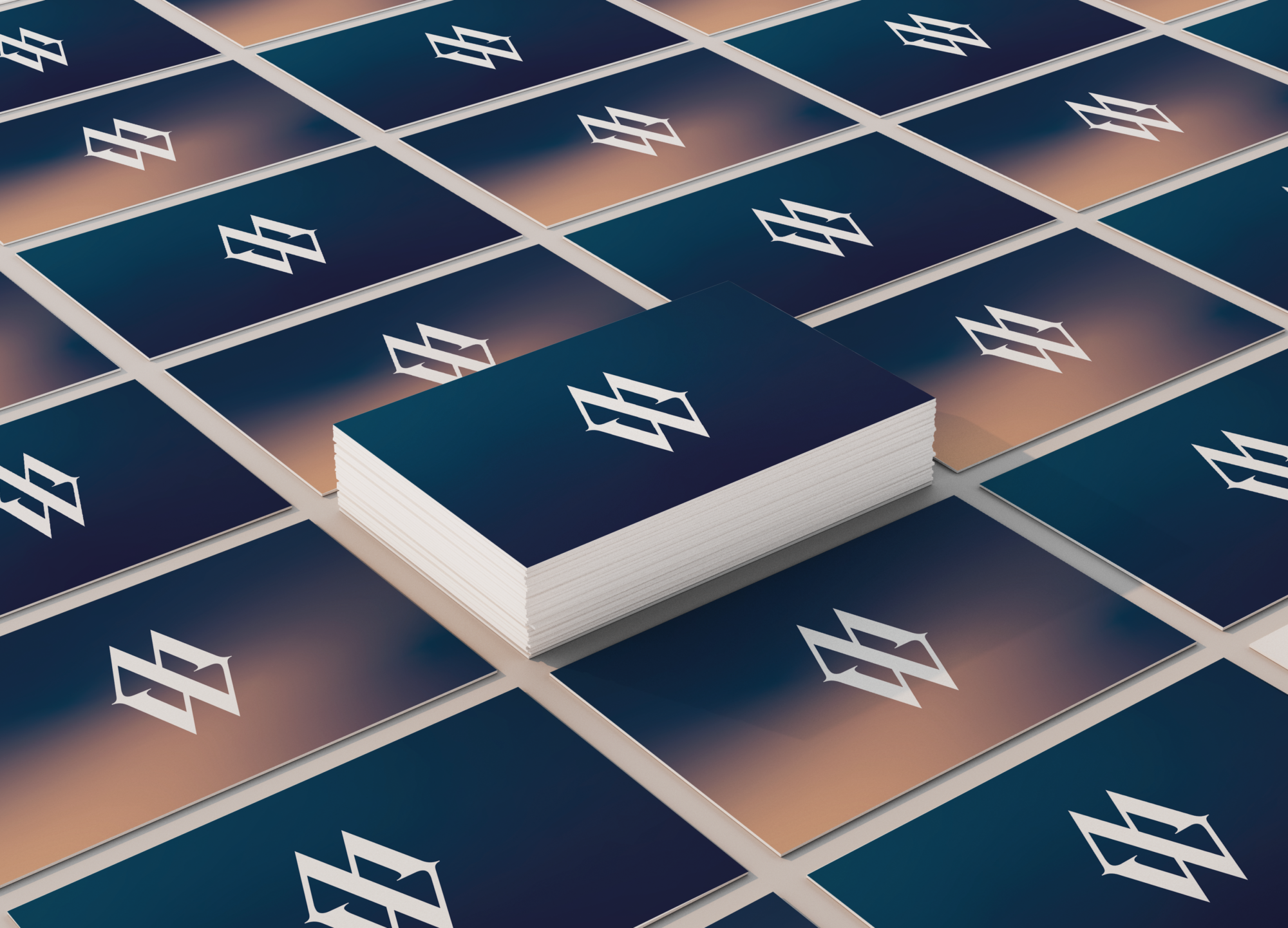
We supported our brand strategy work with identity design that brings M-Wek to life in a distinctive and memorable way. The new branding helps to inspire and motivate the M-Wek team, creating a momentum that powers the company into the future. The design solution is visually compelling and rooted in their commitment to people, not profiles. For example, a flexible, ever evolving brand mark acts as a signifier of M-Wek’s work addressing gender and diversity imbalances. Each ring represents a statistic that M-Wek have reached, such as the number of female placements in senior positions each year, changing with each accomplishment.
The new M-Wek identity and voice cements their commitment to their core values, appeals to a tech savvy audience and establishes them as a people-focused and forward-thinking company.
To read more about this case study and our strategy behind it click here.