Creating a Brand: M-Wek
Starting a people first revolution in financial and FinTech recruitment.
Meet M-Wek, one of our favourite clients. Ok, we do say that to all of our clients (and we mean it) but M-Wek really are special. Their mission is to show the world the sheer power of properly considered recruitment. Operating primarily in the finance and FinTech sectors, M-Wek treat everyone with respect and never act like a recruitment robot. So far, so good.
The depressing statistics:
Traditional recruitment methods are failing. 95% of employers feel ‘let down’ by traditional recruitment methods. 50% said that they are usually provided with below-par candidates. That’s a whole lot of unhappy employers. The prospective job candidates aren’t much happier. A whopping 44% of candidates experience poor communication and slow feedback. While 39% experience delayed decision-making.
M-Wek have focused their business solely on people. It sounds simple and it should be. But what M-Wek do better than everyone else is take it a step further. They refuse to work with bad employers, only partnering with companies that care about their people. After all, your customers won’t love your company until your employees love it first! Furthermore, they look beyond the ‘profile’. Instead they take a holistic view of each candidates specific talents, personality traits, objectives and wants. They create an overall picture of each candidate to properly match them to a role and a company that works for everyone involved. A perfect fit. This approach is personable but also the best kind of strategic. A great company/candidate match results in heightened productivity, increased innovation and dramatically improved retention.
M-Wek’s M.O.:
What really makes M-Wek stand out, however, is their commitment to addressing the gender and diversity imbalance in finance and FinTech. The data speaks for itself. Only 17% of senior FinTech roles are held by women. Plus only 8.5% of senior leaders in tech are from a minority background. M-Wek are actively combatting this. Here are some examples of how:
- Across 2020 34.2% of M-Wek’s placements were female. With women accounting for 60% of their placements in the final 6 months of the year.
- In 2020 they made the decision to part ways with a client as a direct result of their gender pay gap increasing, with no active interest by the firm to address the issue for 2020.
- They only represent female MD’s for positions where women were either very under-represented or not represented at all.
- In 2020 34.2% of their hires were of minority ethnic backgrounds.
M-Wek’s pain points:
M-Wek had experienced impressive growth in just a few years. But their potential was restricted by outdated aesthetics, minimal consistency and a lack of clarity around their offering and values. They wanted to attract more FinTech clients/candidates without alienating their Financial clients. Yet their visual and digital presence didn’t align with the expectations of a FinTech demographic. Simply put, M-Wek weren’t speaking their language.
The old M-Wek website didn’t tell the M-Wek story. Nor did it accurately portray the brand’s personality or act as a convincer. Moreover, they wanted a brand identity that aligned with their status-quo busting objectives. One that levelled the playing field for job applicants of all genders, races and backgrounds. M-Wek needed a boost in the right direction and a shot of brave design to really get their message across. So we took M-Wek into new territory. We made them fearless and future-facing. Resulting in a brand worthy of their mission and reflective of the people they serve.
What we did:
To kick things off, after a client immersion (fancy words for really getting to know M-Wek) we created a research report to ground the project. The report featured audience profiles, audience pain points, key market challenges and a competitor matrix. From here we were able to build a full set of brand collateral. This included identity design, tone of voice, a set of key messages and straplines, a UX focused website, illustrations, web copy and a set of brand guidelines. With these tools M-Wek are now able to reach and attract a demanding tech audience. Moreover, they can galvanise their existing audience and grow their appeal with executive boards, founders and start-up organisations.
What was achieved:
- We built a cohesive brand system for M-Wek, promoting them as dependable and trustworthy. Their new identity portrays their warm personality and spirit of inclusivity. Whilst at the same time communicating their offer in a more obvious and compelling way.
- We created a brand identity that simultaneously incorporates the established aesthetic of the historic finance industry, whilst drawing inspiration from tech giant re-brands and trends. This allows M-Wek to appeal to their very specific cross-section of clients and candidates. The result is esteemed, approachable but modern.
- Before starting work on their identity, we oversaw an intensive immersion session to ensure our team truly understood who M-Wek are. Our aim is to work from the inside out to create something truly authentic for each of our clients. Working closely with the founder and his team, we helped the M-Wek team better establish their core values and beliefs. This led to us developing a brand tone-of-voice, set of brand guidelines and a concrete set of USPs. M-Wek are now able to more confidently and coherently communicate with their audience, garnering increased respect and affinity for their brand.
- A changemaker business needs a differentiating brand identity. We built something truly unique. They stand out among their competitors, which has cemented their position as industry disruptors. Special attention was paid not only to the aesthetics of the brand and website, but also to their tone-of-voice and messaging.
How we did it:
1. Logo variations and brand marks
Let’s start with the logo. We referenced serif fonts from Broadsheet newspapers, such as the Financial Times, to create a feeling of familiarity and trustworthiness among M-Wek’s business savvy audience. The primary logo features a tightly kerned hyphen to appear more ‘solid’. It’s accompanied by a rotationally symmetrical monogram, which gives the brand an air of refinement and tradition.
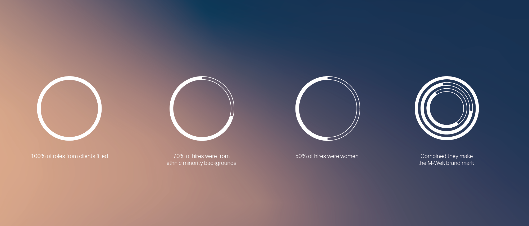
It’s counterpart, the circle brand mark, draws from financial graphs, pie charts and every PowerPoint in the history of office meetings. Each ring in the circle acts as a percentage bar for key M-Wek statistics, revealing data on the issues close to M-Wek’s hearts. This might include, by way of example, the number of female identifying candidates they placed in a year. The idea here is to redraw the logo regularly to reveal a progression in their accomplishments. This allows M-Wek to provide a public record of their success and growth in a visually compelling and modern way. Furthermore, it cements M-Wek’s commitment to their core values and key objectives, positioning them as relationship focused brand that looks at the whole person, not just the profile.
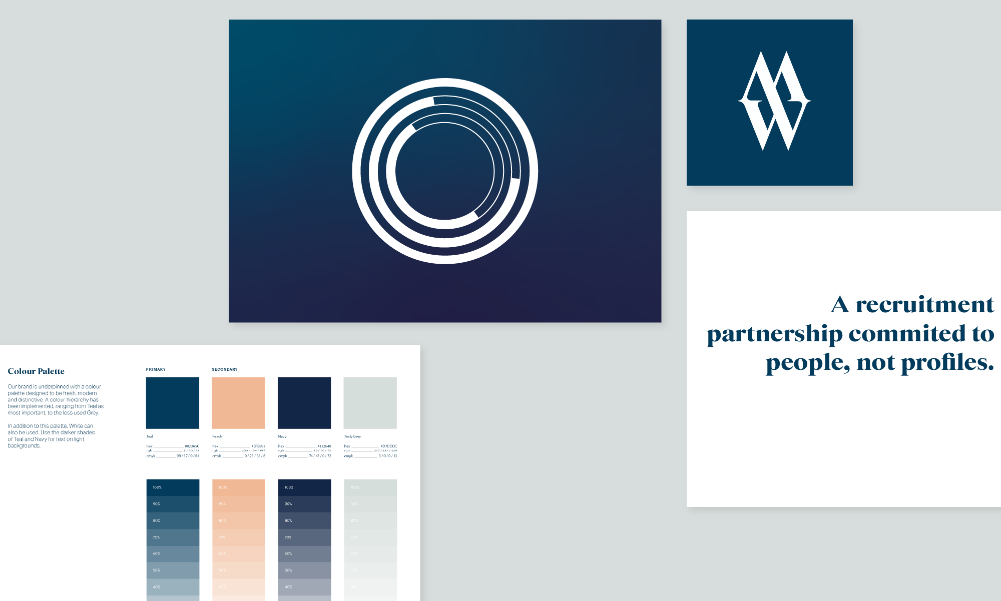
2. Brand colour palette
Once more we looked to the Financial Times as a reference point when considering the brand colour palette. This time we took inspiration from its famous pink pages. The Financial Times chose it’s iconic pink to distinguish it from other newspapers. It’s become their most well known brand signifier and works well due to its welcoming, nurturing shade.
We decided to update the light salmon-pink of the original to a warmer, more modern, hue. This calming and supportive colour fits nicely with M-Wek’s human approach to recruitment. Affable, charming and conversational, this peach is a looker.
To underpin the colour palette with a dose of earnest sincerity, we added a deep blue. Famous for its ability to evoke feelings of reliability, trust and dependability. Deep blue is the go-to for many banks, financial institutions and social media giants for this very reason. We went one step further by adding a rich teal, a unique blend of blue’s stability and green’s optimism. Finally, a light warm grey acts as the neutral shade, whilst benefiting the palette further with its futuristic, stable and dignified connotations.
3. Design language
Brilliant branding is something that needs to be flexible and the introduction of colour gradients is way to efficiently achieve this. Colour gradients allow us to customise the M-Wek design language in a way that lends itself to emerging trends in marketing personalisation. Design and tech savvy audiences appreciate and recognise the gradients as a marker of modernity. Whilst the diversity of the colour palette ensures that no one audience feels alienated.
4. Website
Gradients provide a strong backdrop to M-Wek’s new website. Sitting as an animated canvas, they form the foundation on which everything else is based upon. The peach acts as a guide, directing and encouraging users around the website. It indicates what to click and highlights calls-to-action. Delivered in a collection of pages that take more inspiration from broadsheets. These column based layouts are rich with typographical details, animated charts and M-Wek’s core values.
5. Brand tone of voice and copywriting
The brand tone of voice has been developed to act more like a knowledgeable friend, rather than a faceless office entity. The copy blends professional insight with informal turn of phrase. Optimistic, straightforward and with a little dose of wit, we aimed to create a verbal identity for M-Wek that is both polished and approachable.
And they all lived happily ever after.
Our brand strategy and identity design brings M-Wek to life in a distinctive and memorable way. The new branding helps to inspire and motivate the M-Wek team. It creates momentum that propels the company into the future. The design solution is visually compelling and everything, from the copy to the user journey through the website, is rooted in their commitment to people, not profiles.
The new M-Wek identity and voice cements their commitment to their core values. It appeals to a tech savvy audience and establishes them as a people-focused and forward-thinking company.