LPC Living
LPC Living is a socially minded property development company specialising in urban regeneration. Based in the North West of England, LPC Living have built in excess of 1,300 homes across the region.
Overview
LPC Living's approach is rooted in being conscious of the history and community surrounding the developments they build or restore. Fonthill Mews, whilst their first initiative in London, adhered to this same mission. From utilising local contractors and suppliers, to ensuring the development was sympathetic to its history. The mews were restored and built into individual homes using high quality, often hand crafted materials. The end result was a set of design-focused, beautifully finished properties steeped in history and craftmanship.
Services
Brand Strategy, Brand Positioning + Planning, Visual + Verbal Identity Design, Web Design + Development, UX + UI Design, Copywriting + Messaging, Marketing Strategy, Marketing Management, Content Creation, Campaign Creation + Design, Print + Digital Design, Film + Photography, Social Media Management.
The Challenge
- Based in the North West, LPC were unfamiliar with the London market.
- Needed to achieve price points much higher than market average.
- Essential for LPC to limit the amount of time on market or face losses.
- Increased competition from other mid-size developments.
Barefaced Solution
- We tied the project to its geographical location by crafting a purposefully London-centric visual and verbal identity.
- Elegant textures, typography and photography lent a premium aesthetic to the project’s identity, positioning it as a highly desirable place to live and worthy of higher price points.
- We devised a pre-launch marketing strategy to drive excitement and build moment for a development. It was unlike anything the area had seen before and led to fast sales and a record 121,000+ web hits.
- We identified the primary demographic as being largely socially conscious. By emphasising the project’s ethical and community-focused initiatives we were able to more effectively connect with their target demographic and differentiate Fonthill Mews from its competition.
+71%
Increase in viewings
+12%
Increase in achieved price points.
80%
Units let before official launch.
121,200+
Web traffic across 3 month period.
“Claire and her team completely understood the vision of the property and what we were expecting to achieve regarding marketing. She attended site on a regular basis and it was great to have her working with us as she had the same enthusiasm, creativity, knowledge of the local market, the local community and ability to showcase what we believed was a fantastic product. The photography, videos and overall marketing were second to none.”
– Debbie Mason, Residential Director
SAY HELLO TO YOUR NEW HOME
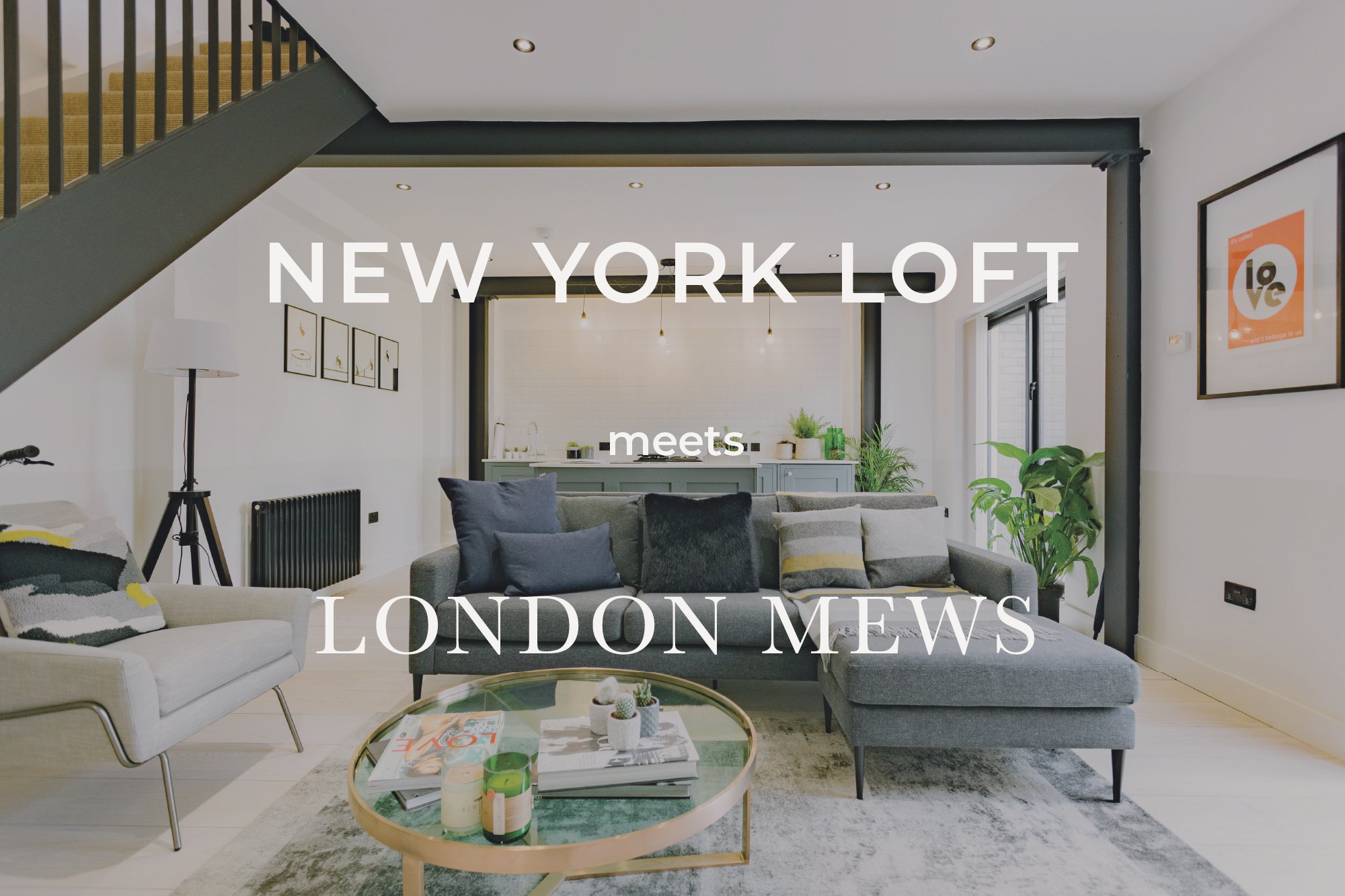
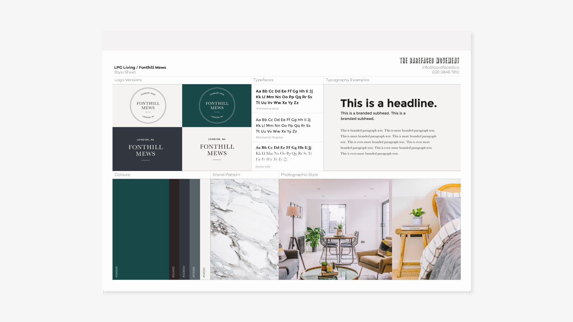
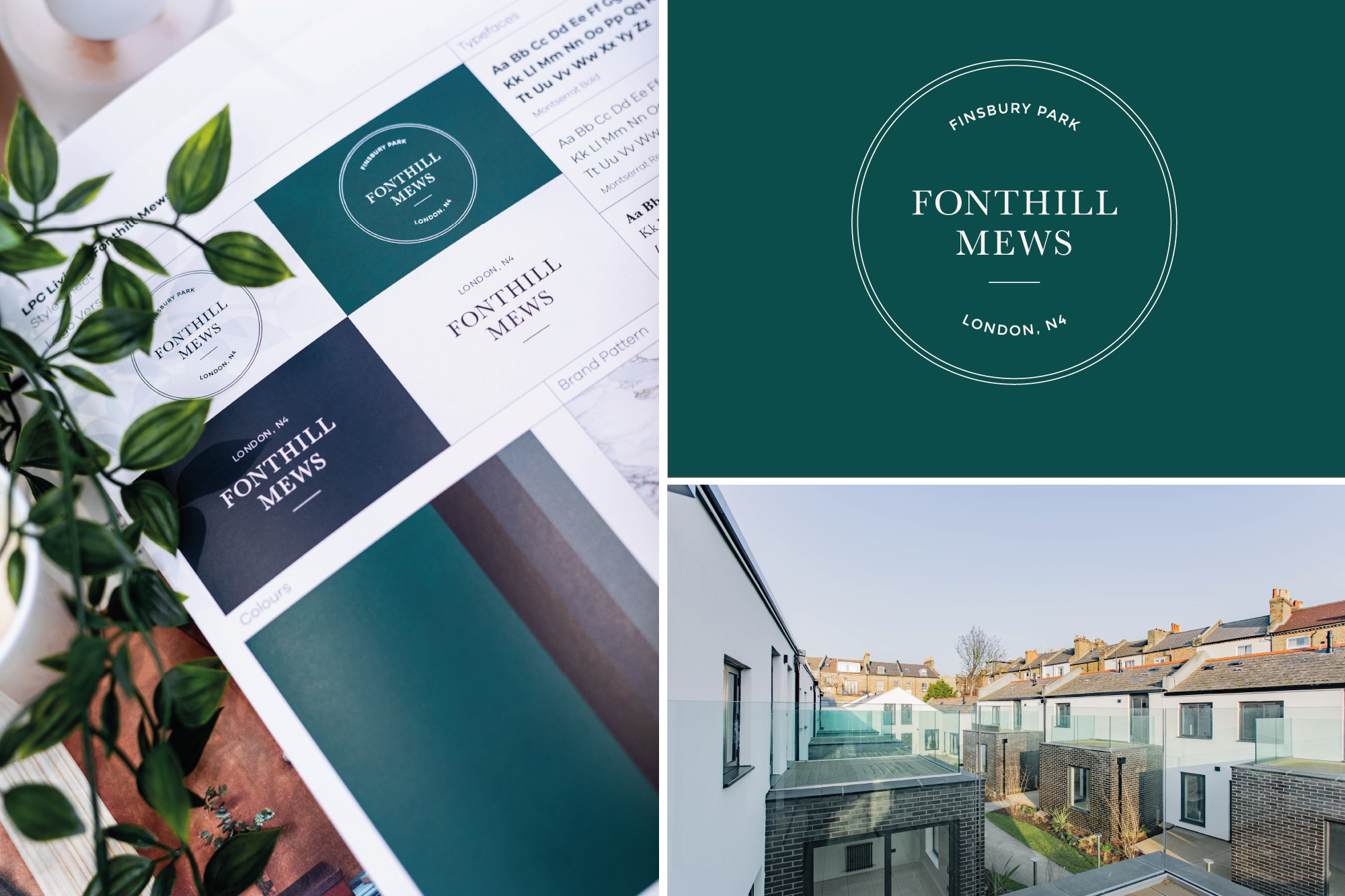
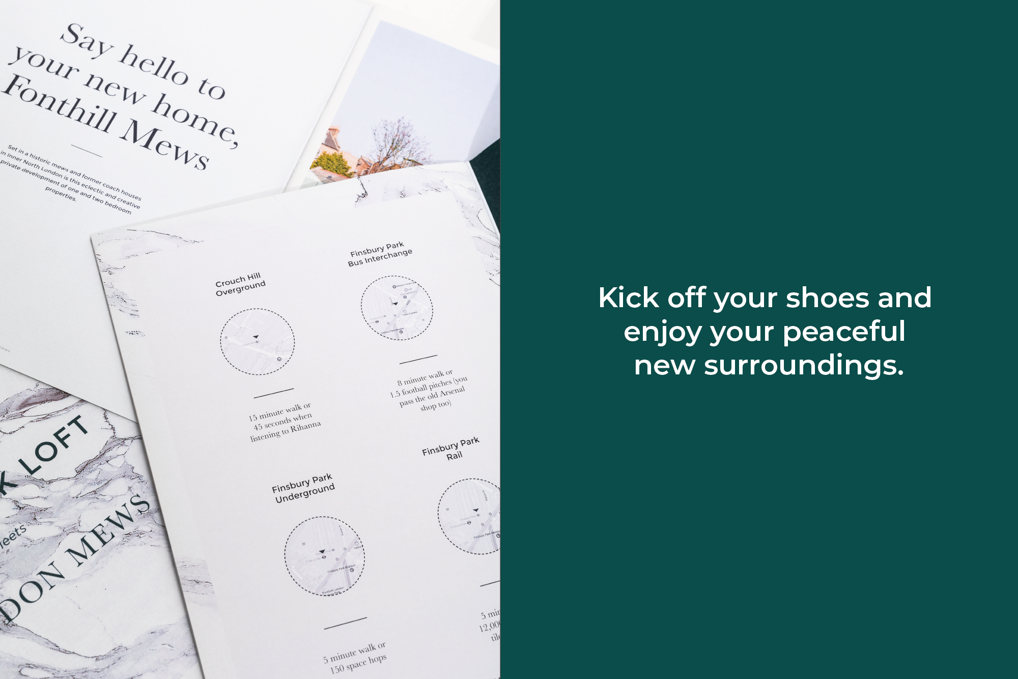
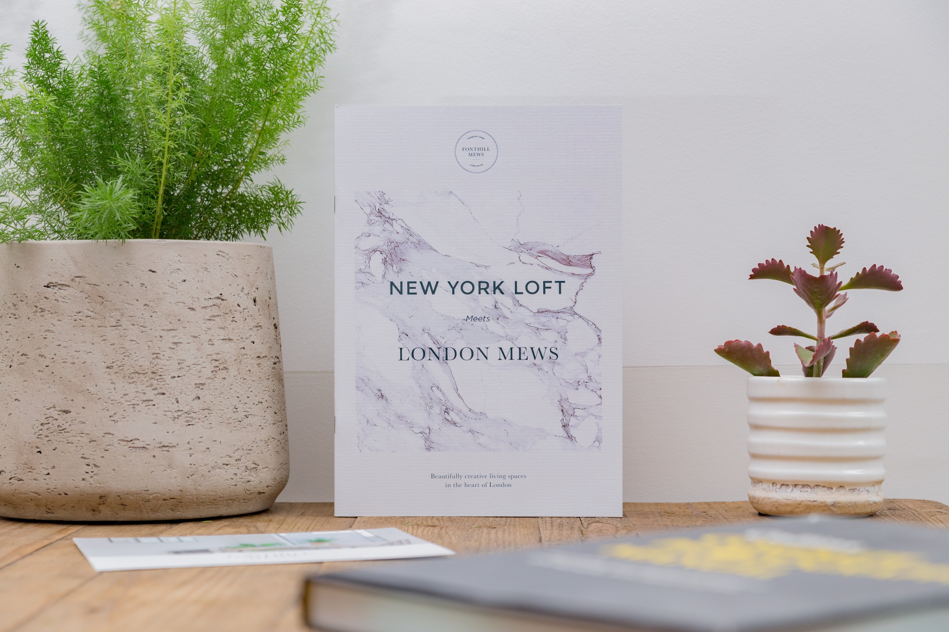
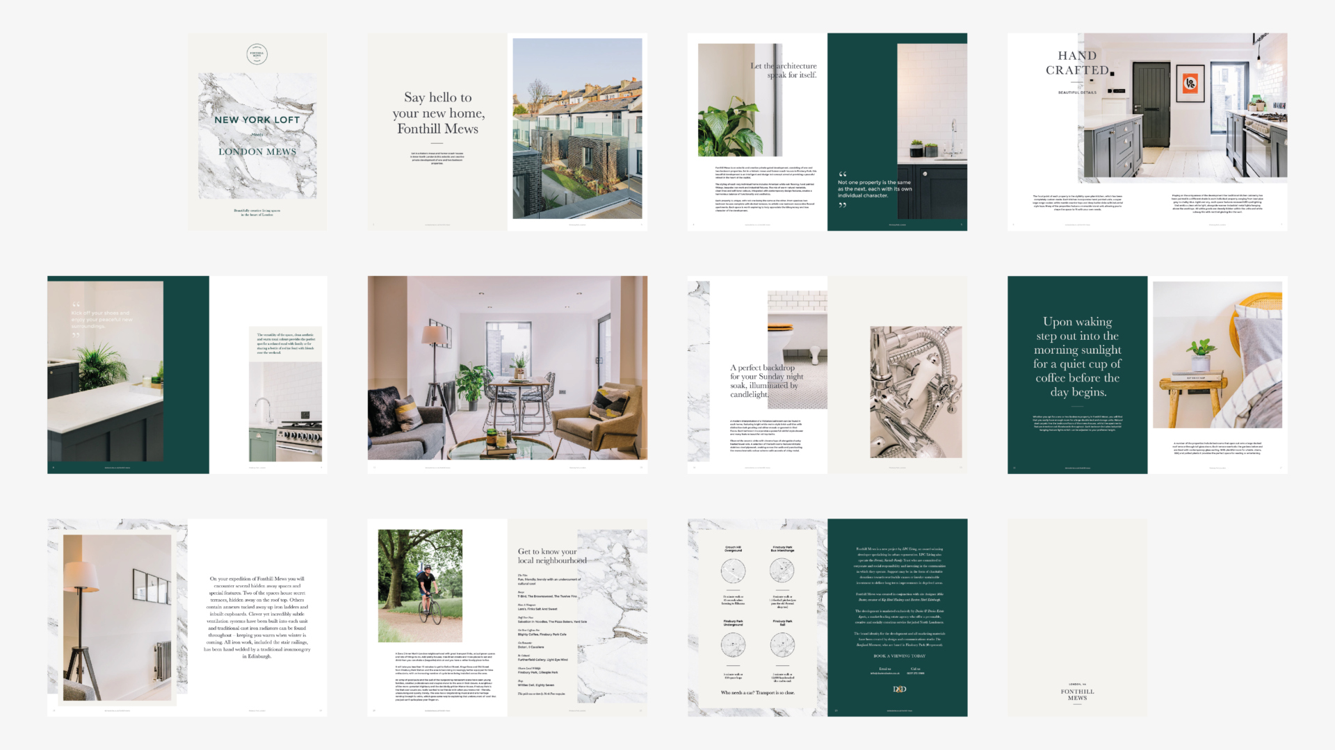
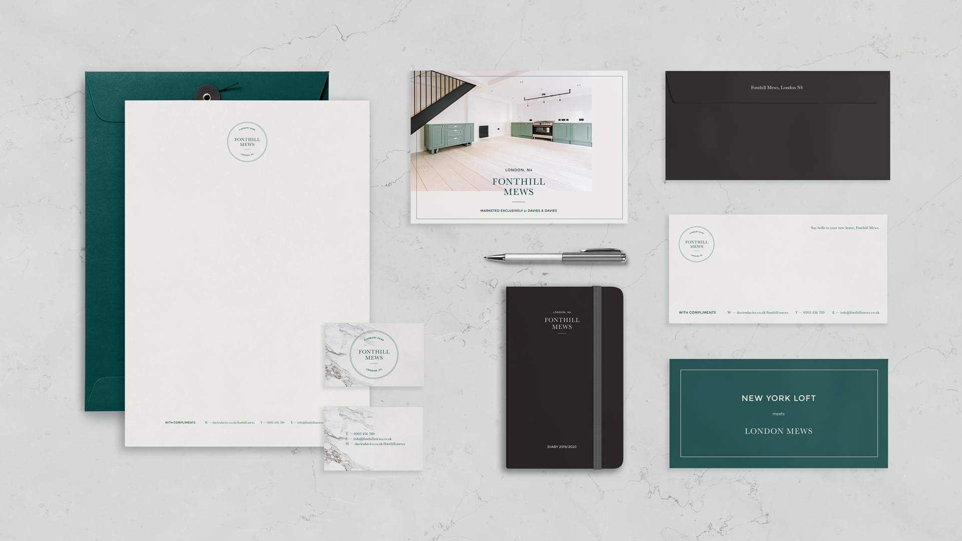
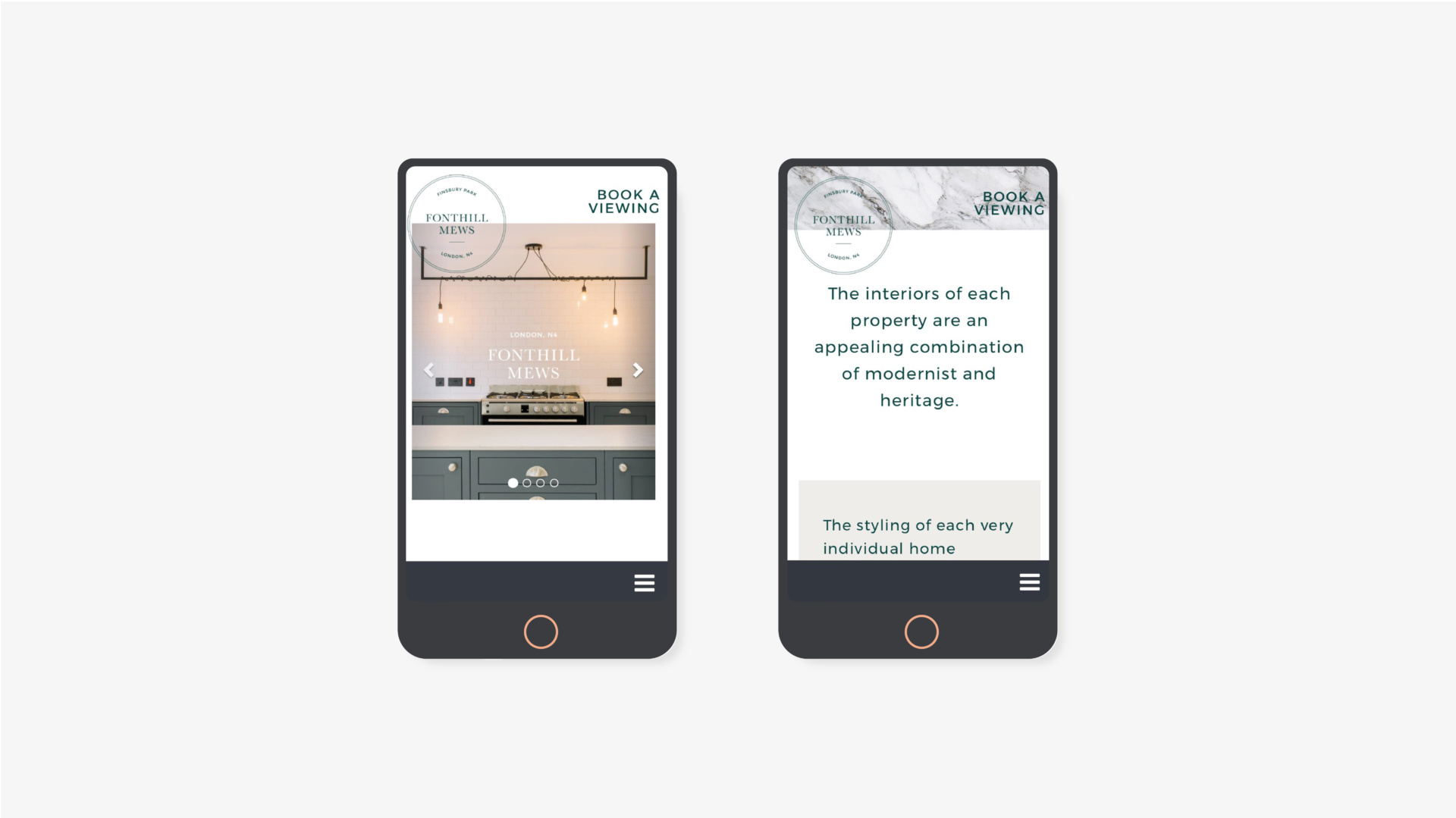
We kicked things off with the slogan “New York Loft meets London Mews,” a cheeky nod to the development’s mix of sleek, industrial interiors and classic British architecture. This became the heart of the brand identity, setting the tone for what was a refreshingly bold approach. To match the design, we chose a palette of steely greys, nodding to the industrial vibe, paired with a rich British racing green to celebrate the mews’ heritage and the natural materials woven into the build. The logo? Think iconic London blue plaques meets modern luxury, while a marbled pattern – straight from the bespoke kitchen – gave the whole look a touch of bespoke elegance.
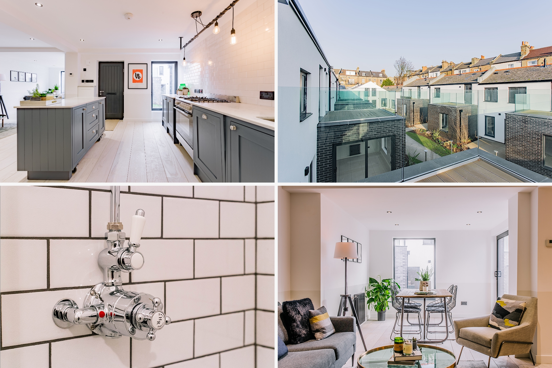
We kept the tone of voice aspirational, but not in a stuffy way. Think travel journal meets a little tongue-in-cheek humour – perfect for engaging millennial professionals dreaming about their next move. The photography? Overexposed brilliance to make those interiors pop, with some quirky angles thrown in to show off the architectural features.
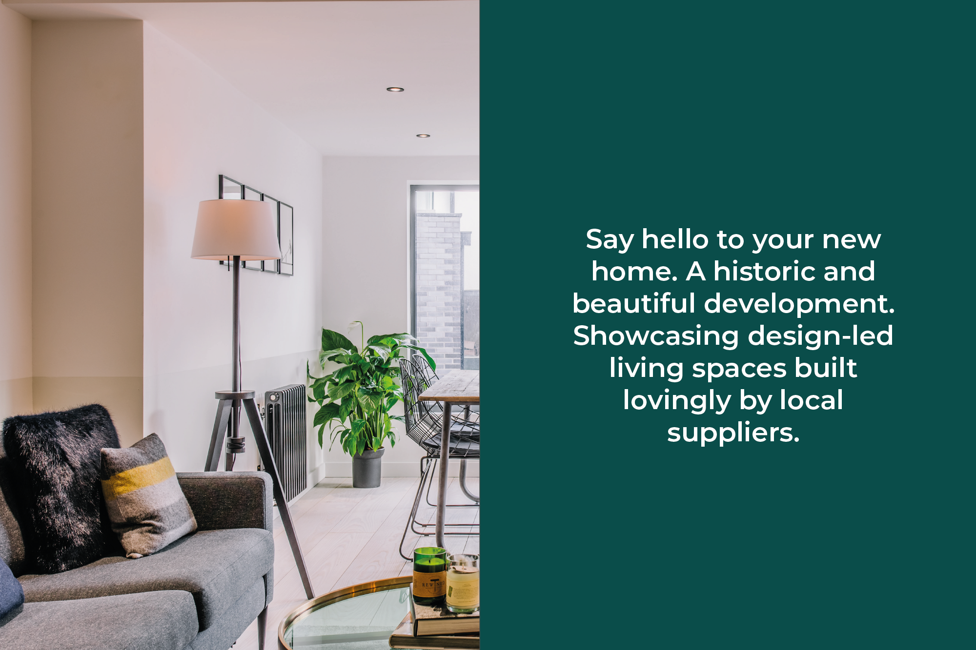
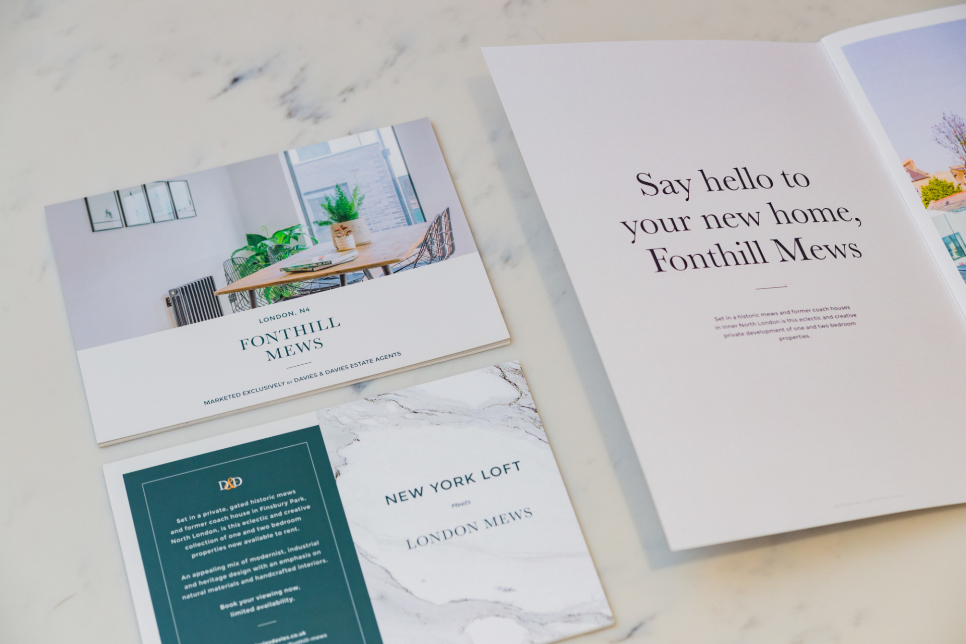
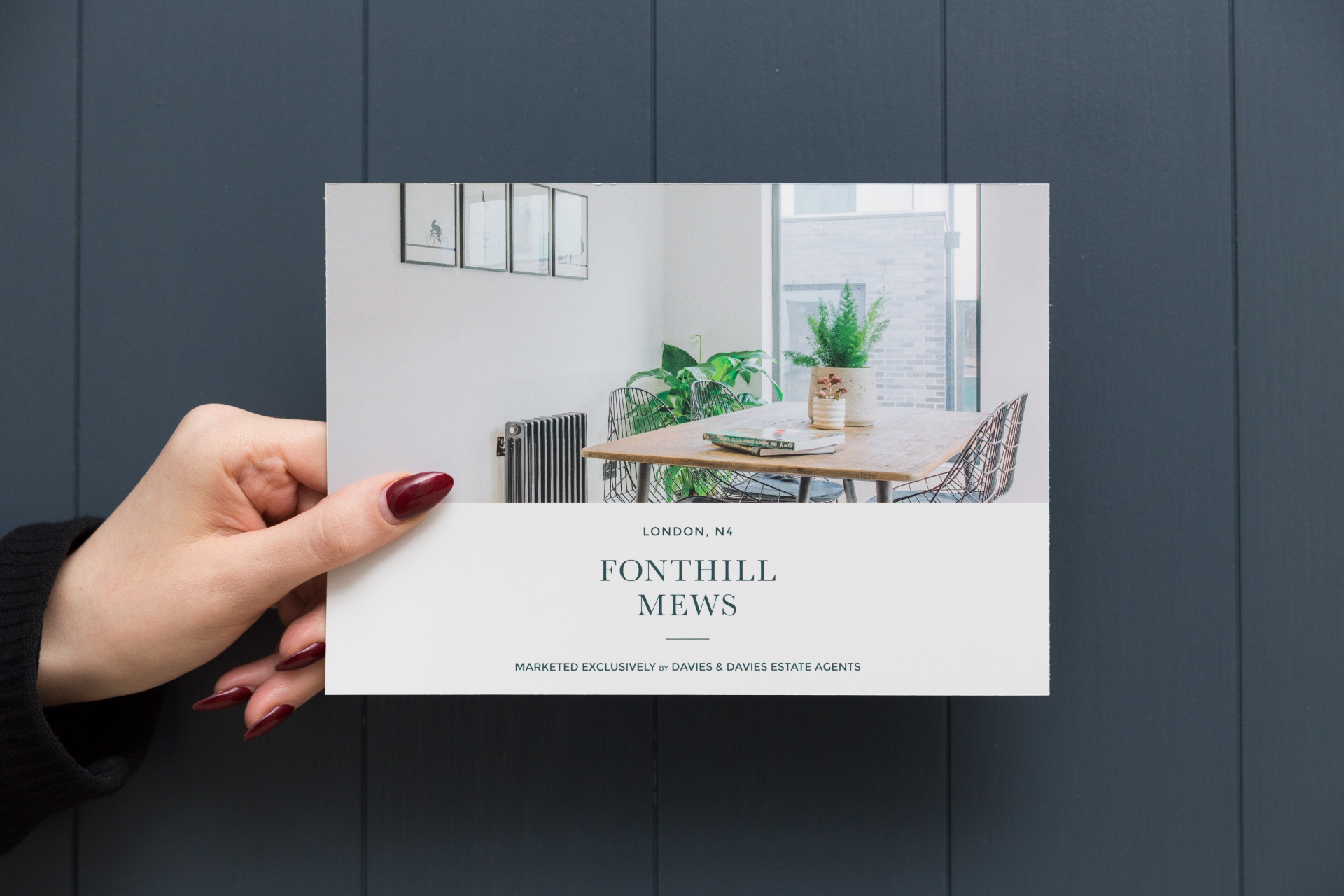
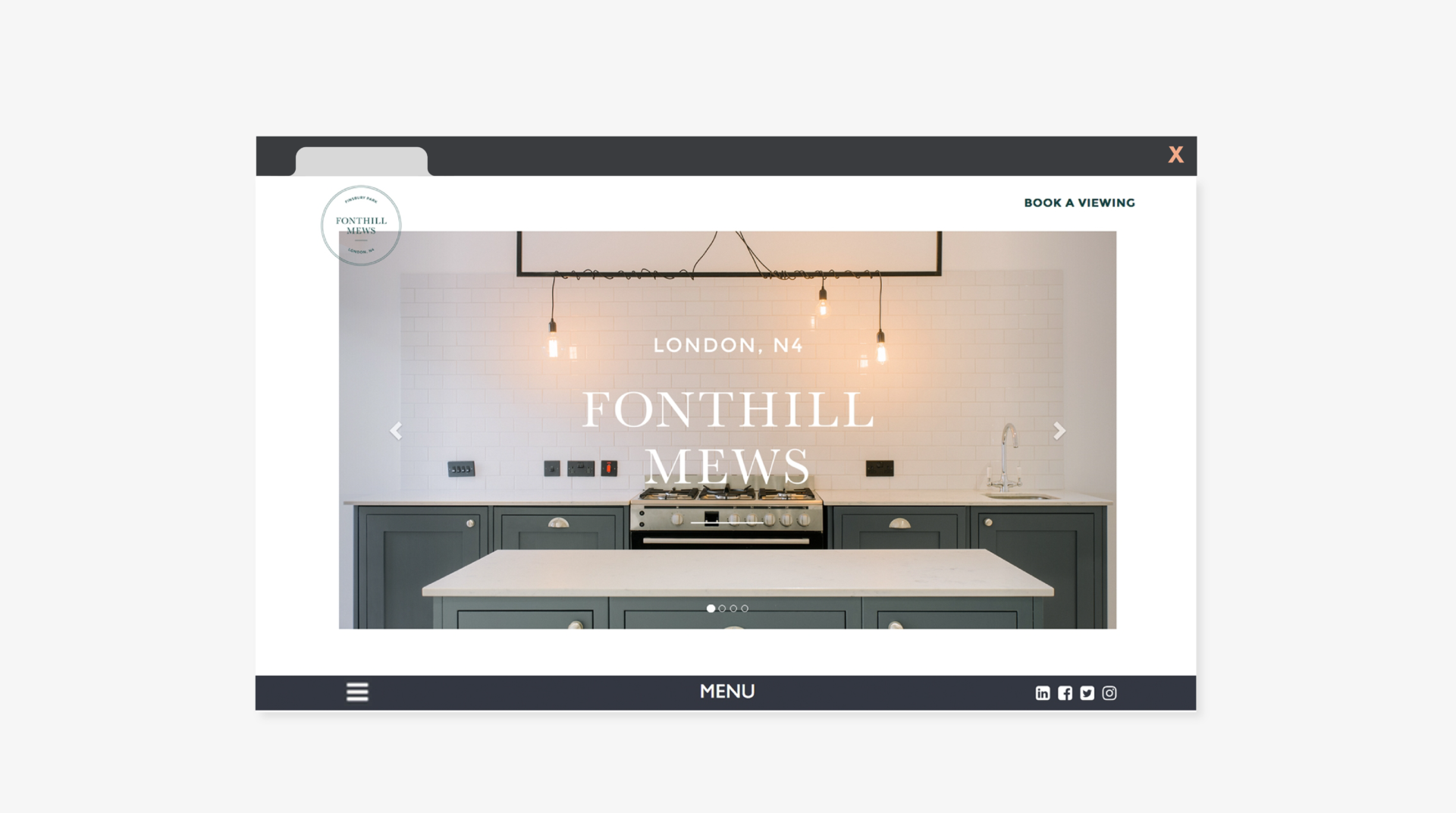
For the marketing campaign, we kept things simple but compelling: ‘New York Loft meets London Mews,’ ‘Let the architecture speak for itself,’ and ‘Say hello to your new home, Fonthill Mews’ became the tag lines underpinning the brand. We ran this ideology through direct, digital, and out-of-home ads to keep the buzz going. And to top it off, we built a slick microsite, sitting neatly within the estate agent’s website but totally capable of standing alone. Every touchpoint was designed to hook potential tenants and get them imagining their future at Fonthill Mews.
Take a look at another property development case study by clicking here.