5 website mistakes that will cost you money
These website problems might be costing you a fortune
You know who your audience are. You have a great brand and have pretty much perfected your product/service. So naturally you’ve taken the next step and have successfully launched your marketing campaign. As a result the traffic to your website is growing by the day. Well done you! This is going swimmingly. Hang on. What fresh hell is this? None of those people accessing your website are actually doing what you’d like them to do. Alas, it turns out you’re making some fatal website mistakes!
Whether you want them to buy from you, contact you or subscribe to your mailing list. It’s just not happening. Many are even leaving your site pretty sharpish. Great Odin’s raven! This isn’t good.
Never fear! Barefaced Studios are here. Here are five common website mistakes you’re probably making that are stopping your customers from taking that crucial next step. Plus we’ve laid out some advice on how to fix those mistakes.
Reason 1: the user experience is poor
Bad user design will create a whole nightmare of problems. Incorrect pricing, ordering glitches, slow load times and difficulty finding information will make your customers incredibly frustrated and stomp off elsewhere. Moreover, annoyed customers are really, really difficult to win back. This type of bad user experience further leads to bad word-of-mouth, resulting in a poor reputation. Reputations are a real pain in the arse to rebuild. So, now you can see why poor user experience is such a big clanger of a website mistake.
The number one thing that will win you customers and sales? A website that’s easy to use, has an easy to understand format and features easily accessible information. If you don’t do anything else, do this. Think about how your customers will use the website. Is it easy to find everything they might need? Are your key messages clear or is there too much writing on the page? Does everything actually work properly? Do a big test of the website from a user’s point of view. Even better, get your friends to do the same and tell you what problems they encountered, or what annoyed them. User experience is something we specialise in at Barefaced Studios, so get in touch by clicking here if you need some help.
Reason 2: your content is awful
Most of us are pretty lazy. Generally, if we access a website and don’t immediately understand what the company does, we scarper. That’s not the half of it though. If we realise that the information on the website we’re viewing is out of date we instantly distrust the business. Pixelated or obvious stock imagery? We’ll presume the business is cheap and unprofessional. If the copy and imagery is boring and hard to understand then you might as well throw in the towel now. Your precious time could be better spent listening to podcasts about weird cults, rather than trying to get through this rubbish. Frustrated, confused and tired, you’d exit the website and look elsewhere.
The content on your website is your opportunity to help your customers in their buying process. Well crafted copy and beautiful imagery on a website improves customer awareness and compels decision making. It dispels myths and helps build your customer’s confidence in buying from you. It should be informative, but not overbearing, and regularly updated. Are your key messages prominent enough? Are you using page headings, subheadings and subtitles correctly? Is your content interesting, does it tell a story, does it align with your brand? This is something professional copywriters and content creators, like our team at Barefaced Studios, can really help with. We’re also good at shameless plugs.

Reason 3: it’s fugly
Your ugly website will scare customers away. A badly designed website can make a brand appear out-of-touch, cheap and incompetent. Would you choose to work with the business that has a run-down, crowded, unreadable, naff looking website? Or would you pick the business with a beautiful, thoughtfully designed website? Moreover, who would you trust more? 75% of consumers admit to making judgements on a company’s credibility based on the company’s website design (source: SWEOR 2020). Ouch.
“75% of consumers admit to making judgements on a company’s credibility based on the company’s website design” – SWEOR 2020
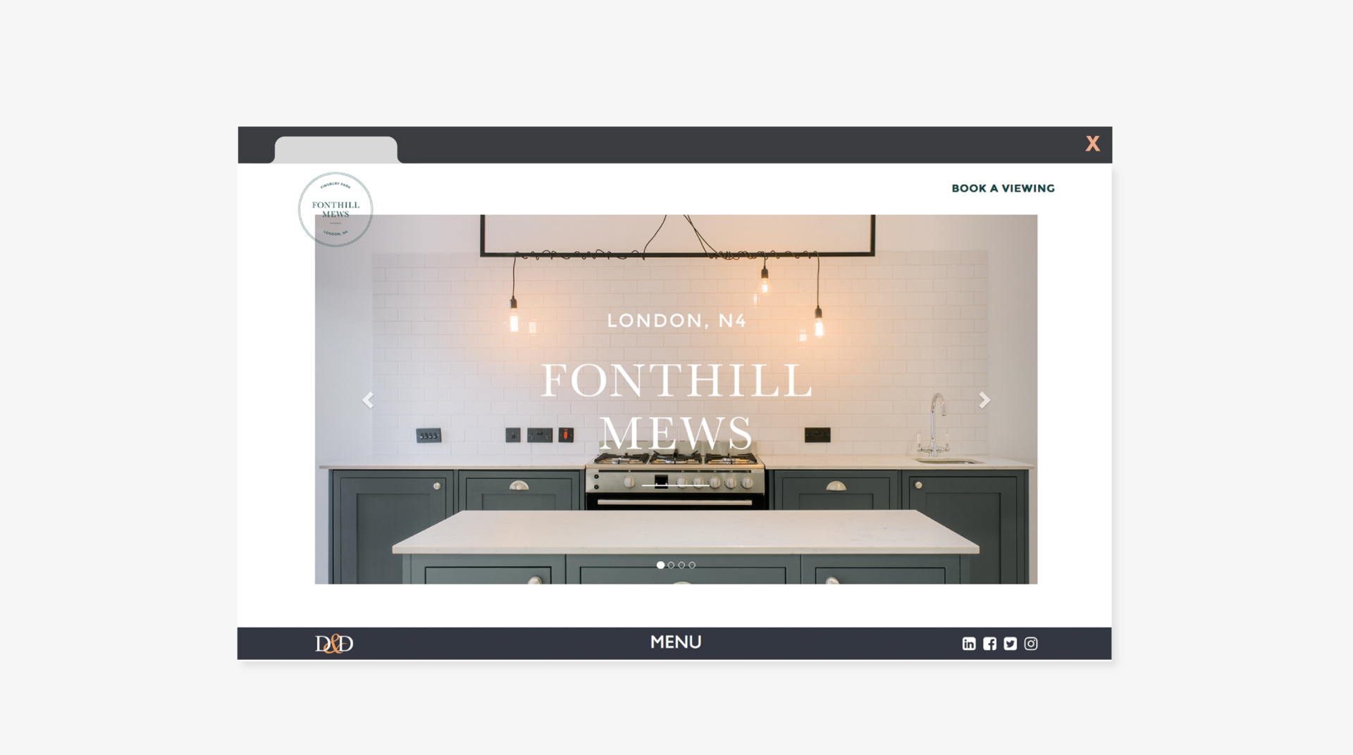
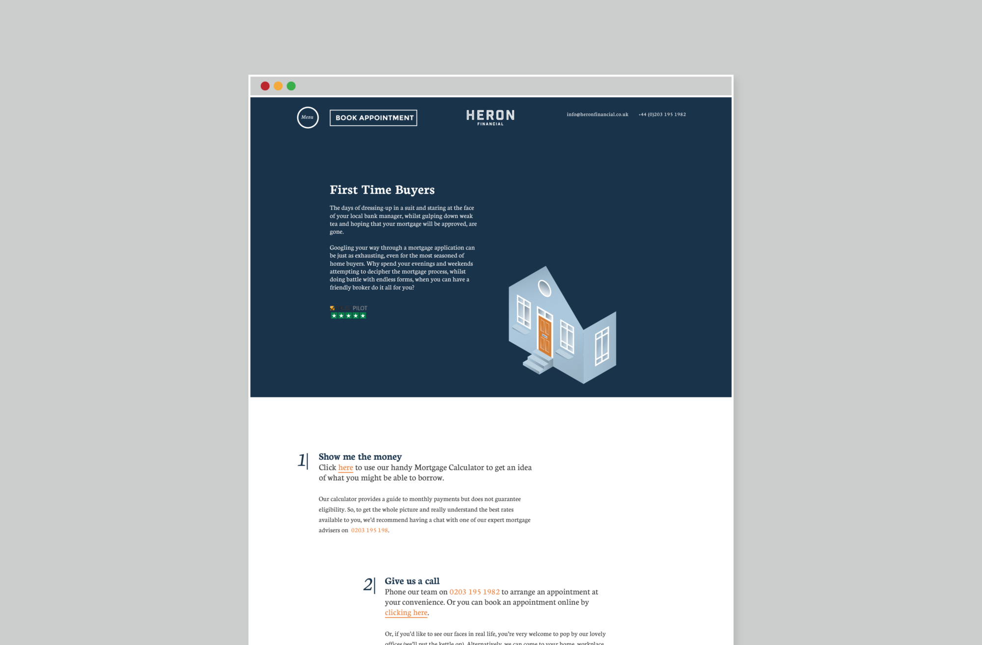
It hurts to hear but you can’t always trust your own judgement here. Much like we would be rubbish at designing cars, a car maker would likely not be adept at designing a website. We’d always recommend getting a professional to design and build your website (shameless plug 2.0: we do this, click here to take a look at one of the websites we’ve built). You should view it as an investment. Your website is one of the most important parts of your business. It will affect your reputation and your ability to sell. If you can’t afford professional help you might decide to use a freebie DIY web design service, or a cheapie web designer (like the ones you might find on Fiverr). If so, our top tips are to keep it simple. Don’t try to add too much information or fancy features. Quality over quantity always. Make sure the content is on point – nice, in focus images and properly crafted copy. Then make sure to get a good cross-section of people to give you honest feedback on the website.
Reason 4: it’s hard to navigate
Nothing is quite as frustrating as having to click a hundred times just to find an email address or phone number. In fact, making a website easy to navigate is so important that 94% of consumers say it’s a ‘must’ (source: Clutch survey 2019). Your customers want efficiency. Make life easy for them and they’re far more likely to buy from you or book your services.
“94% of consumers say that making a website easy to navigate is a ‘must’” – Clutch Survey 2019
Make sure your main menu is easy to find and features an obvious sequence and hierarchy. Avoid sub-menus. Your links should be clearly labelled in a does-what-it-says-on-the-tin kind of way. In other words, call a spade a spade, or an about page an about page. Have a clear pathway for your visitors to follow across your site, accompanied with clear call to actions throughout. If you’re working with a marketing and/or web design specialist they’ll develop your sitemap for you. They’ll also determine the most effective call to action buttons based upon your business goals.

Reason 5: there’s no clear next step
You could have the best website in the world. The type that other websites wish they could be. But if you don’t make it clear what you actually want your website viewers to do, you’re missing the biggest trick of all.
Your website should be built with a goal in mind. For example, you might want people to buy your products via your website. Therefore, a successful website will make sure that all of the key elements on you site support that goal. A big part of this is making sure that there are obvious and clearly labelled call to actions at all relevant touch points. Our brains are always on the lookout for instructions and signs. So a big fat ‘add to cart’ button next to the products you want people to buy is crucial. Your website should be built with a clear hierarchy. Each page should encourage the visitor to take a clearly defined journey down the page, or across the site, depending upon their needs. Subtitles, links, navigation bars, call to action buttons, imagery and copy all play a part here. Not sure if your website cuts the mustard? Take a holistic look at the pages on your website and ask yourself if it’s obvious what to do next? If there’s no obvious next step, you’re making a big website mistake and losing customers and sales.
How to take action
We live in a world of endless choice. A potential customer only needs to spend a few seconds on your website before they decide if you’re worth their time and money.
- If you haven’t already, decide what your key objective for your website is.
- Do an audit of your site, are any of these website mistakes happening on it right now?
- Get friends, colleagues and customers to test your website. Ask them to make notes on what they like, don’t like and if anything was broken or frustrating for them.
- Make a plan, in writing, of what improvements need making.
- Contact us to discuss how we can help.
If you’re able to fix these website mistakes you’ll have a real gem of a site. Even better, you’ll soon notice a direct correlation between your newly improved website and improved customer contact, traffic and purchases. Impress with your website and those visitors will return again and again. They’ll likely bring people with them too.
—
Written by:
Founder + Creative Director