Sipping Liquor
Sipping Liquor is a craft spirits club and subscription service. Their booze experts scour the planet to bring their members the best whiskies, rums and brandies (and occasionally something a little more exotic like a mezcal or grappa).
Overview
People are thirsty for new experiences. If you can have those experiences in the comfort of your own home then even better. Please welcome to the stage Sipping Liquor. An affordable booze delivery service that focuses on niche spirits from craft distilleries that aren't found on the shelves of mainstream shops. Sipping Liquor also exclusively work with small producers, which helps to sustain the local economies and communities of these distilleries. The public are on board with this too, with 55% of UK consumers preferring to buy local brands. Sipping Liquor are here to prove that you can have brilliant drinks, made by brilliant people, at a brilliant price.
Services
Brand Strategy, Visual + Verbal Identity Design, Copywriting + Messaging, Print + Digital Design, Illustration.
The Challenge
- Fresh faced start-up in a market where you have to subscribe to everything.
- Desire to push the notion of belonging to a community, without feeling like you might get turned away at the door.
- Important to create an identity that can easily connect with independent craft distilleries and smaller producers.
- Wanted to convey the unique taste and flavours of their monthly offerings, without sending subscribers soggy print samples.
Barefaced Solution
- Sipping Liquor focuses on craftsmanship. So we created a brand with a strong story that hints at tradition, to cut through in an oversubscribed subscription industry.
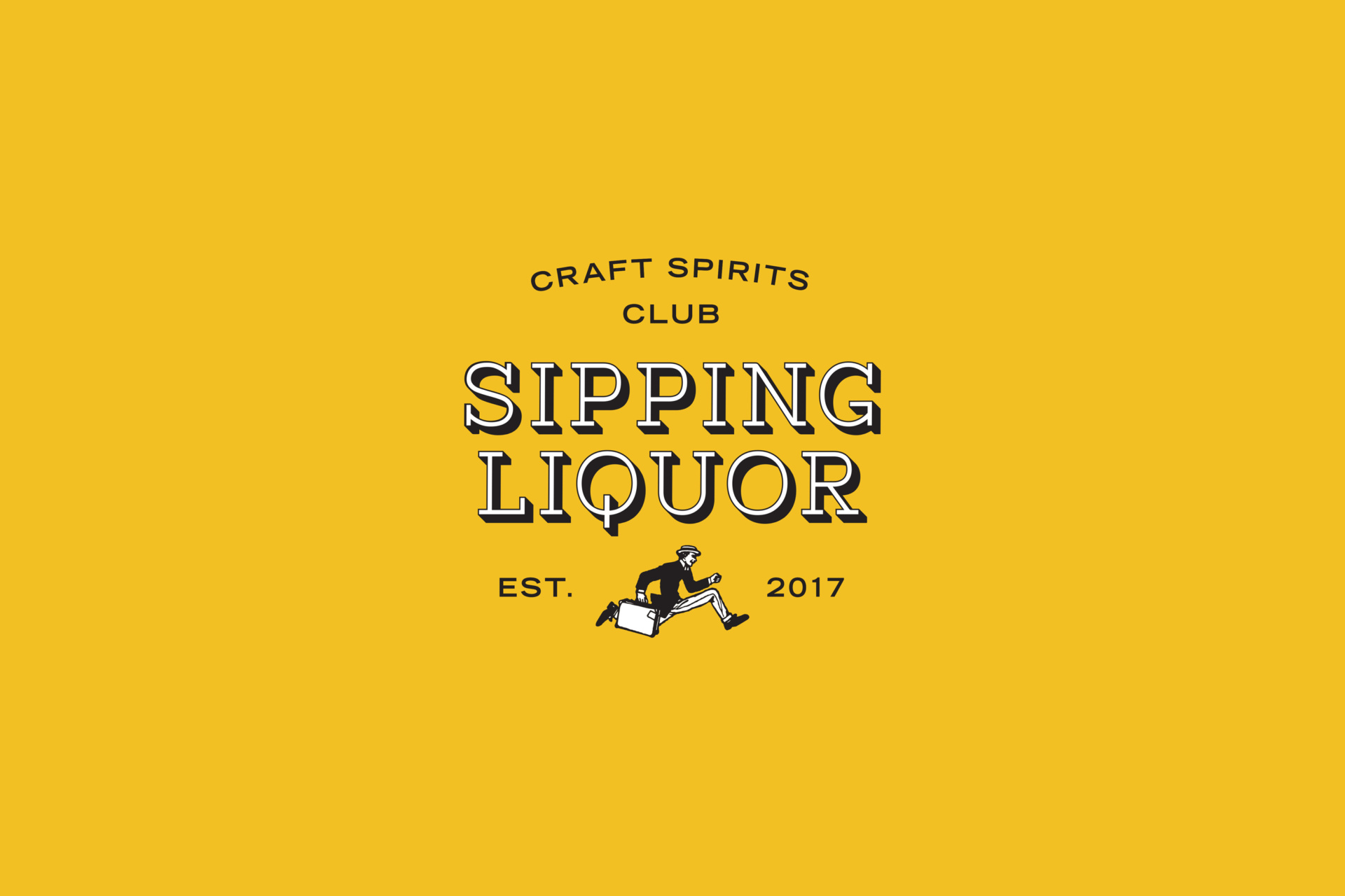
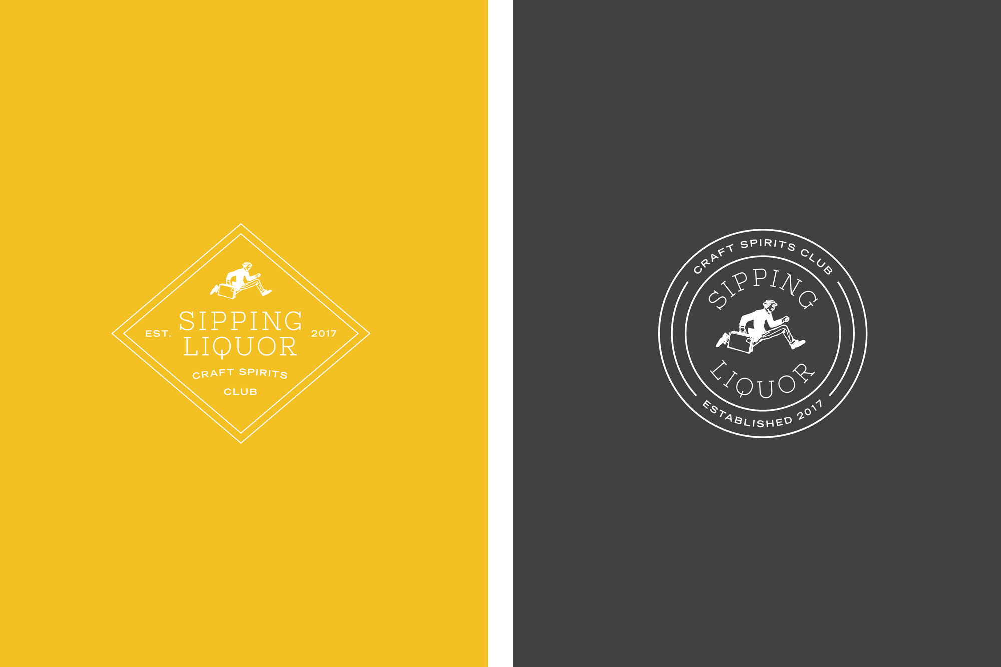
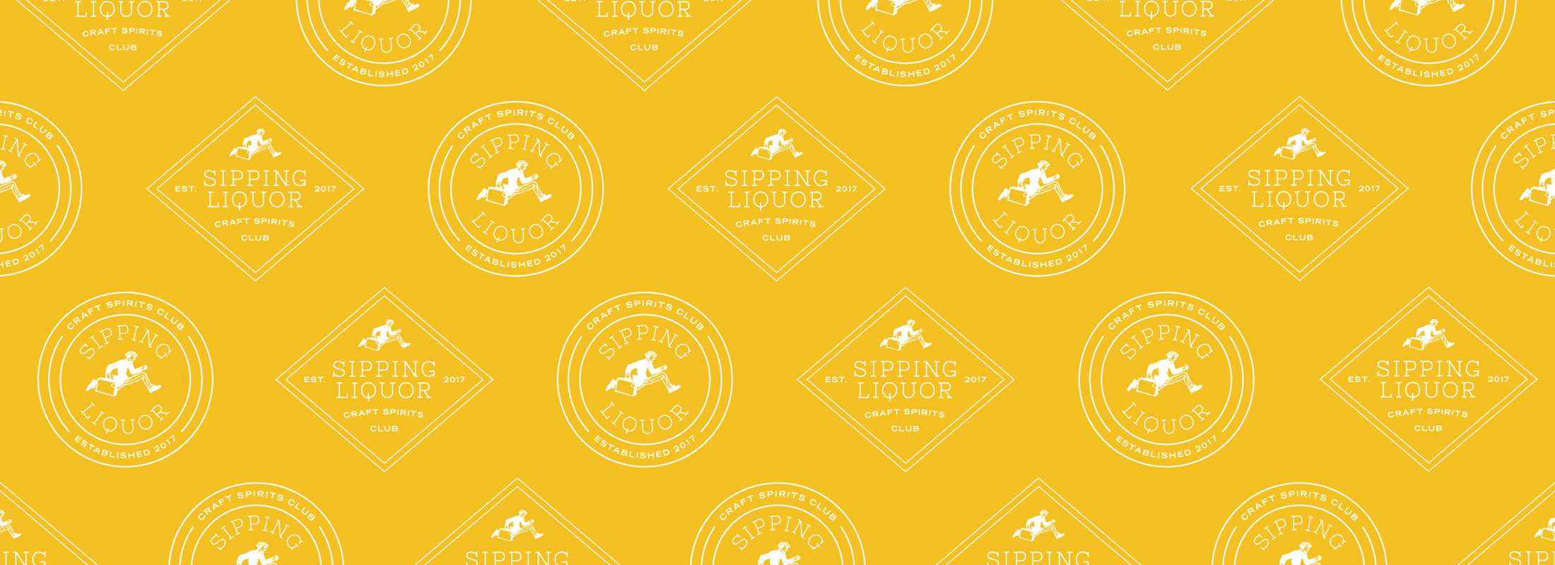
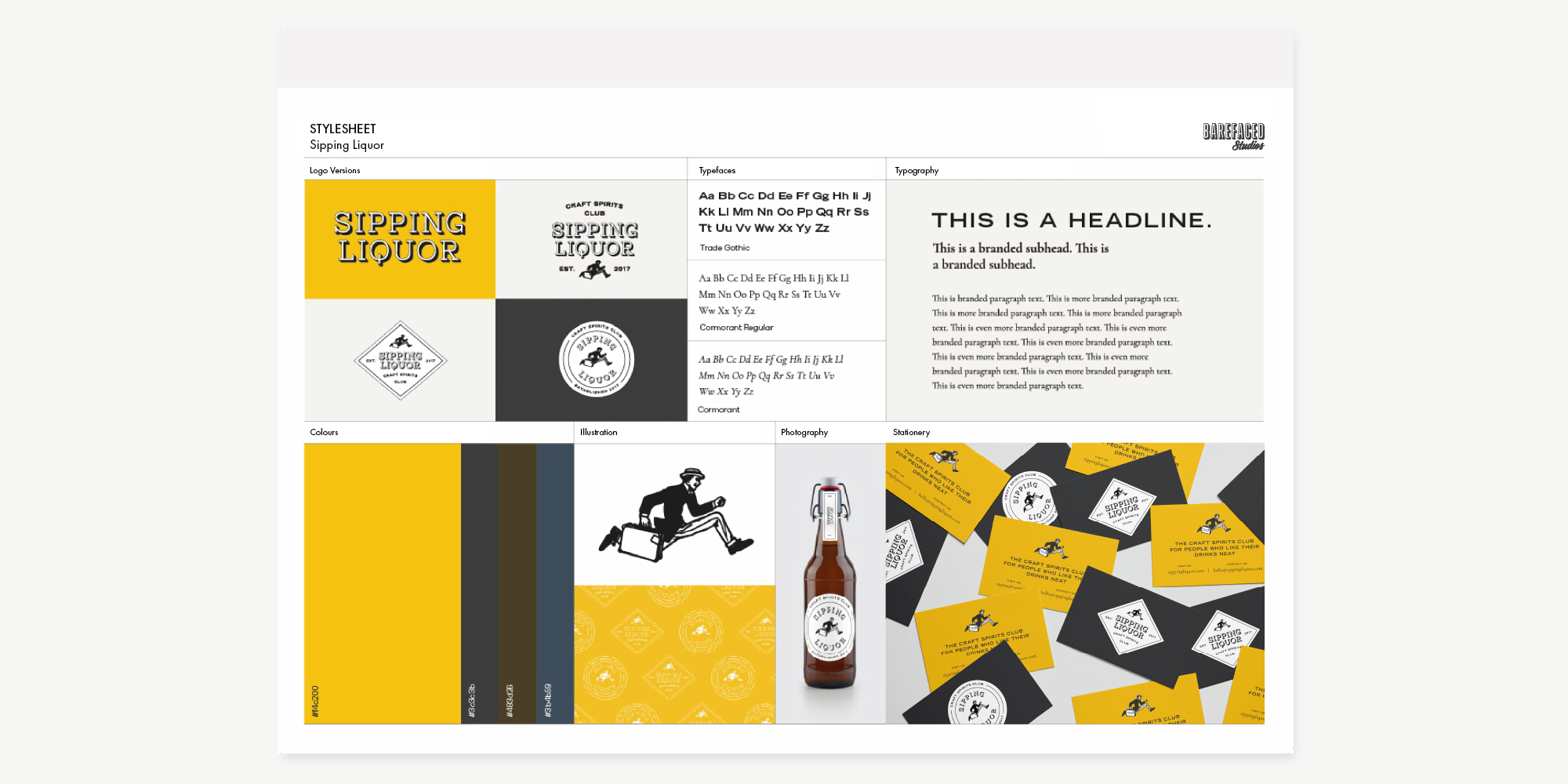
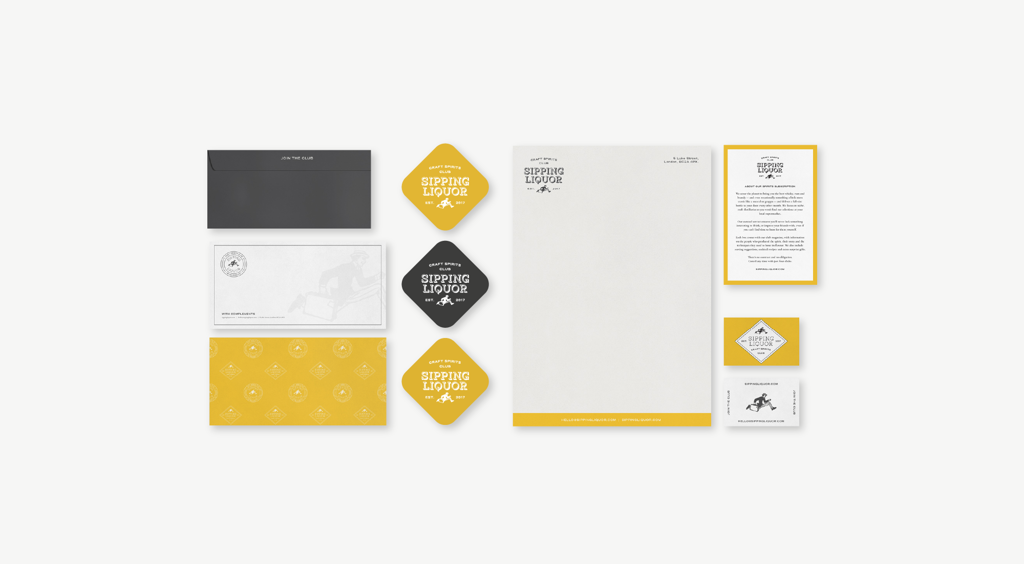
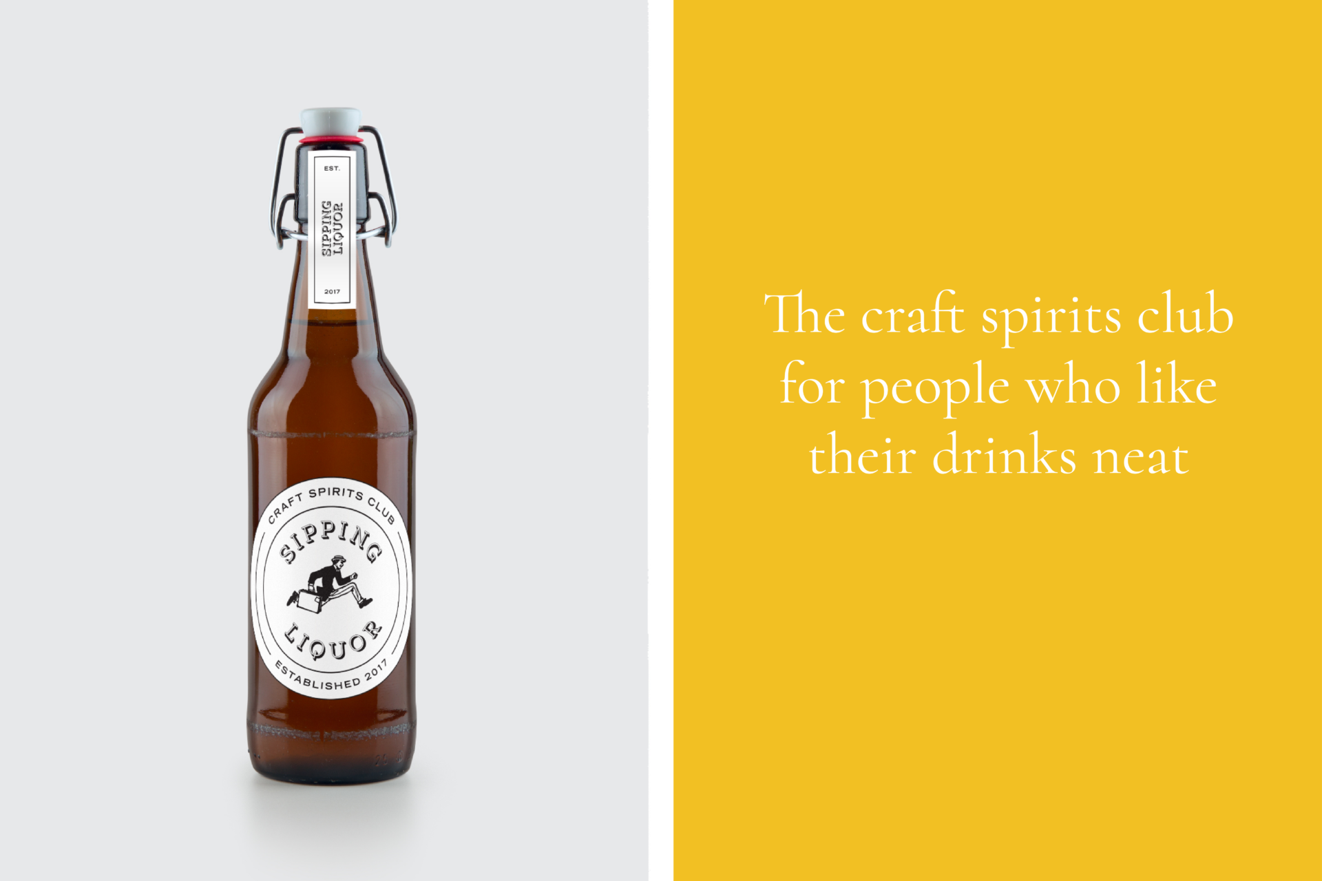
- Marvin, Sip’s illustrated mascot, led the charge in making the brand accessible to all. Inspired by Harry Craddock of Savoy Cocktail Book fame, Marvin brings the brand to life by delivering Sip’s offerings straight to customers, creating a direct, inclusive connection.
- We focused on articulating the quality, process, history and taste credentials of the producers working with Sipping Liquor through a visual language compassionate of the heritage and craft of distilling spirits.
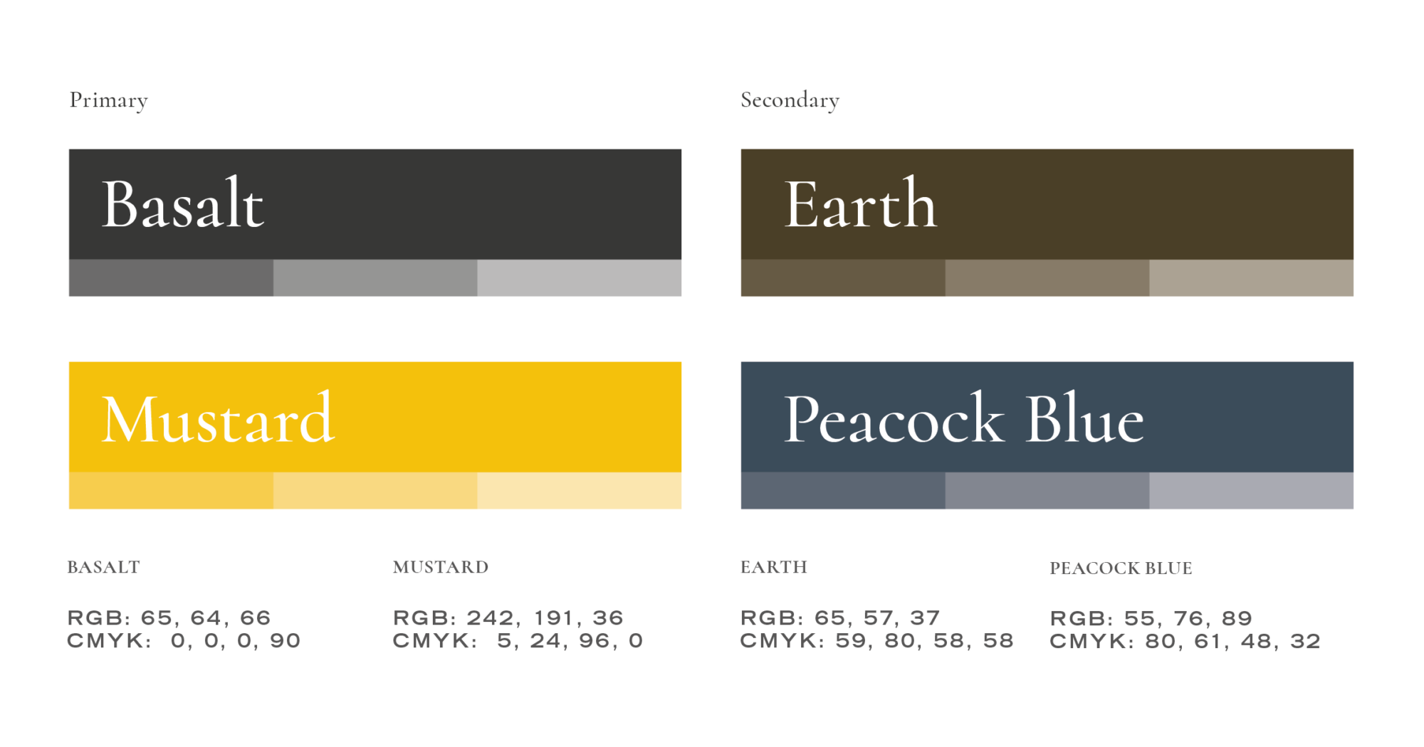
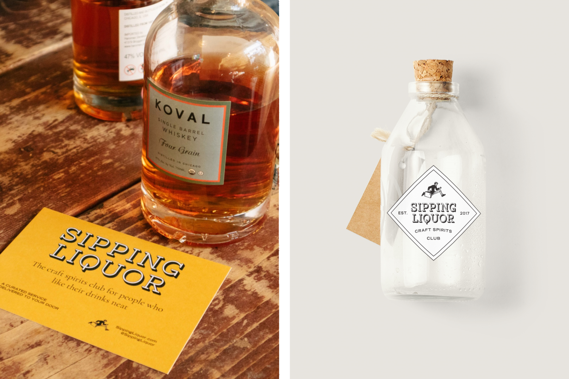
- The colour palette acts as a visual shorthand for the deep, complex flavours of liquor, designed to stimulate the taste buds and not just the eyes.
“Barefaced did a great job designing the brand identity for Sipping Liquor. Claire and her team of creatives were a joy to work with. I felt I had input at all stages and I’m really happy with the final results.”
– Andrew Rummer, Owner
If you like a lot of whisky in your tumbler, join our club
We spotted a gap in the market for a premium yet approachable brand that brings something new, and a sense of community, to its subscribers. So, we set out to give spirit branding a modern twist, influenced by the old-school charm of British members clubs. We chose a rich mustard as the core brand colour, inspired by the golden undertones of whiskies and rums, and paired it with earthy, muted shades to keep things grounded.
Enter Marvin – our illustrated mascot. Channeling the spirit (pun intended) of Harry Craddock, the legendary bartender behind the Savoy Cocktail Book. Marvin is always on the move, running with a briefcase to deliver Sipping Liquor’s latest shipments to ‘club members’, embodying the idea of personal, direct service.
The result? A brand that combines the heritage of spirit-making with the feeling of being part of an exclusive yet welcoming community. The colour palette doesn’t just look good – it’s designed to tantalise your taste buds, visually capturing the complex flavours of the spirits. This sensory approach helps build a deeper emotional connection with the brand.
Marvin brings the fun with his witty, charming persona, becoming a conversation starter while keeping the tone light and playful (seriously, check out Sipping Liquor’s marketing—it’s hilarious). And who knows? Maybe one day we’ll introduce Mabel, Marvin’s sidekick, to make things even more interesting.