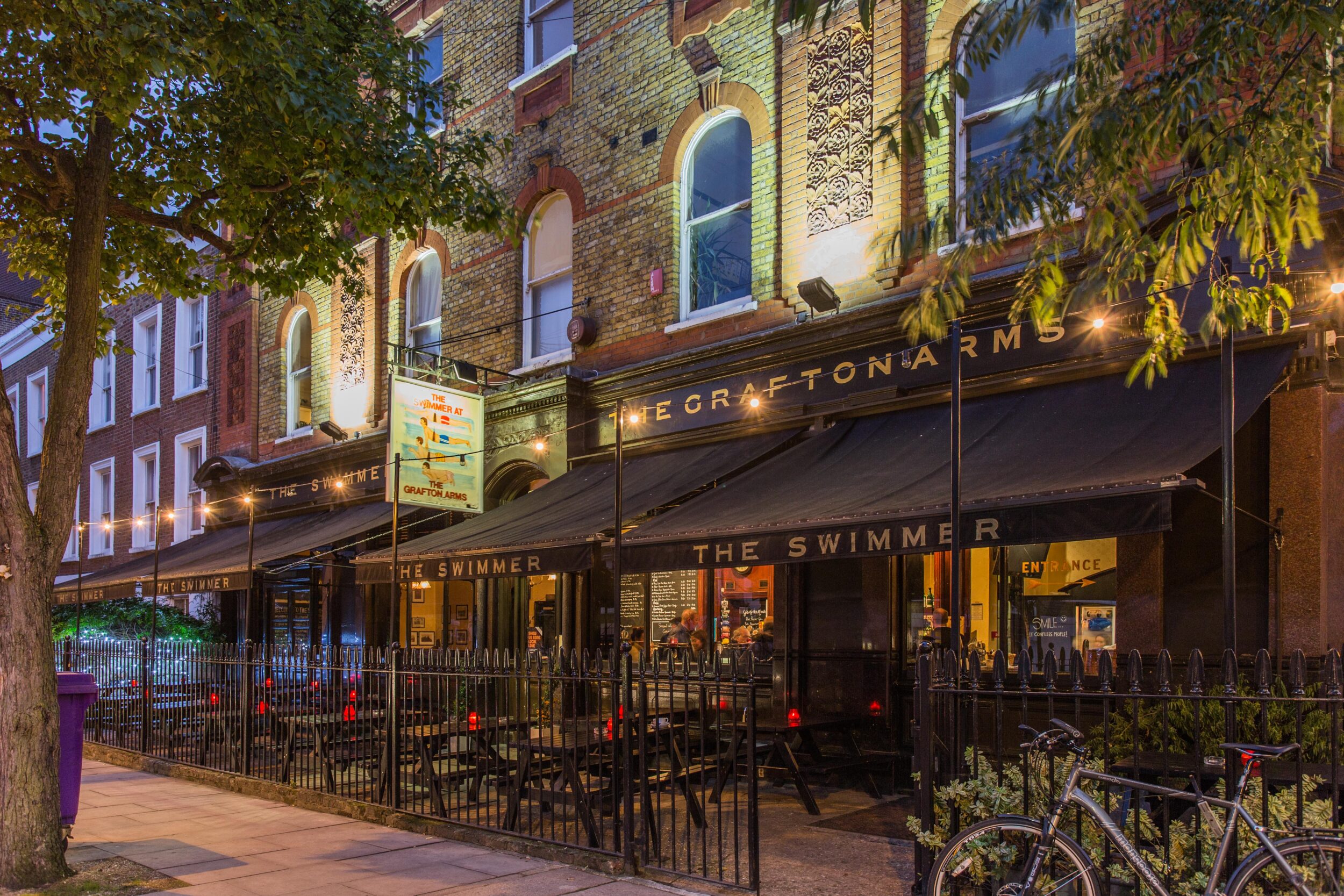
We helped Remarkable ditch the tired, dark designs that make most British pubs look like they’ve been stuck in a 1970s time loop. You know the ones – where every pint is a “dirty” pint and the decor feels like it was sourced from a scrapyard. Instead, we gave Remarkable a brand identity that reflects the true spirit of their pubs: revival, community, and a salute to British tradition.
Remarkable’s legacy isn’t just about restoring buildings; it’s about breathing life back into them and preserving the heart of British pub culture. We didn’t just refresh their look – we brought back a sense of purpose, so people actually want to settle in for a pint and some good conversation.
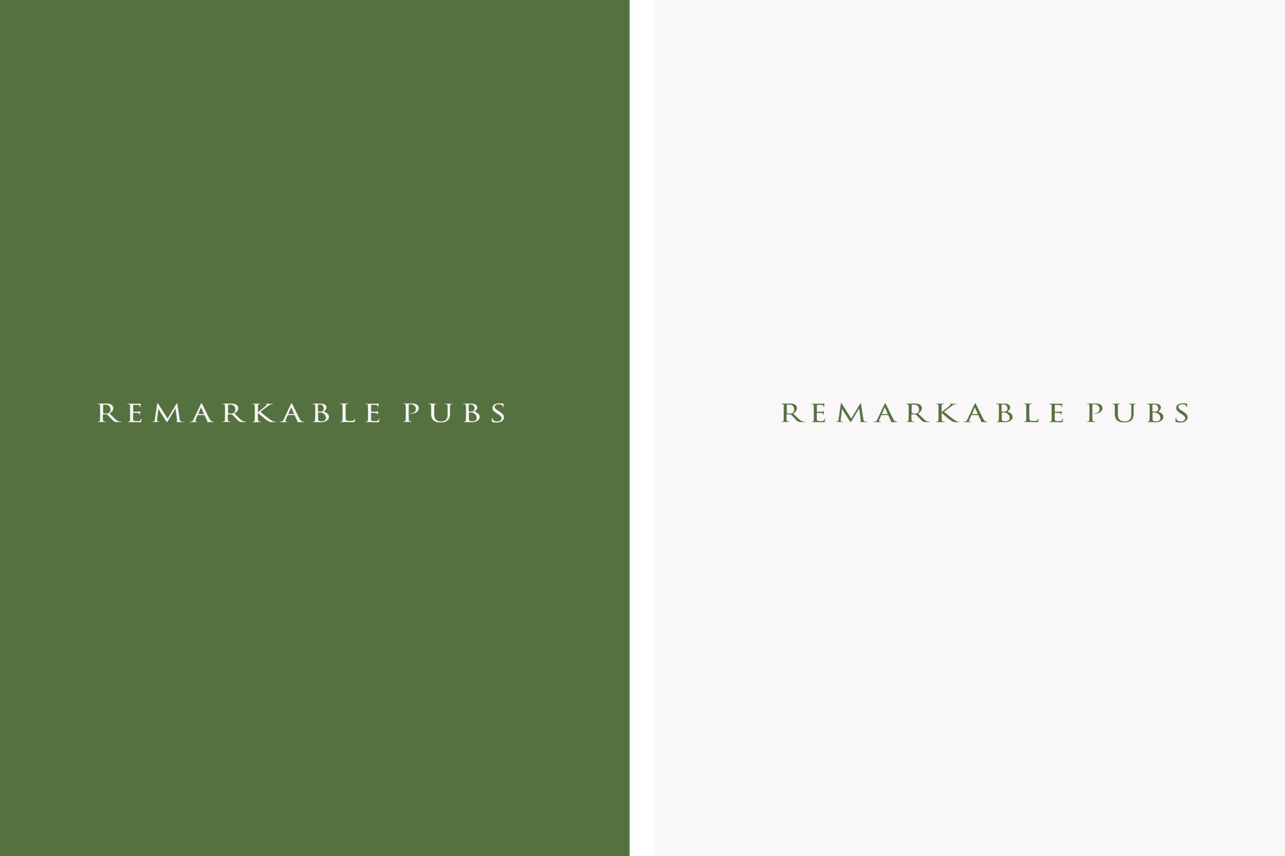
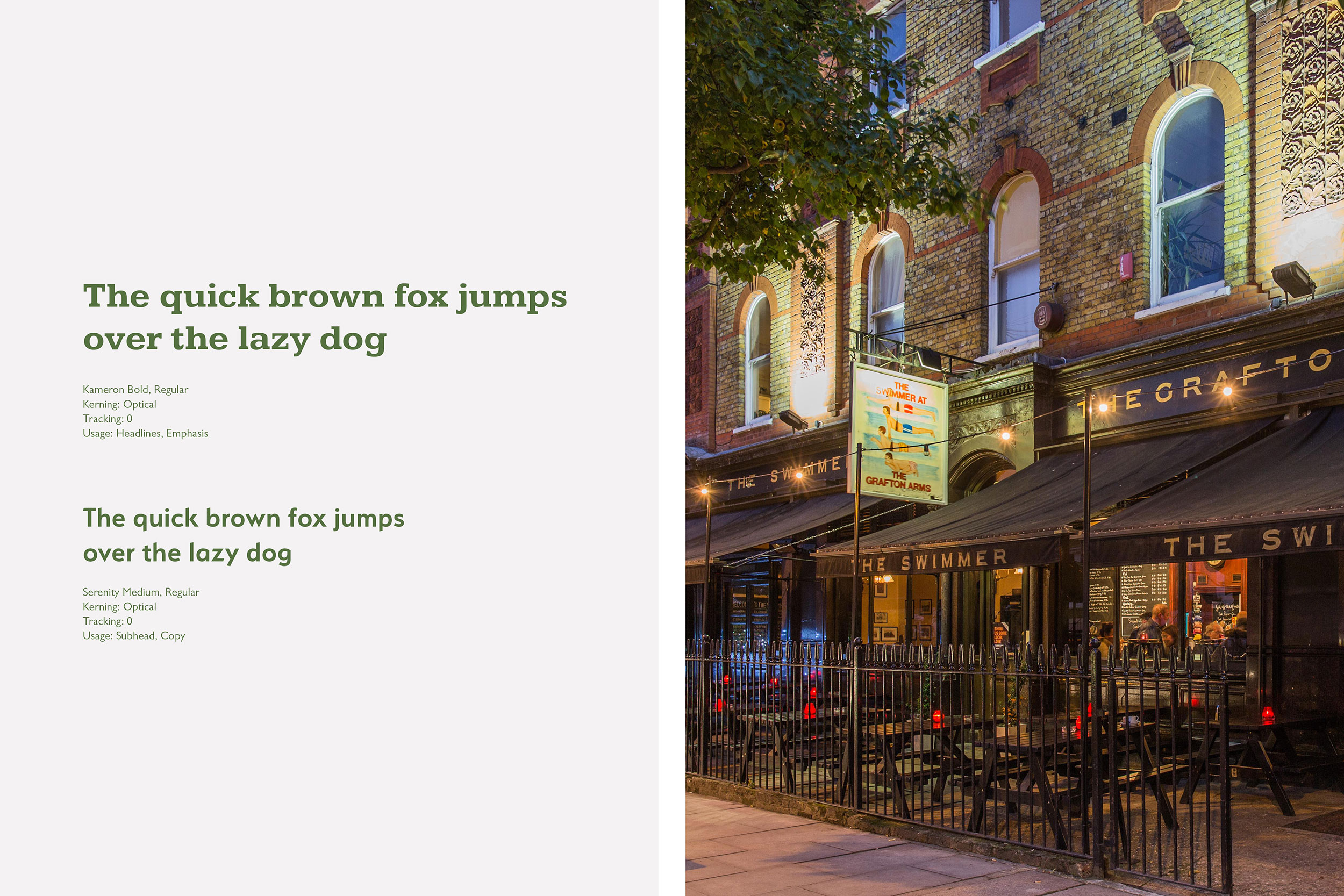
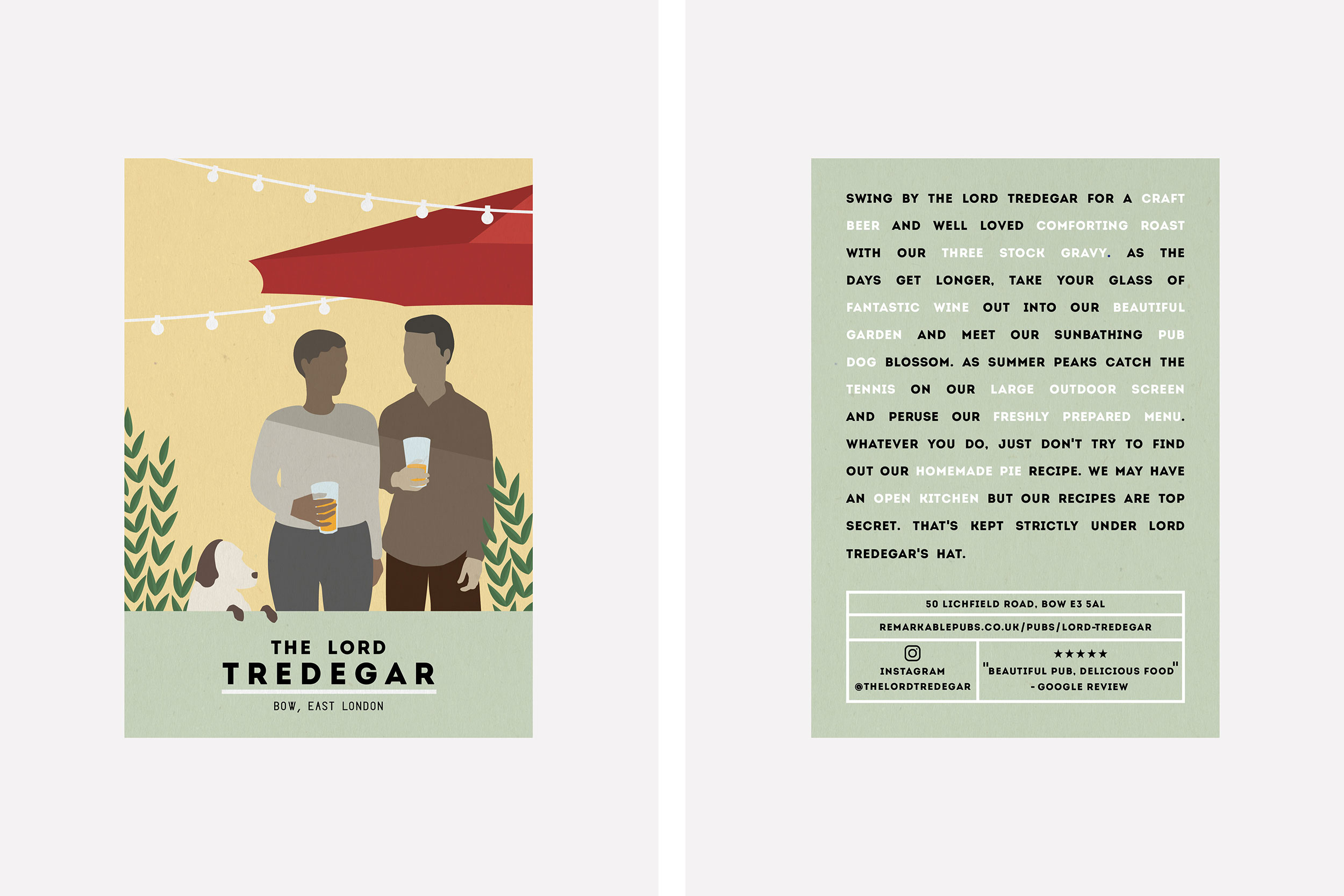
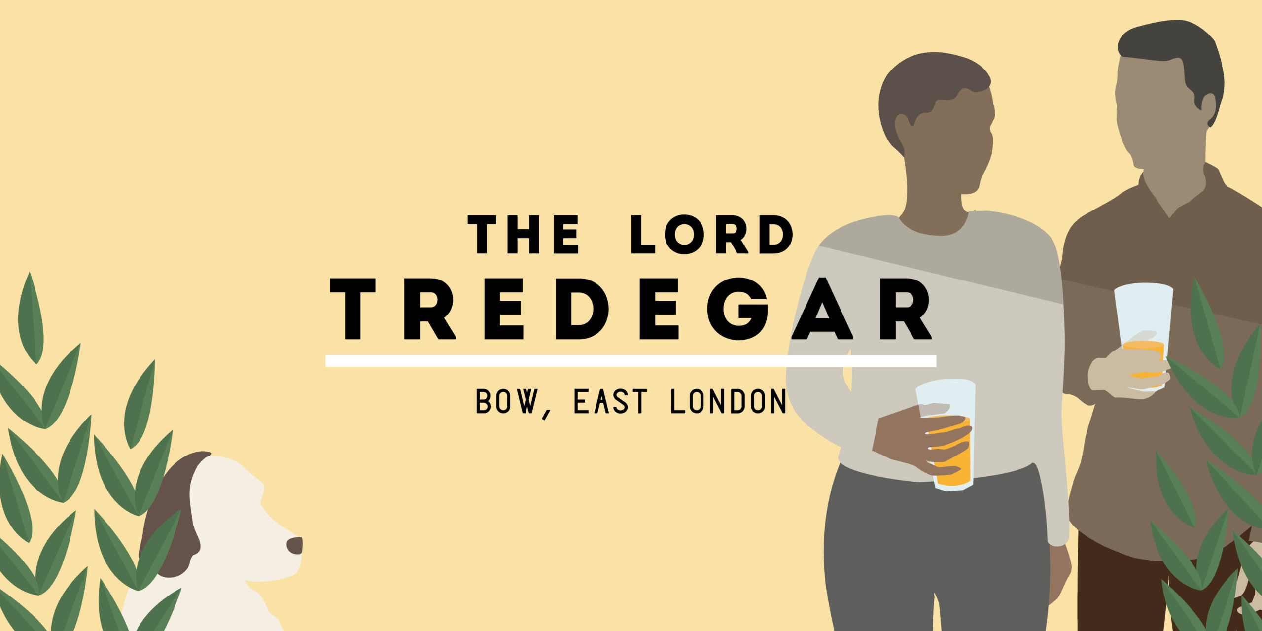
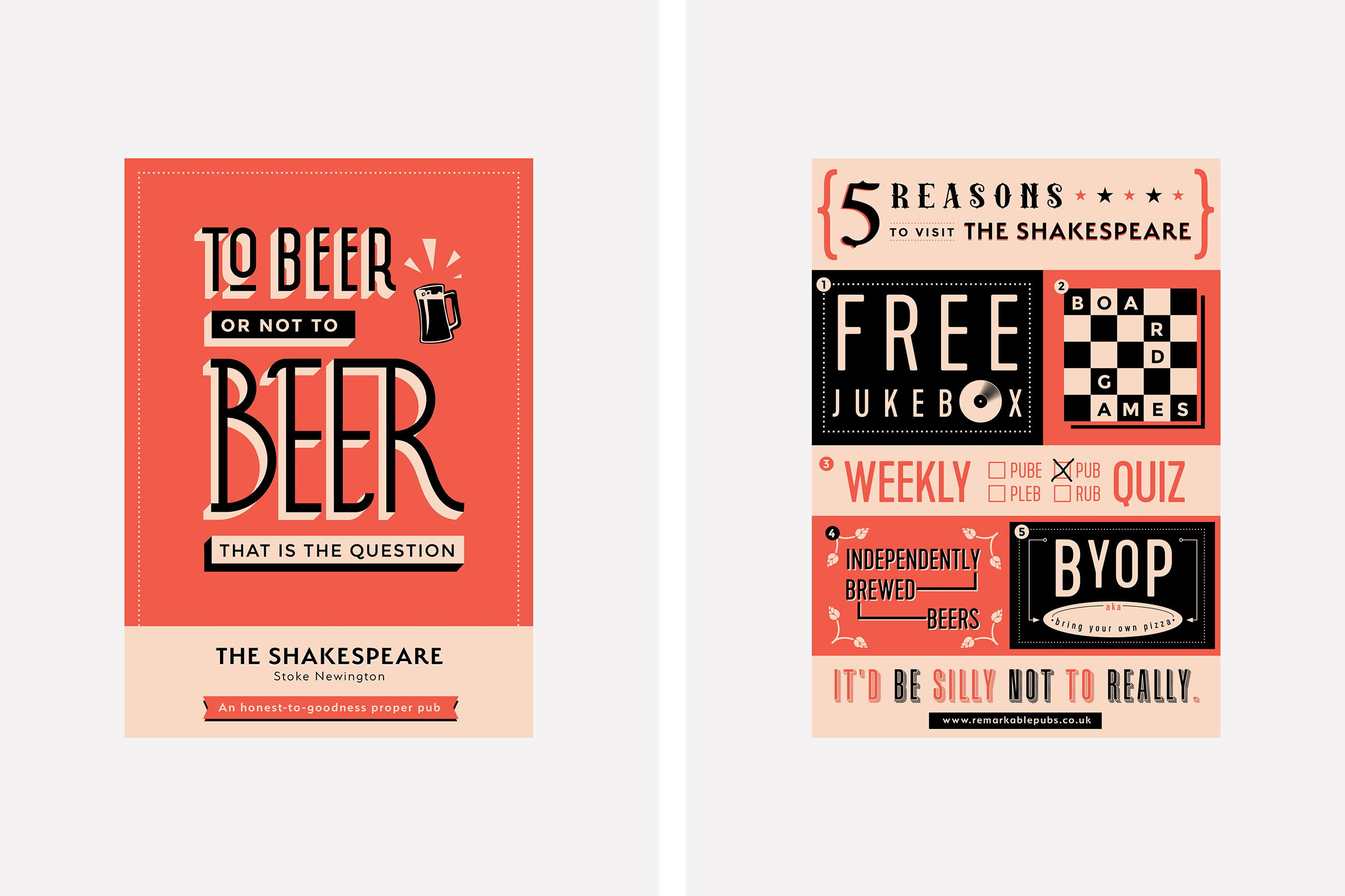
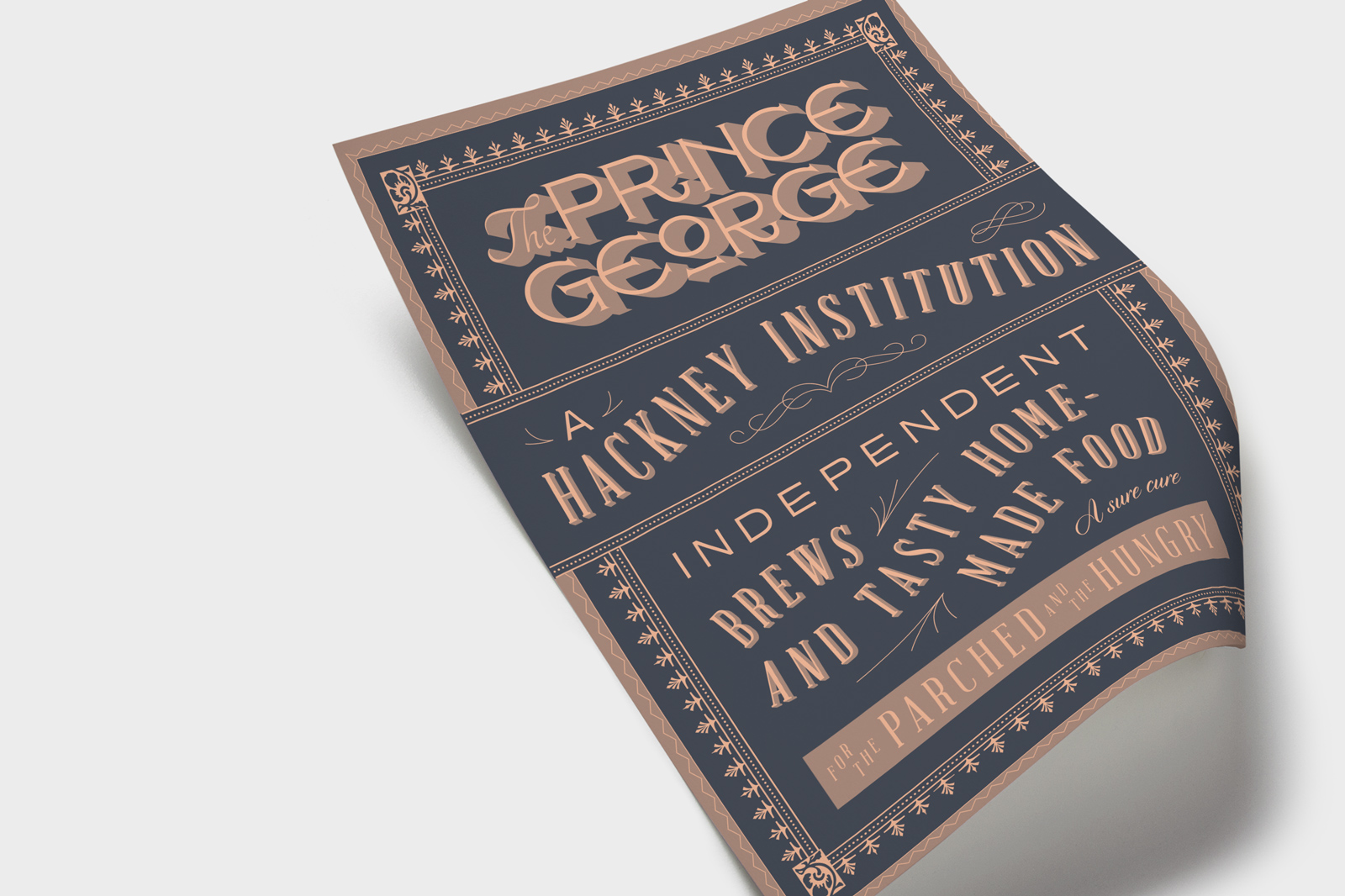
We kept the original logo, which has sentimental roots with the founders, but created a secondary, flexible version that could be used across all mediums. Then, we introduced a rich “British racing green” colour palette that’s as heritage-driven as a classic Jaguar, paired with a traditional font to bring in some old-school charm. But we also softened it up with a contemporary, friendlier font and a cheeky tone of voice – because let’s face it, British pubs aren’t meant to be stiff.
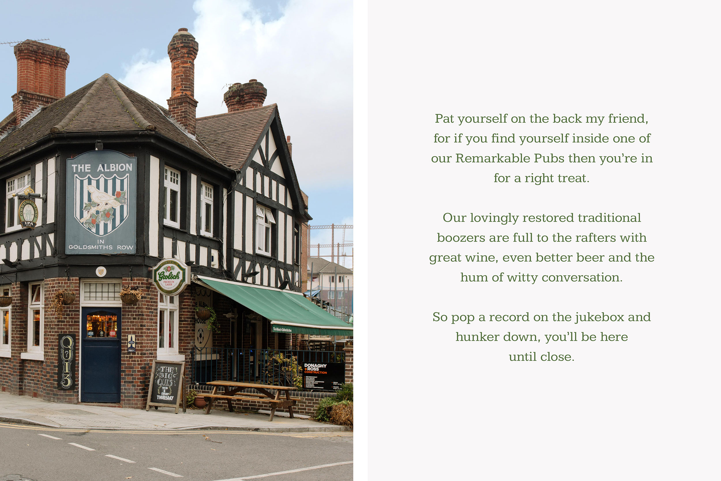
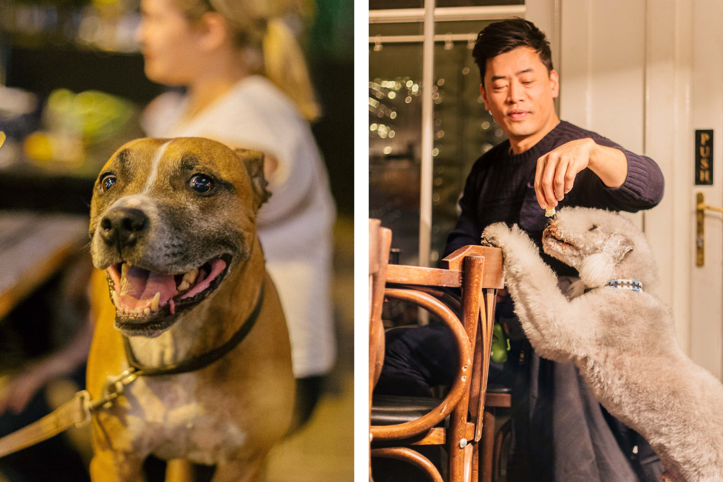
New photography? Oh, we nailed it. We went for a fly-on-the-wall style with a slight retro grain, giving the images a cinematic vibe. It’s the kind of photography that makes you feel like you’re kicking back in a Remarkable pub, beer in hand, watching the world go by.
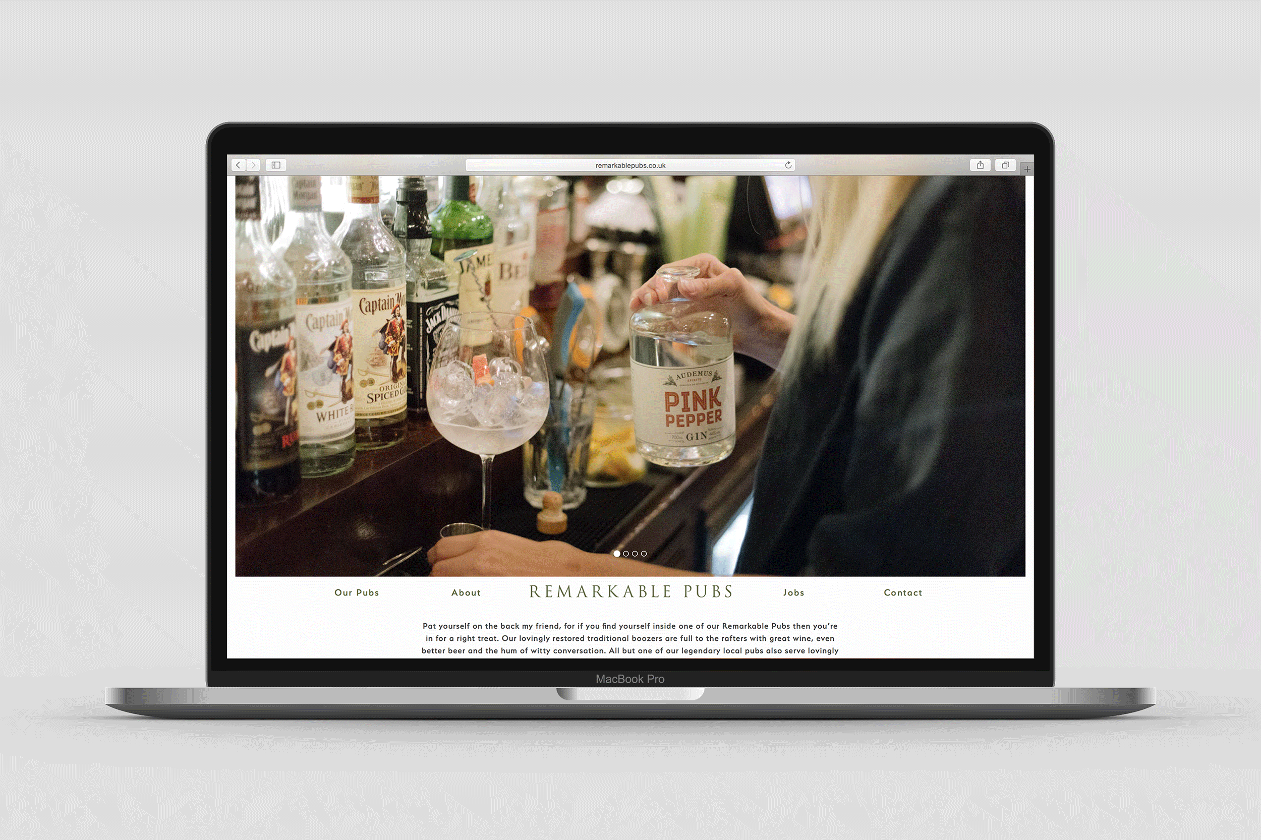
Finally, we built a website that’s clean, minimal, and lets the content speak for itself. The result? Remarkable now feels fresh, fun, and dripping with character – a place where tradition meets modern wit. The new look and voice aren’t just inviting; they’re a pint of something very special.