Harley Academy
Harley Academy are the UK's largest postgraduate training provider in aesthetic medicine. Their objective is to raise educational standards for injectables and cosmetic dermatology treatments.
Overview
Aesthetic practices are largely unregulated in the UK. The Department of Health has cited that '...dermal fillers are a crisis waiting to happen.' In fact, 934 of 937 complaints made to Save Face in 2019 were in regards to unregistered practitioners. What drew us to Harley Academy was their steadfast determination to fix this. Their be all and end all is to radically improve patient safety. How? By creating a pioneering level 7 qualification mapped to Health Education England guidelines for a start. Their approach is innovative and features a tech-focused online learning system, further boosting their forward-thinking credentials. Harley Academy are driven to make the aesthetics ecosystem responsible, accountable and collaborative whilst ending all unregulated practices.
Services
Brand Strategy, Brand Positioning + Planning, Brand Audits + Guardianship, Visual + Verbal Identity Design, Web Design, Copywriting + Messaging, Marketing Strategy, Print + Digital Design, Photography.
The Challenge
- Harley Academy came to us to help them define their brand and set them apart as an ethical pioneer in an industry whose reputation treads the edges of moral and social responsibility.
- They wanted to create a visual identity that simultaneously represented education, prominence, tech and aesthetics. No mean feat!
- They were keen to disrupt the aesthetics of the aesthetics industry (see what we did there?) by promoting an authentic vision of beauty.
- It was important to position Harley Academy as leaders in their field in order to weather growing competition.
Barefaced Solution
- Dived deep into market research to reimagine Harley Academy’s brand, aligning it with their mission to reshape the aesthetics industry.
- Broke the mould by ditching the cold, clinical look of medical brands and avoiding the tired clichés of plastic surgery – creating a bold, fresh identity.
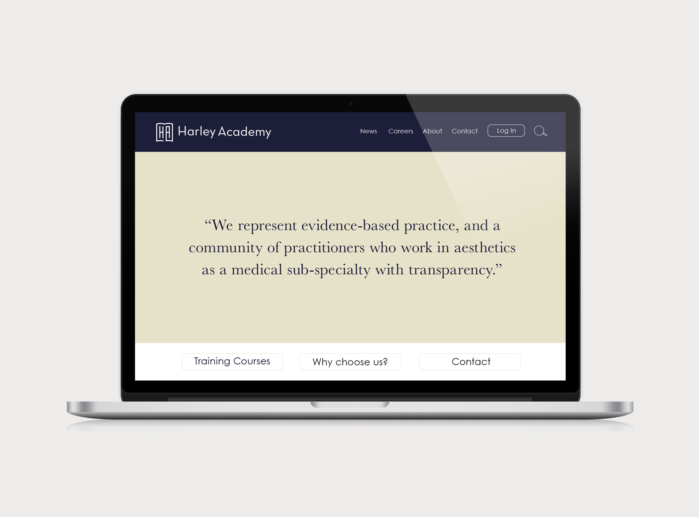
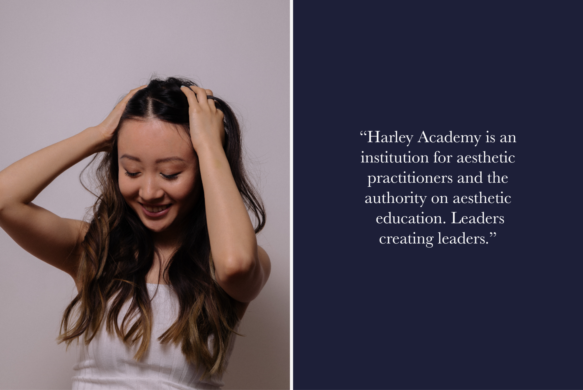
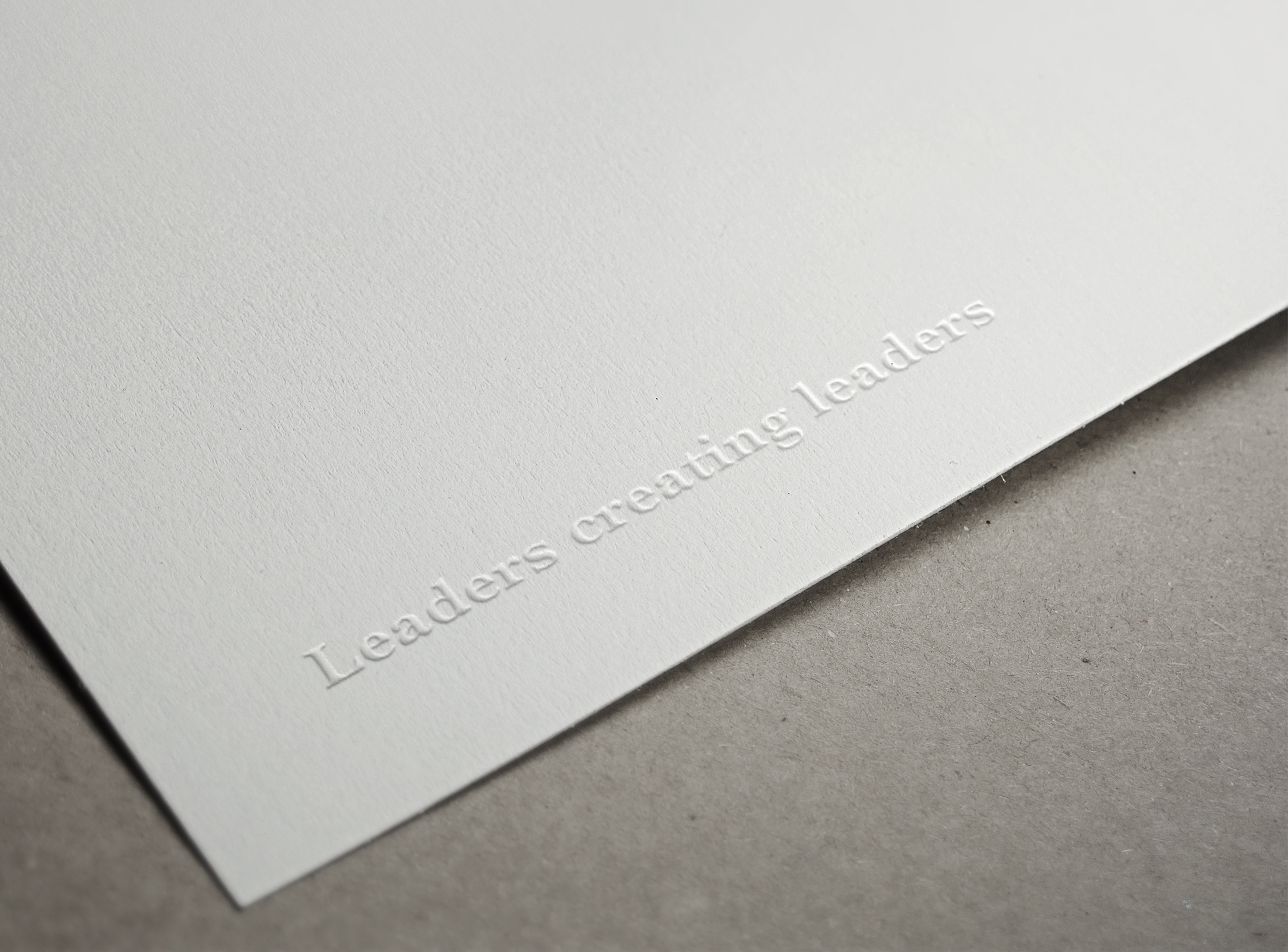
- Launched with a powerful message: “Aesthetics with integrity,” humanising the industry and building trust with both practitioners and clients.
- Flipped the script by positioning Harley Academy as a modern, forward-thinking leader in education, inspired by British universities and iconic keyboard symbols.
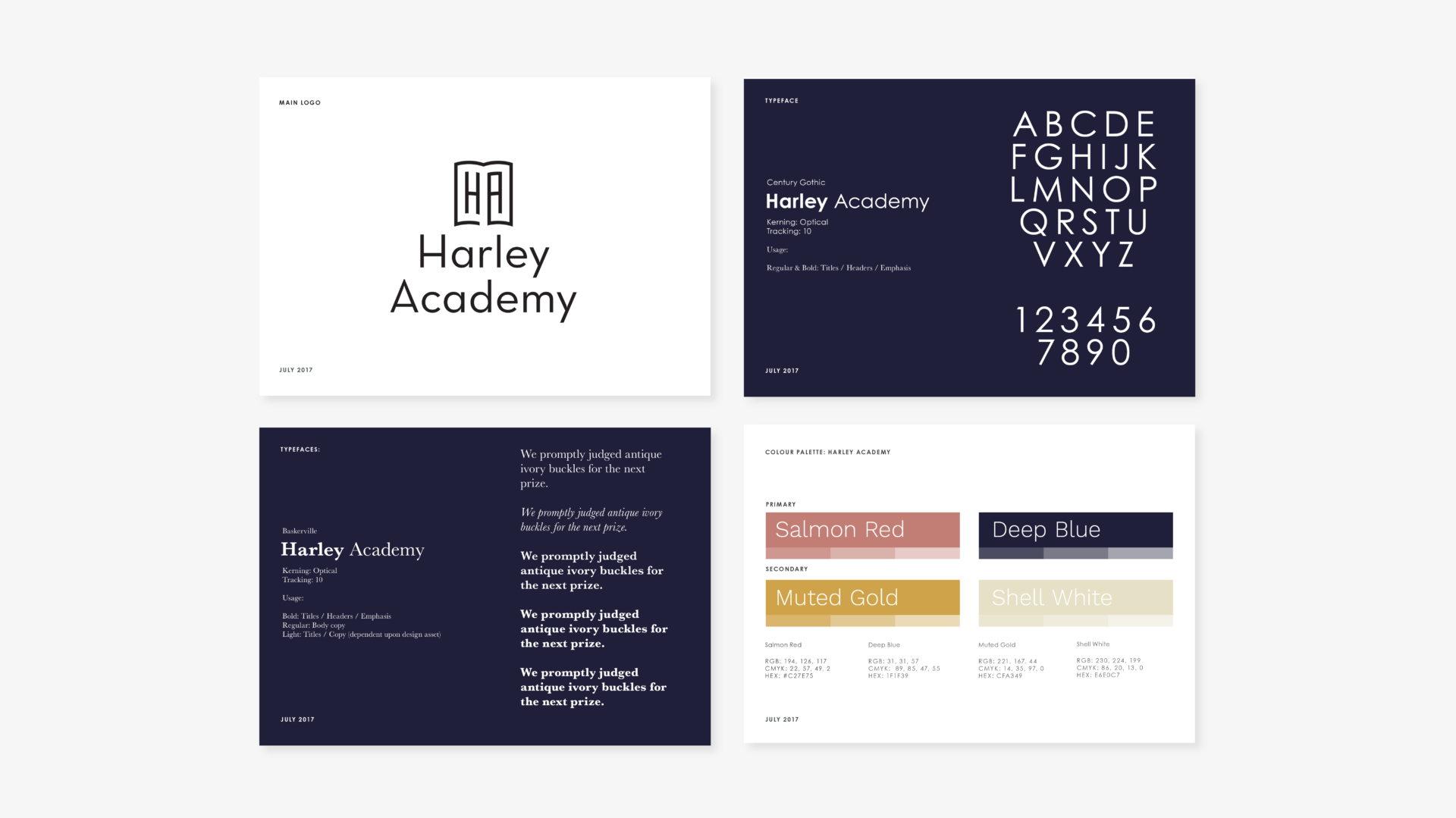
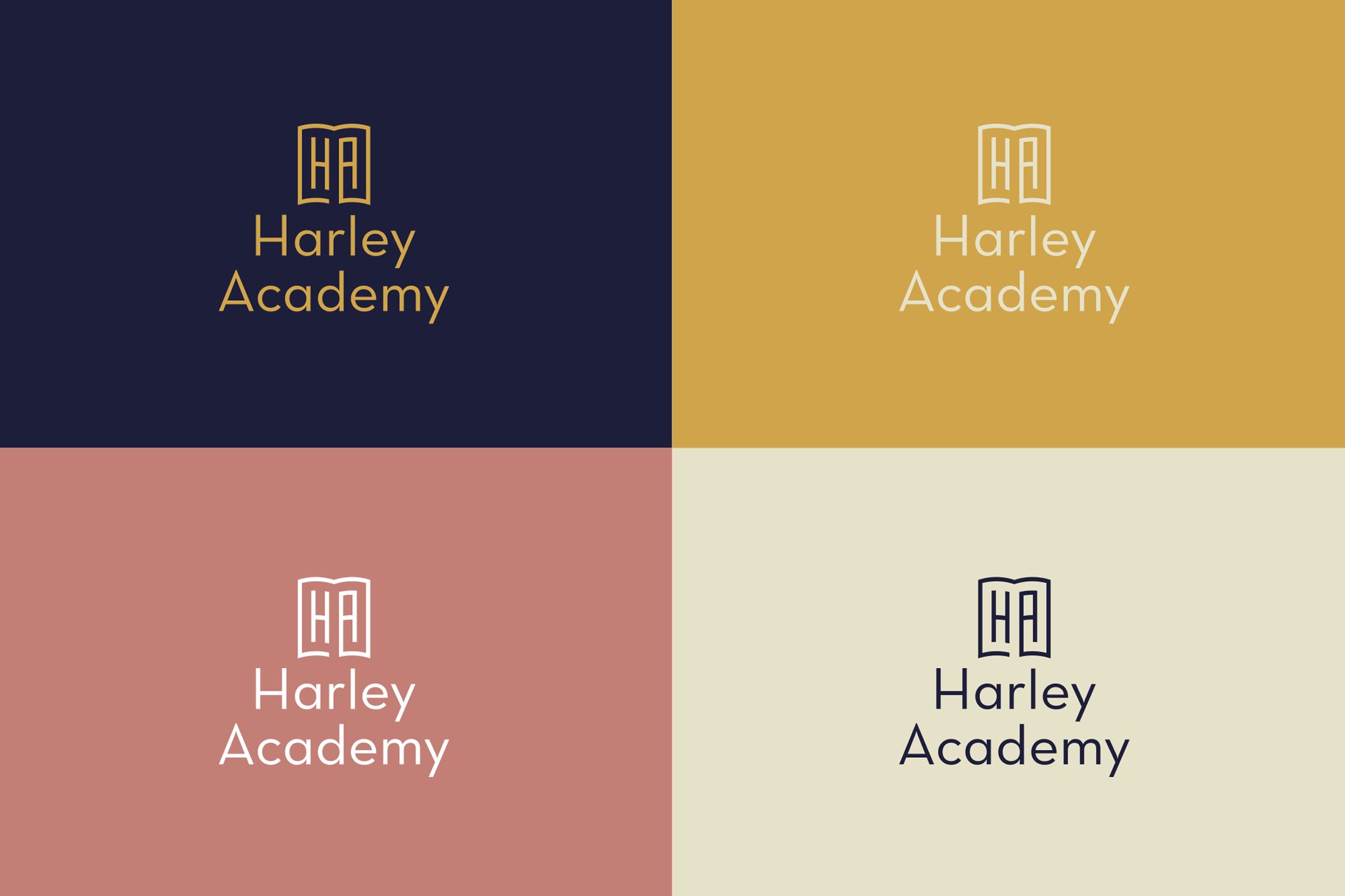
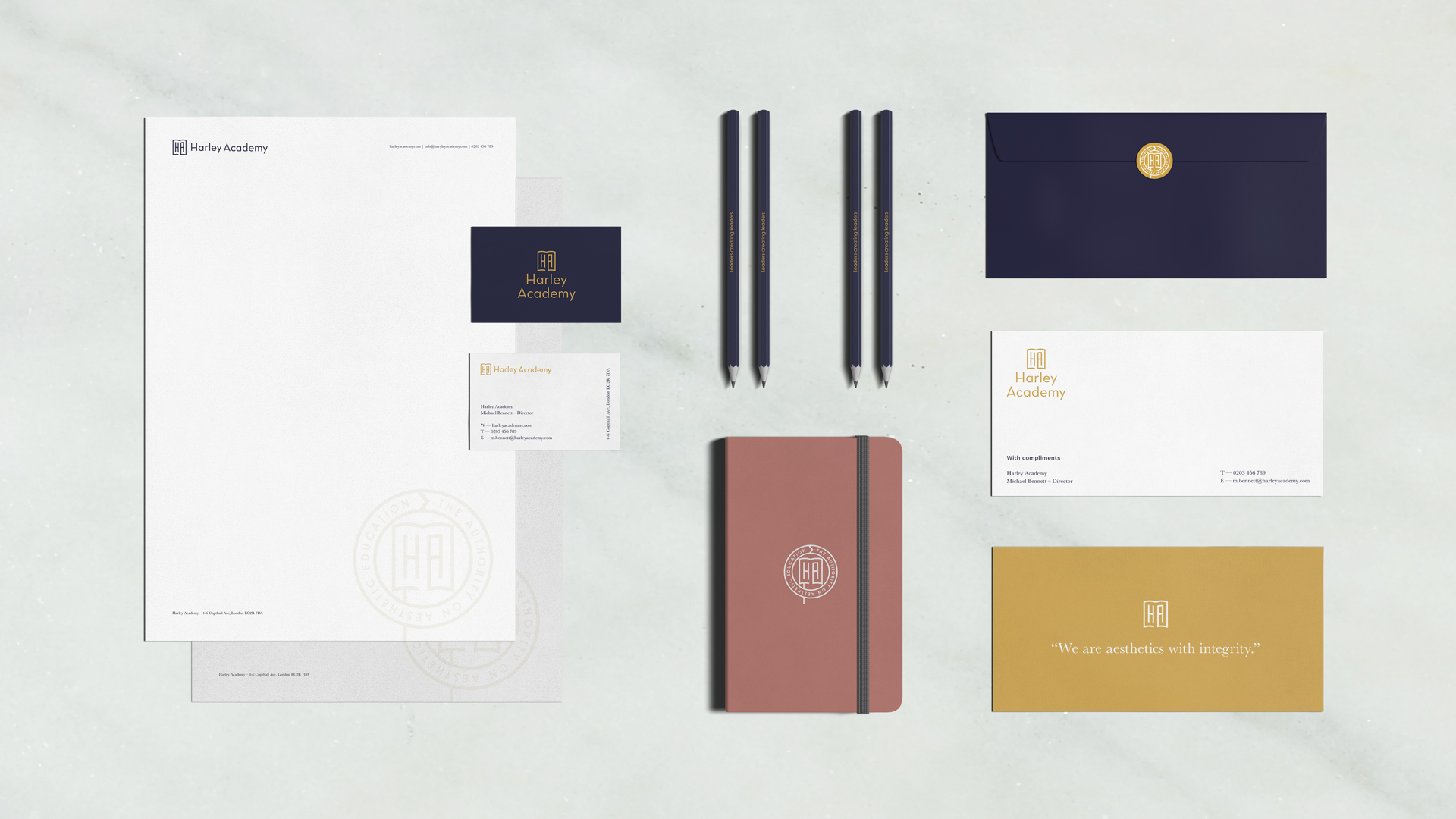
- Designed a logo that blends prestige, education, and tech, supported by a visual identity that reflects compassion and excellence.
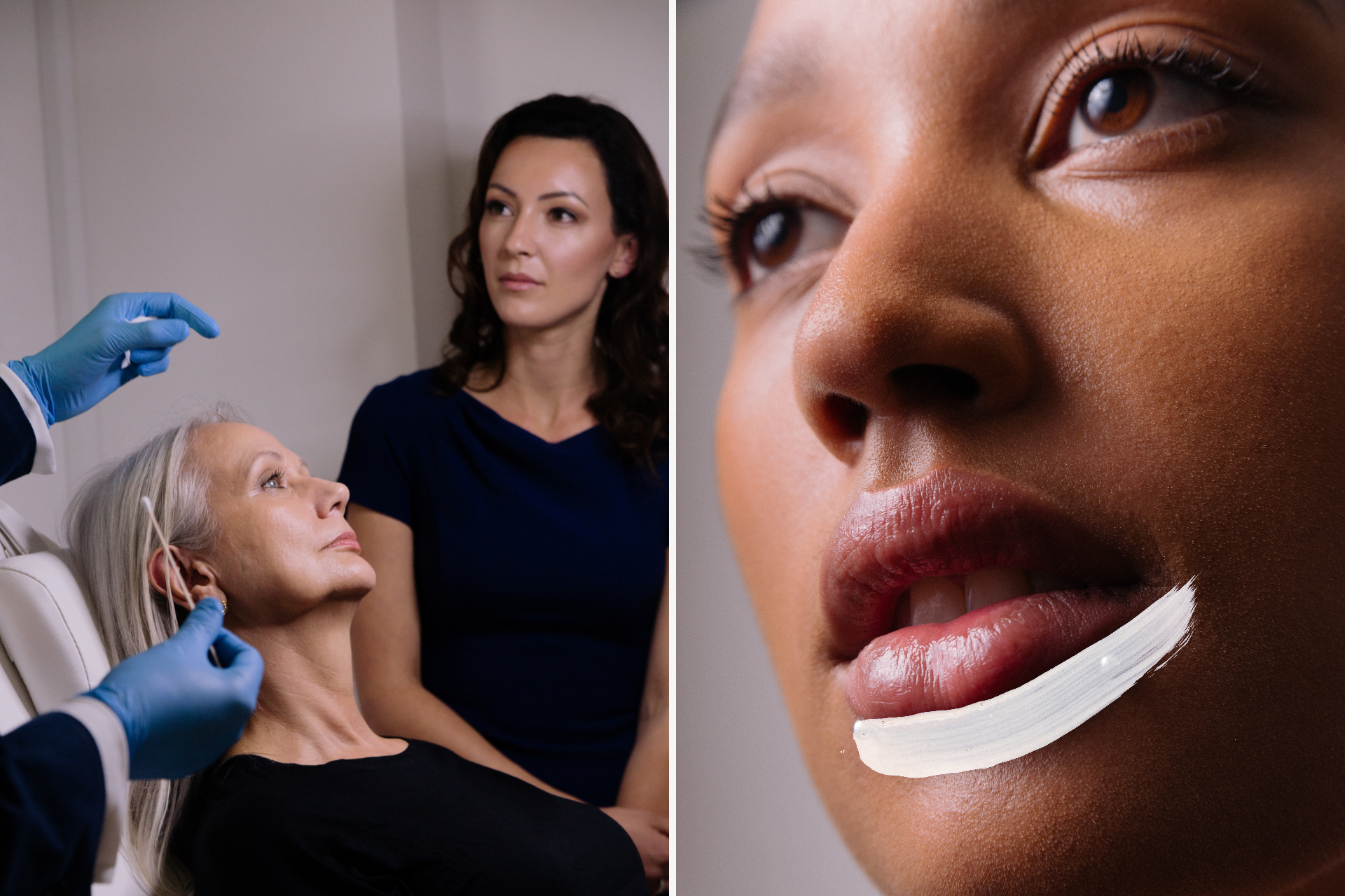
- Celebrated diversity with a photographic style that focuses on enhancement, not concealment, sending a clear message of ethical practices.
- Crafted a bold, authoritative look that stands out in the crowded aesthetics space, combining confidence with a touch of warmth.
- Created comprehensive guidelines to drive consistency, allowing Harley Academy to expand quickly and make a lasting impact in new regions.
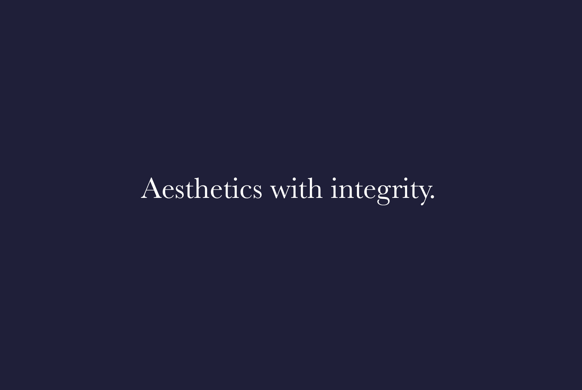
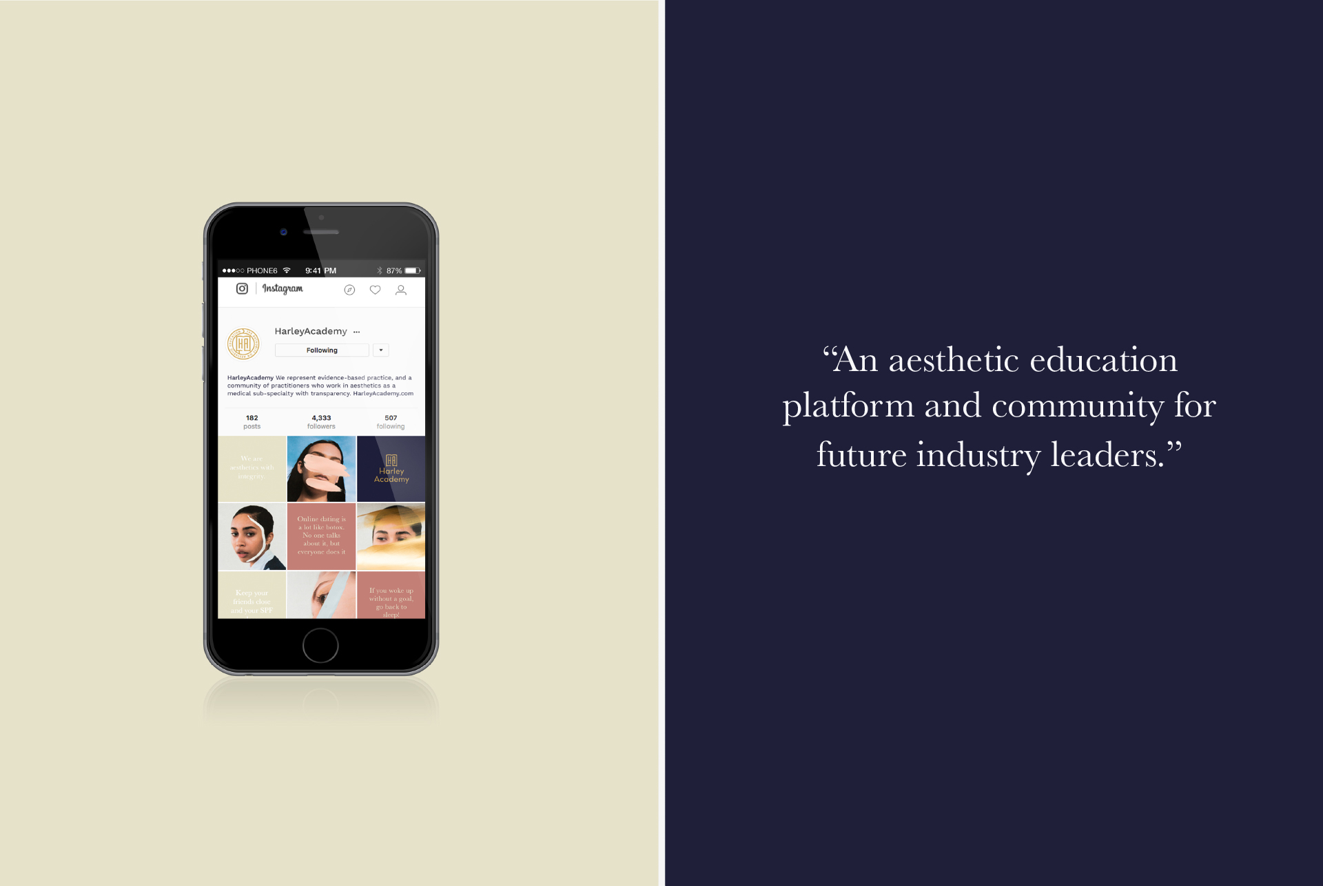


AESTHETICS WITH INTEGRITY
Harley Academy is disrupting an entire industry, so it was time for a bold new approach – one that would elevate them beyond the stale, predictable branding of the market.
The reimagined Harley identity strikes a perfect balance between authority, approachability, and innovation. It’s neither stiff nor flashy – just a fresh, powerful brand that stands tall in a market that’s largely stood still.
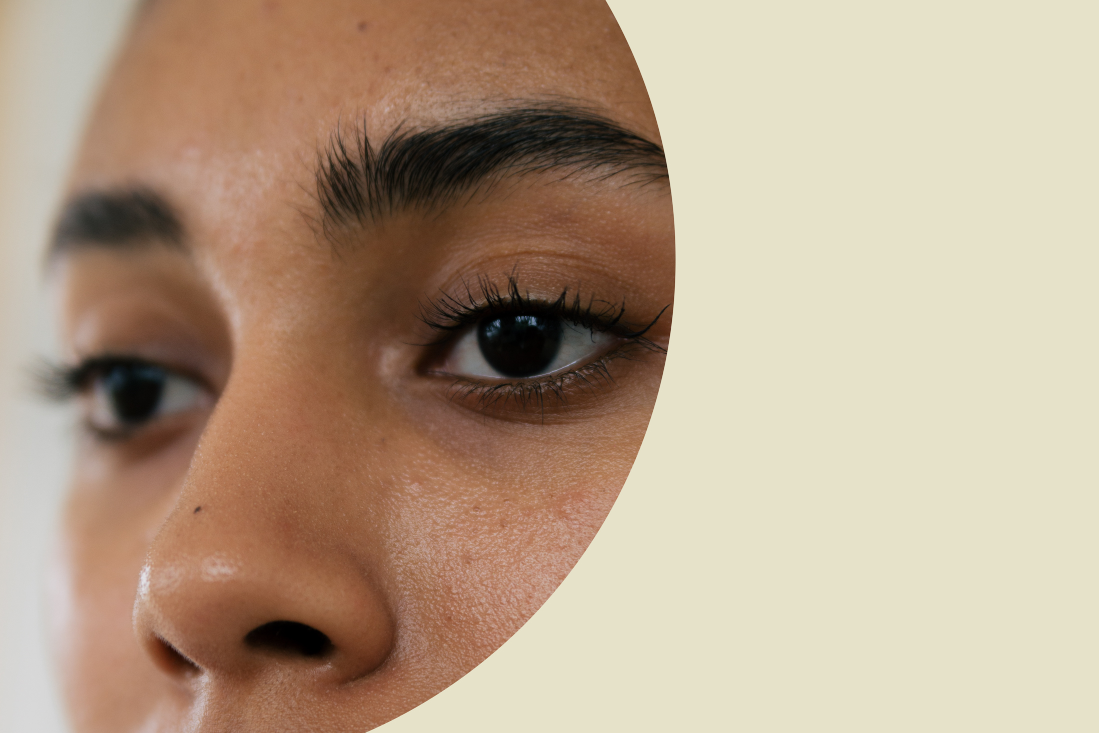
Their new photographic identity is rooted in a human-first, inclusive philosophy. We chose real models from diverse backgrounds and ages, embracing natural skin tones and textures – no airbrushing, just authentic beauty. The visuals champion human difference, while the illustrative style features warm, skin-inspired tones with vibrant pops of the brand palette. Soft, abstract forms and brushstroke textures evoke a sense of organic, tactile depth.
The result? A dynamic, forward-thinking identity that’s both ethical and educational – standing out as a beacon of change in an industry that desperately needed it.