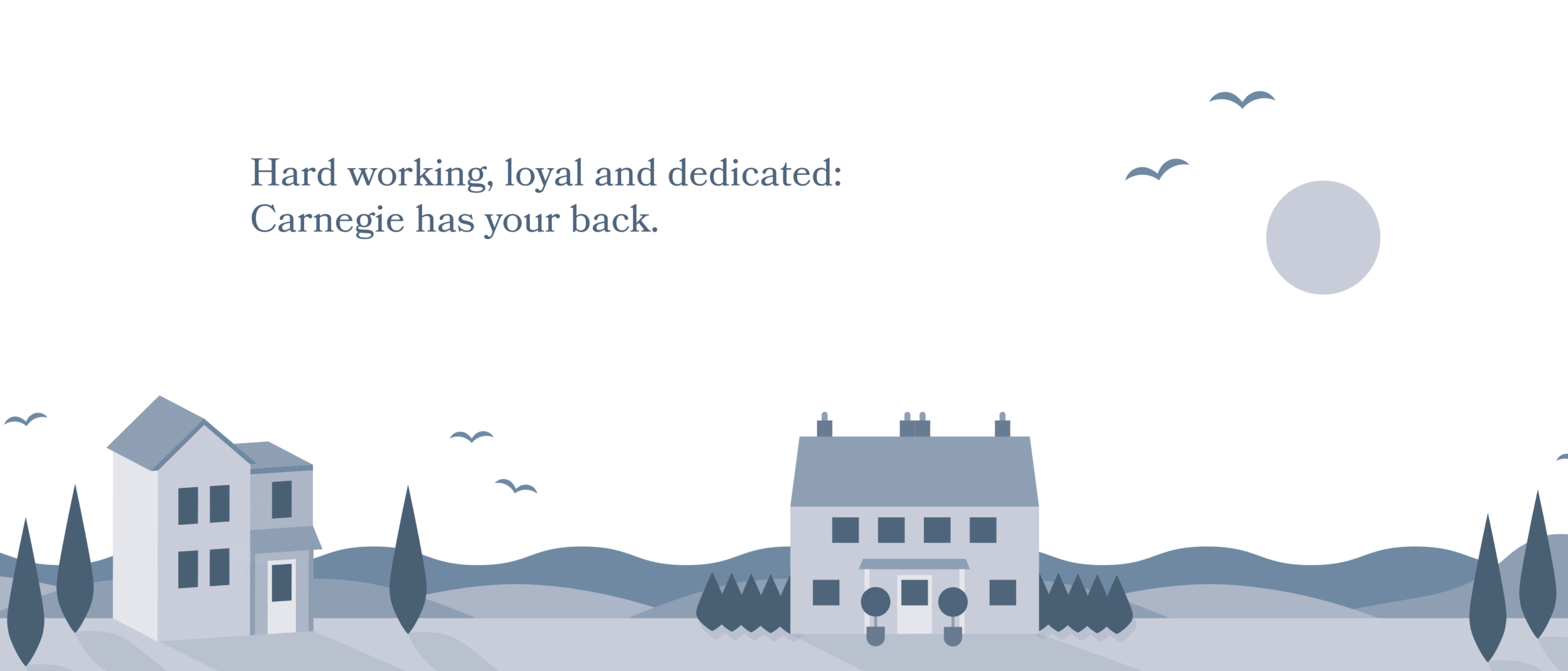
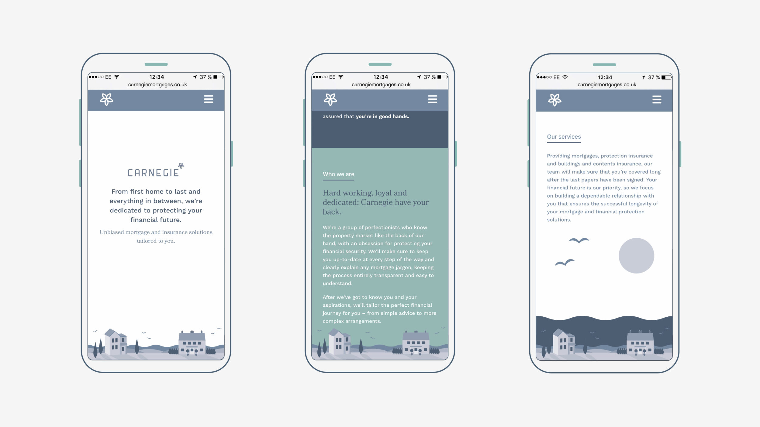
We built a brand that feels as at home in Carnegie’s local community as it does across the broader UK market – personal, professional, and deeply rooted in regional identity. It’s a refreshing antidote to the sea of corporate, tech-heavy mortgage brokers that dominate the space today.
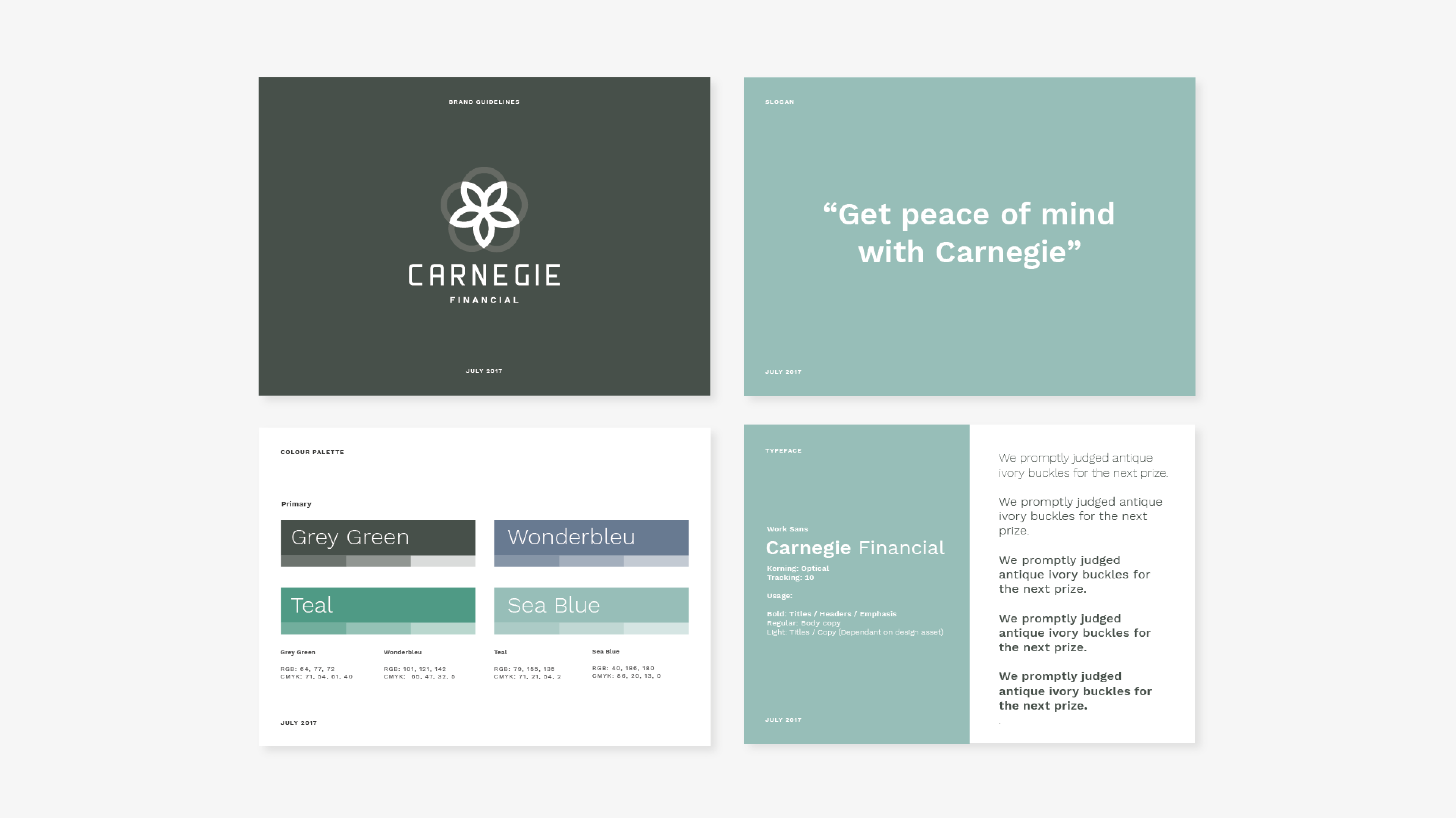
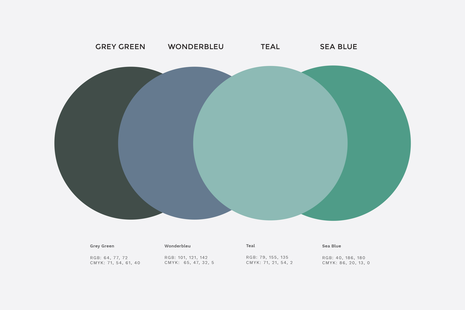
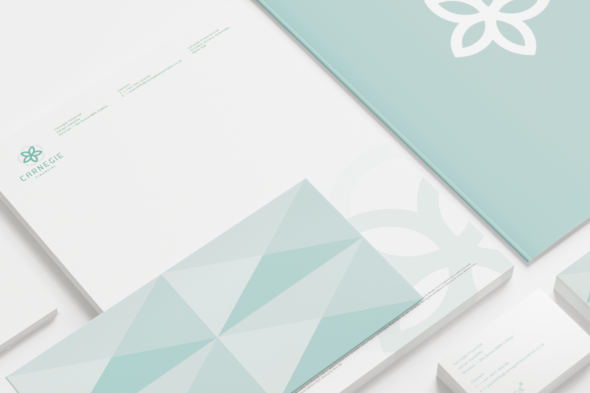
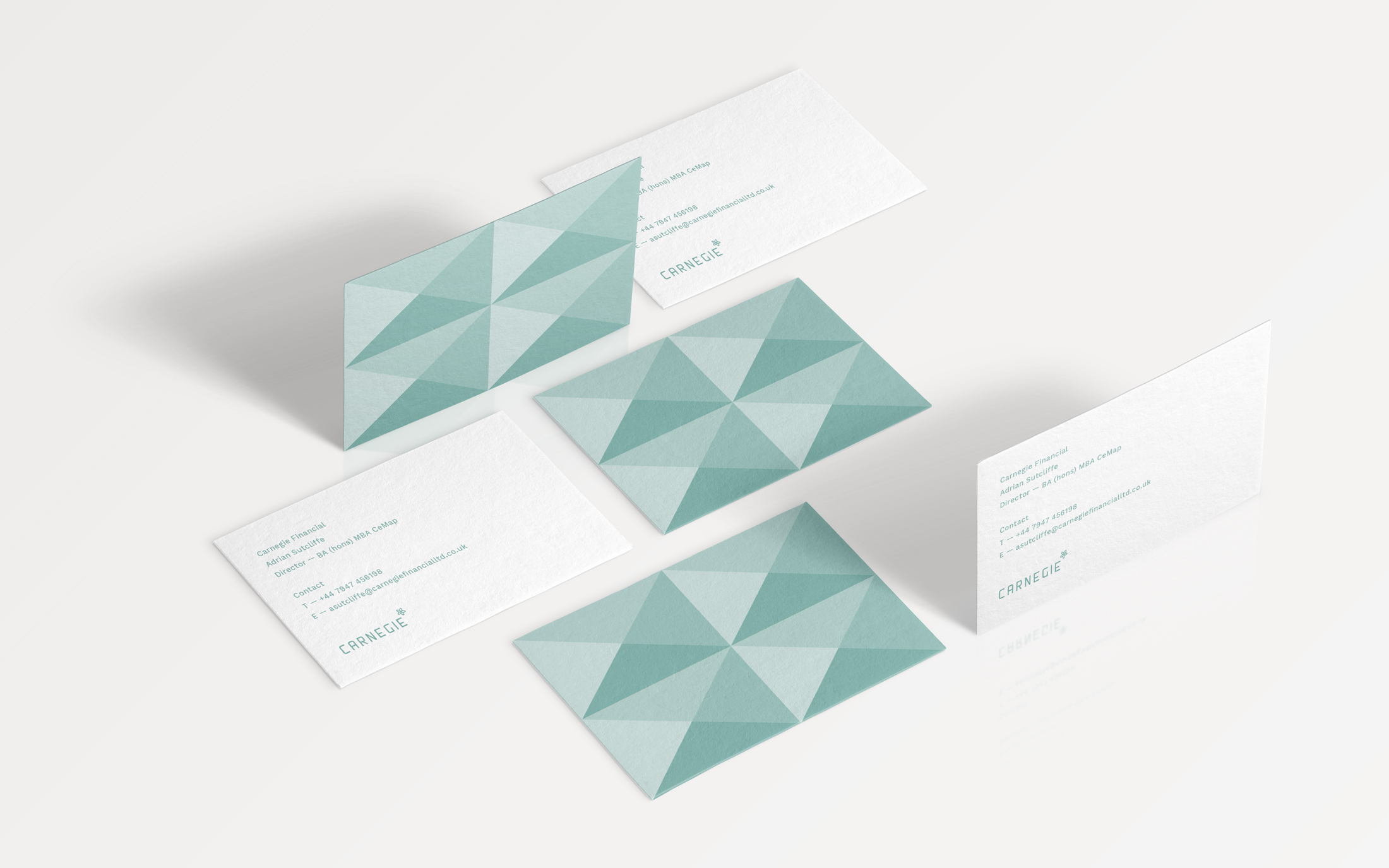
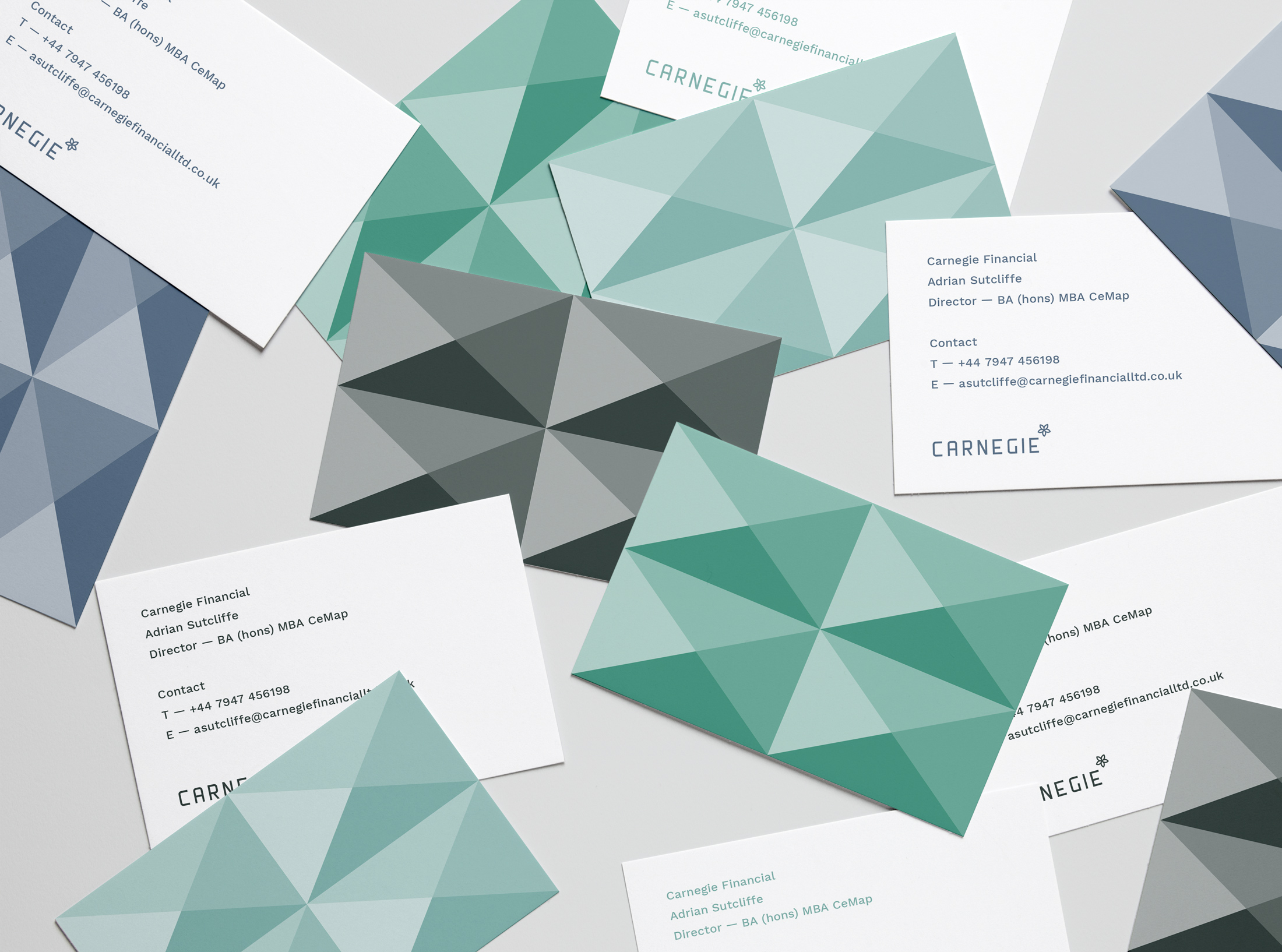
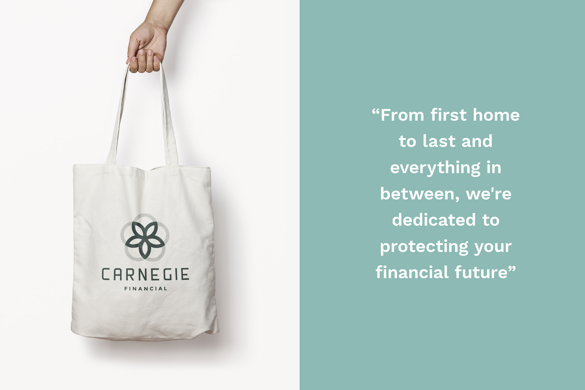
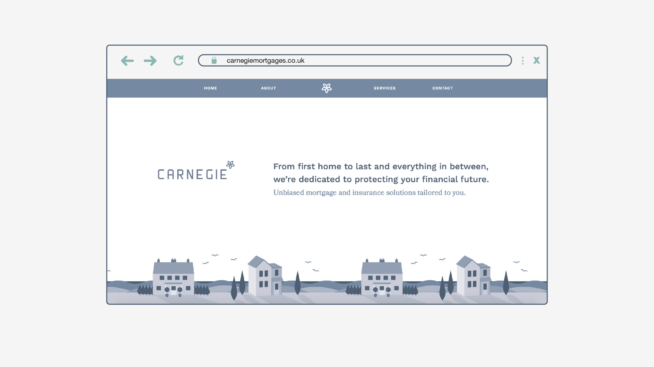
For the logo, we drew inspiration from the ghost signs that grace buildings across Tyneside, Leeds, and York – tributes to the region’s industrial past. The name “Carnegie” was chosen by the founder, a nod to his student days at Leeds Beckett University and his connection to the Yorkshire Carnegie rugby club. We adapted the Yorkshire Rose into a modern, geometric symbol, merging heritage with a forward-thinking visual. The typography and symbolism together create a brand that’s fresh, yet deeply connected to its roots. To break from the usual finance colours, we opted for an unconventional chalky palette, softening the look and giving the brand a more approachable feel.
“Get peace of mind with Carnegie” became the tagline, speaking directly to a no-nonsense audience seeking simplicity and reassurance. The tone of voice and copy carried that same welcoming vibe, making customers feel right at home (while they buy one, of course). Our work helped define Carnegie Financial as both a local hero and a nationwide contender – approachable, familiar, and still elegant enough to appeal across the UK.