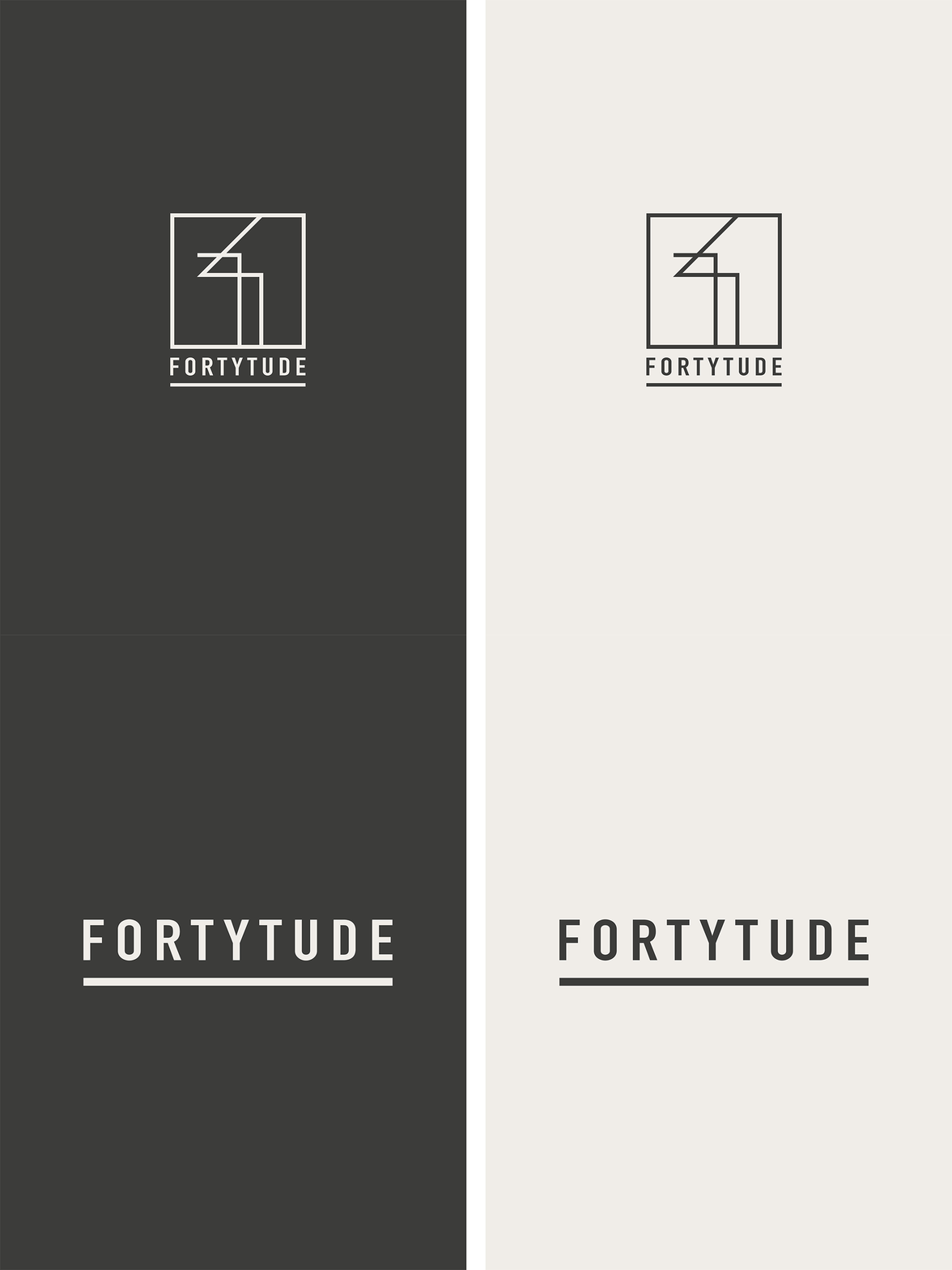
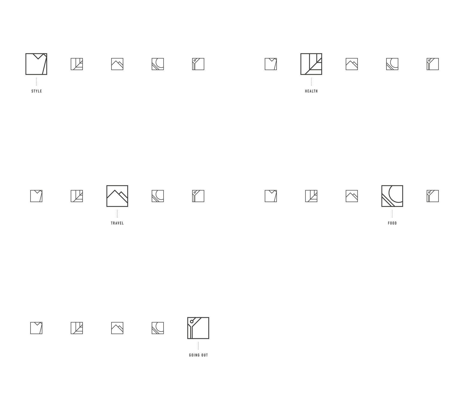
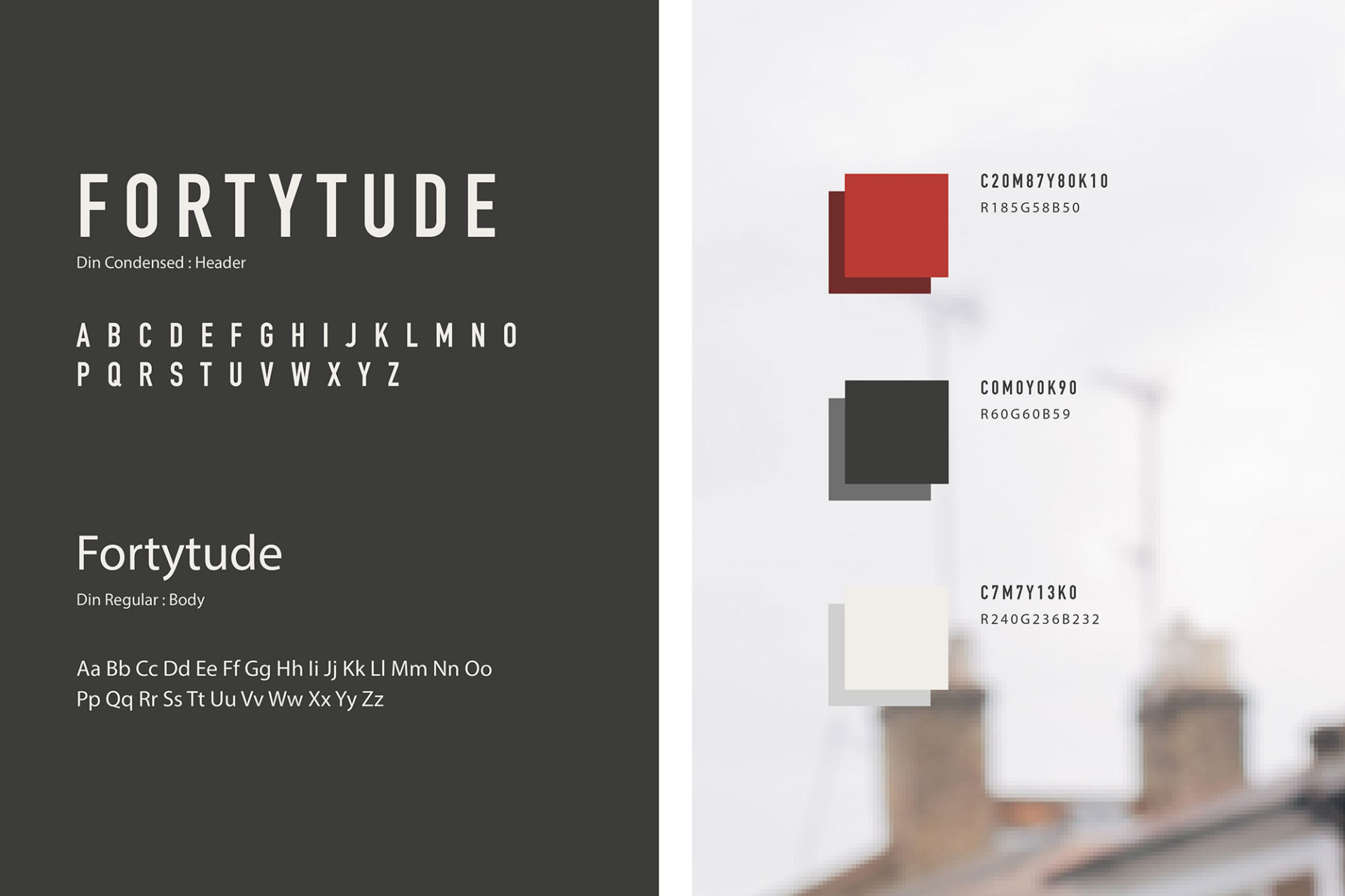
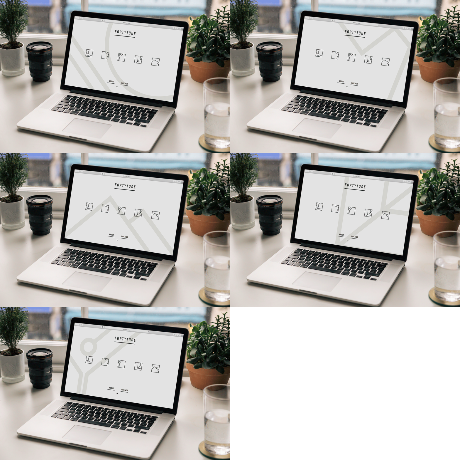
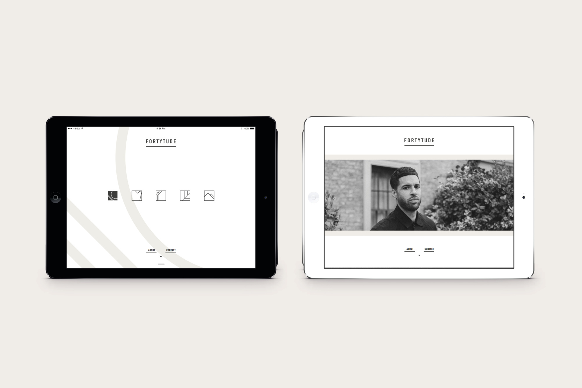
To meet the brief, we created a neutral aesthetic with clean lines and a subtle aspirational edge. Through candid feedback from our focus groups, we learned that this audience values simplicity, functionality, and a visual and verbal language that’s beautiful yet purposeful. They’re confident, well-travelled, and endlessly curious about the world, culture, and design. So, we drew inspiration from German designer Otl Aicher’s clean, geometric style to create bespoke icons for the five core categories Fortytude covers: health, fitness, food, going out, style, and travel. We blended this with the minimalist, modular nature of Japanese brands like Uniqlo and Muji, and the urban edge of Japanese streetwear from the likes of Hiroshi Fujiwara, to create a brand that’s world-wise, trend-savvy, and intellectually charged.
Fortytude
A life lived in the streets of cities, engaged in conversation, dancing to the beat. For those who are increasingly daring, dress honestly and originally, explore, create and observe. A lifestyle journal and brand by Clint McDonald. Coming soon…
Overview
Fortytude is a visual diary and lifestyle brand aimed at those in their late thirties to early fifties. It aims to deconstruct traditional notions of those in their third, fourth and fifth decades. No longer a generation resigned to conforming to stereotypes of ageing - middle adulthood has been redefined.
Services
Brand Strategy, Visual + Verbal Identity Design, Web Design + Development, Copywriting + Messaging, Photography, Illustration.
The Challenge
1. Fortytude wanted to address their audience in modern way. Appealing to a generation that no longer follows the same trajectory as their predecessors.
Barefaced Solution
- We started with interviews and focus groups, diving into the minds of Fortytude’s audience to uncover exactly what they want, need, and desire – no guesswork, just raw insights.
- Our research revealed this group wasn’t interested in anything patronising, trend-chasing, or half-baked—they wanted a brand that was bold, unapologetic, and oozing confidence.
- Armed with that intel, we built a strategy that’s all about authenticity, ditching the usual tired tropes and stepping into something much more real.
- The result? A brand that doesn’t just talk – it makes a statement, standing tall and owning its space in a world full of brands that just don’t get it.
93%
Of test audience felt branding aligned with their needs
1,203
Sign-ups in first month
450%
Increase in Instagram followers in first month
“Barefaced are great to work with. They actually listened to my objectives, really got to understand my brand and were open to my ideas whilst shaping them deftly with their own expertise and experience. Easy to work with, patient and always willing to help.”
– Clint McDonald, Founder
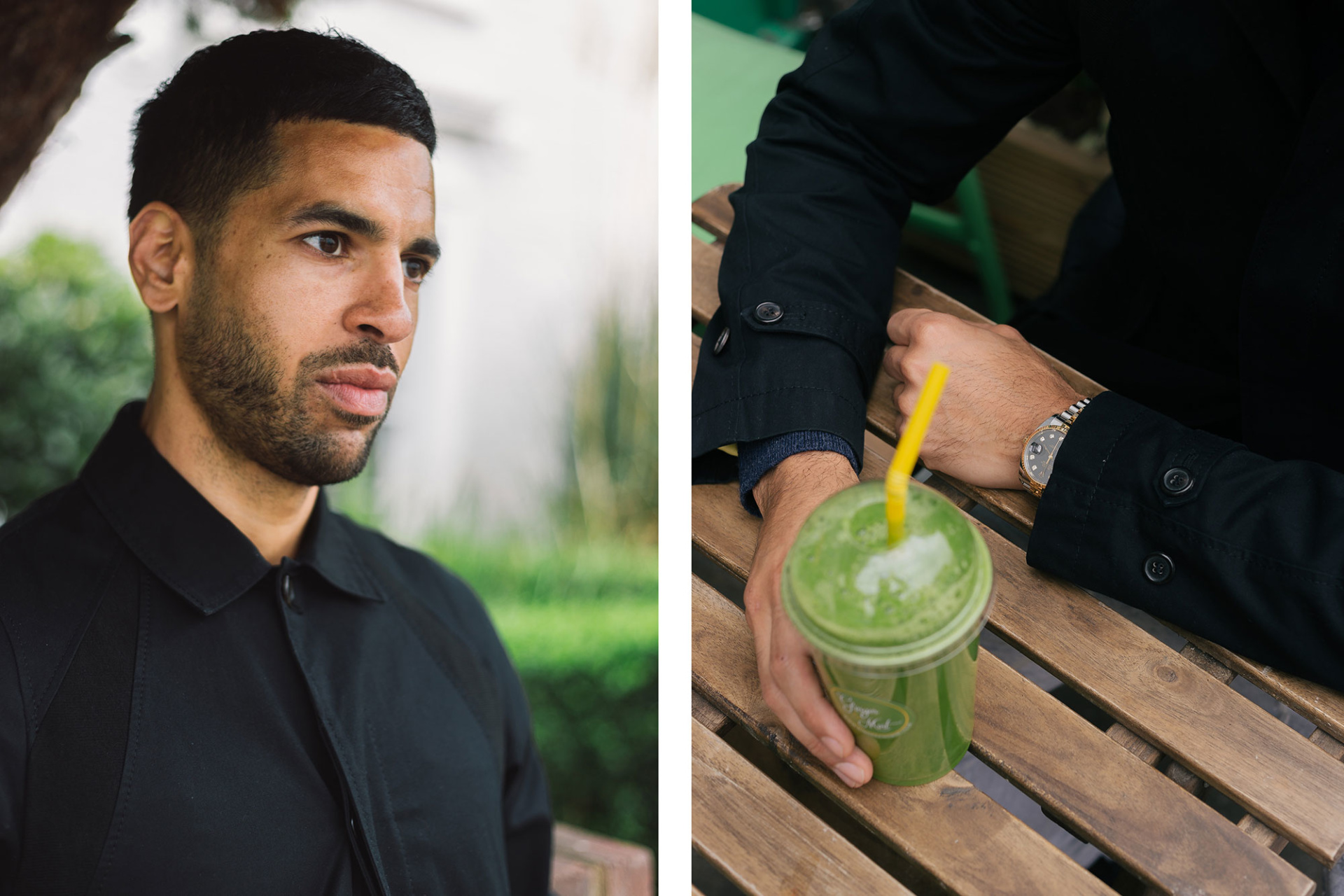
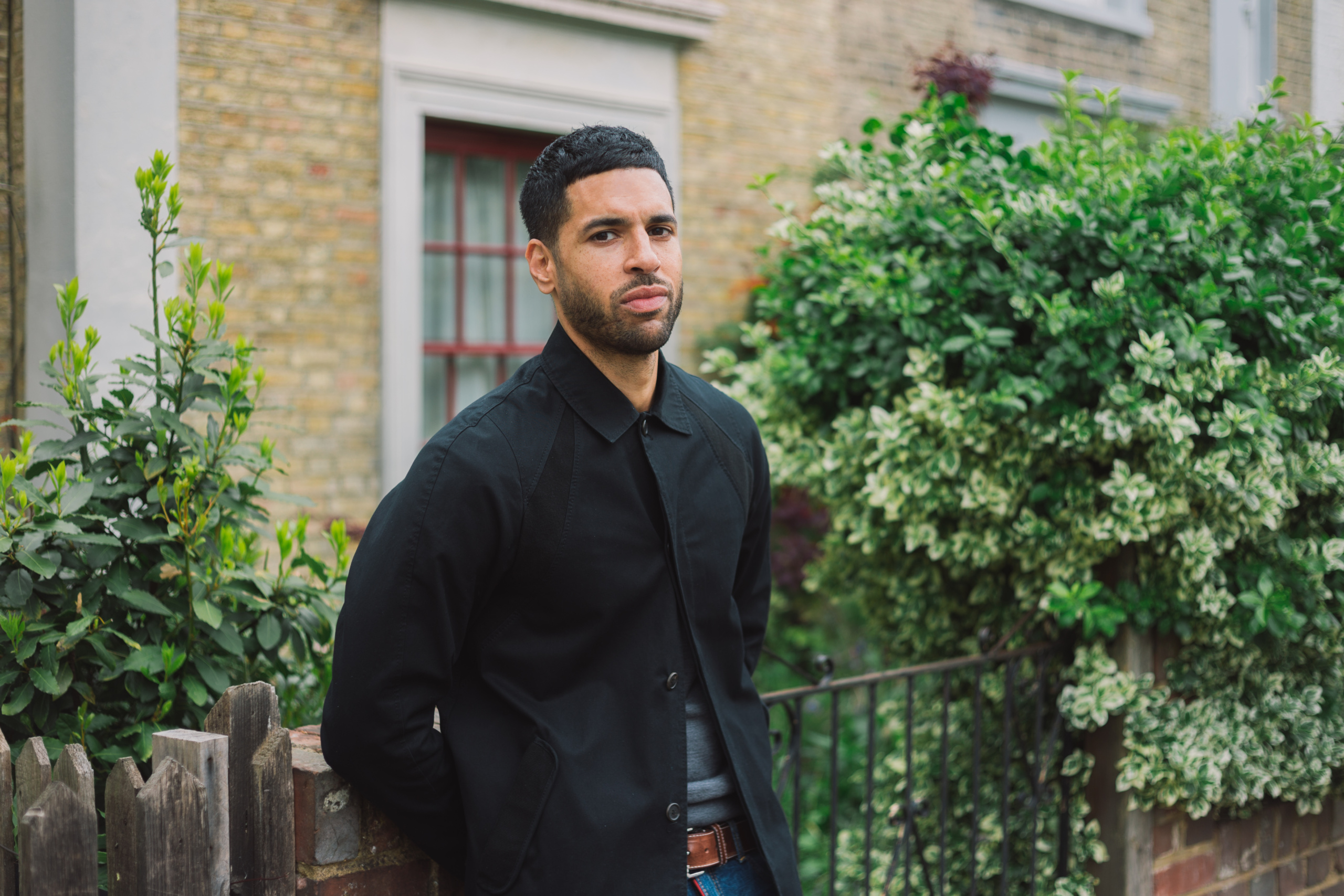
Middle adulthood redefined
Fortytude is a visual diary and lifestyle brand crafted for those in their late thirties to early fifties, aiming to completely flip the script on what it means to be in your third, fourth, and fifth decades. This is no longer a generation resigned to outdated notions of aging. With longer, healthier lives, we’re redefining middle adulthood and living differently than previous generations. Fortytude wanted to speak to this engaged, influential, and effortlessly cool crowd with a brand identity that’s as confident as it is understated.