Davies & Davies
An independent, market-leading estate agent based in Inner North London. They're now a multi-award winning agency and have been voted as the 7th best estate agent in the UK by the Best Estate Agency Guide.
Overview
Estate Agents don't have the best rep. You know it, we know it, Davies & Davies know it. But D&D do things differently. An ethical estate agency (yep, you read that right) whose mission is to make their customers lives easier. They're big on corporate social responsibility and go out of their way to support their local community. In fact, their proud history and connection to their local area is central to their identity. D&D needed a way to stand apart from the quagmire, shift perceptions and show the world why they're special. So we helped to position them as the alternative to rubbish estate agency: an ethical estate agency for jaded North Londoners.
Services
Brand Strategy, Brand Positioning + Planning, Brand Audits + Guardianship, Visual + Verbal Identity Design, Web Design + Development, UX + UI Design, Copywriting + Messaging, Marketing Strategy, Marketing Management, Content Creation, Campaign Creation + Design, Print + Digital Design, Packaging Design, Film + Photography, Illustration + Animation, Social Media Management.
The Challenge
- Low brand recall and heightened competition from large corporate agencies and online agents.
- Negative brand perception leading to low sales fees in order to remain competitive.
- Shrinking market and not enough market share.
- Outdated and unintuitive website causing low lead generation.
Barefaced Solution
- Dug deep into D&D’s heritage, drawing inspiration from the 1920s, when the business was founded, to craft a brand that’s classic yet refreshingly different from their modern, glossy competitors.
- The rebrand breaks away from the digital, corporate overload, offering a grounded, trustworthy vibe that feels both familiar and timeless.
- Positioned D&D as industry leaders, blending trust, quality service, and strong local ties – helping them become the UK’s 7th best estate agent.
- Boosted fees by up to 50% with a fresh brand that resonates with both heritage and modern relevance.
- Created standout campaigns around two community-driven slogans: “Established in 1927, we know this neighbourhood” and “Your local property nerds” to capture attention in a shrinking market.
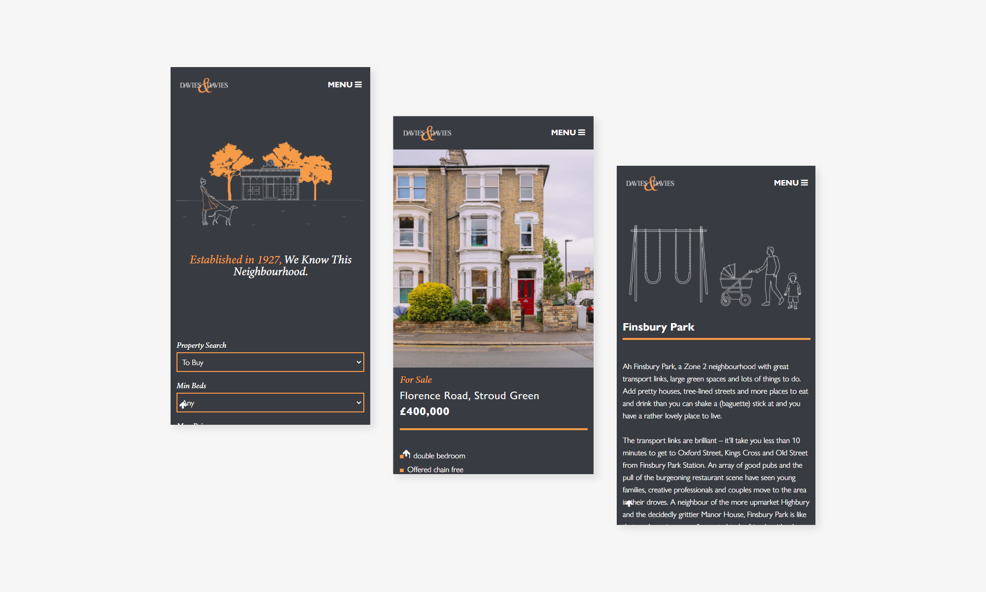
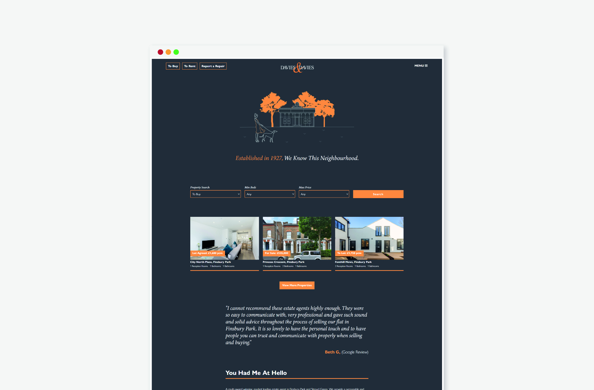
- Launched a sleek, user-focused website with high contrast, plenty of white space, and modern elegance – resulting in more traffic, deeper engagement, and a noticeable drop in bounce rates.
≤50%
Increase in sales fees
+41%
Increase in valuation enquiries
+200%
Increase in website traffic
5
Awards won
“Barefaced Studios have helped us completely turn our business around.
By re-positioning our brand identity and creating brilliant marketing collateral for us, we’ve seen a massive increase in web traffic, Rightmove and Zoopla click through rates and client inquiries. The team are friendly, easy to work with and go above and beyond. I’d highly recommend them.”
– Mark Scales, Company Director

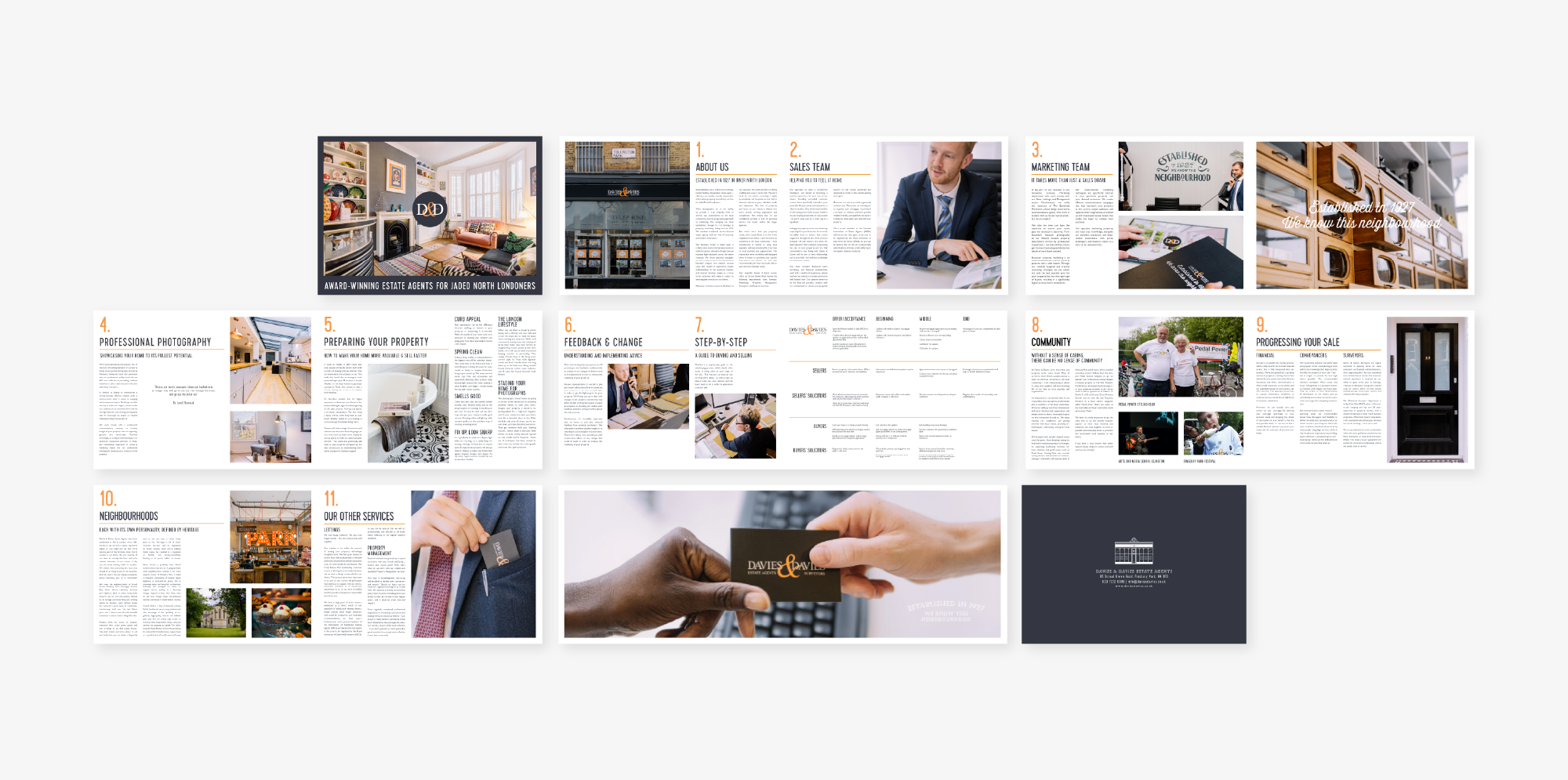
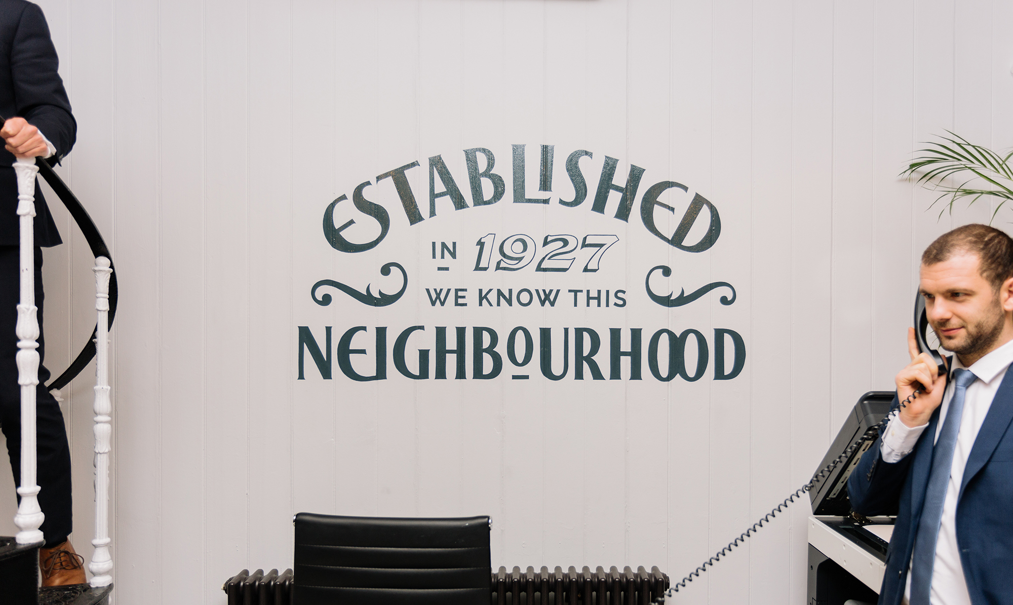
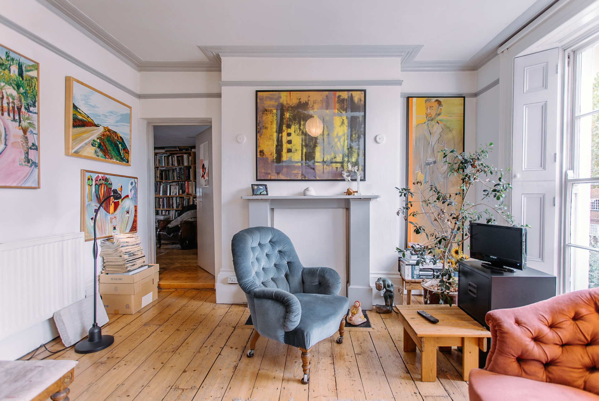
Your local property nerds
Davies & Davies are on a mission to make estate agency less of a headache and more of a pleasure – while also giving back to their local community. They’re out to flip the script on an industry known for dodgy practices and a bad reputation. We helped them inject personality, warmth, and a touch of cheekiness into their brand, all while honouring their rich local heritage.
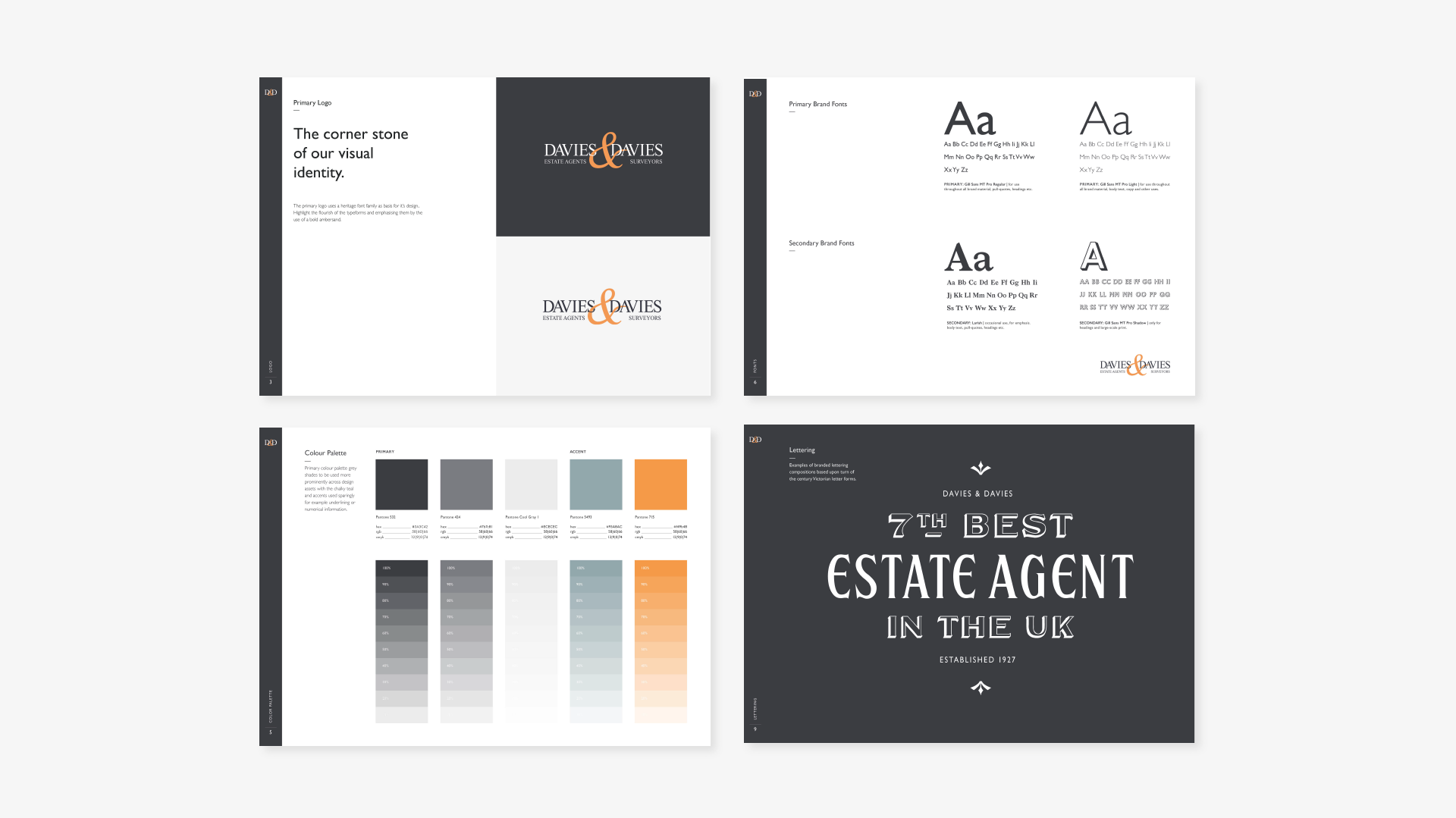
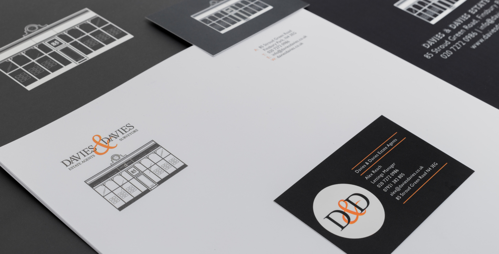
Founded in 1927, we brought a fresh twist to their legacy by channeling classic Art Deco design. We gave their logo a smart refresh, keeping the iconic Times New Roman-inspired typeface and adding sleek fonts like Gill Sans. A bold colour palette of refined dark grey and vibrant orange now brings the brand to life with energy and class.
We decided to have some fun with estate agent stereotypes, while dismantling them! So, we crafted a brand voice that’s witty, approachable, and full of cheeky British slang. Think clever puns, memorable slogans, and stunning artwork that sets D&D apart from the usual corporate crowd. Their new website? A thing of beauty, focused on killer imagery and a seamless user experience that guides clients every step of the way.
With a smarter, more vibrant brand and some savvy strategies, D&D has grown their market share, boosted brand recognition, and nabbed the title of the 7th best estate agent in the UK. And as for us? Let’s just say, we’re basically in a committed relationship now as their brand and marketing partner.